Download
1 / 9
90 likes | 245 Views
• OUR PURPOSE: Achieve better integration of informational graphics into learning visuals by combining content with appropriate and creative metaphors, thereby creating a more compelling experience for clients.

E N D
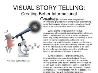
• OUR PURPOSE: Achieve better integration of informational graphics into learning visuals by combining content with appropriate and creative metaphors, thereby creating a more compelling experience for clients. Our goal is the combination of intellectual engagement with enjoyable sensual perception, which can result in ‘synesthesia’ — a state of understanding that forms long lasting connections within the memory. In other words, by taking complex data and turning it into accessible charts with interesting images, our clients and readers can digest that data more easily. We want to push both the intellectual and emotional buttons at the same time to make sure they better remember what they’re learning and achieve a full nexus of meaning. By making better use of creative metaphor, information becomes easier to understand. For any subject there are dozens of metaphors, and while we should generally avoid obvious clichés, those too can be good if given creative treatment or a clever twist. By this means we can connect the two universes: The left and right ones. The microscopic with the telescopic. The detailed micro view with the holistic macro view. VISUAL STORY TELLING: Creating Better Informational Graphics Presented by Ben Garrison
Chart ideas: Basic vs. Elaborate • TOP: Here is a chart that is presented in a typical and perfunctory manner. It has been done this way for a reason: Time. Of course, what time really means is money. Charts often change in size and content, therefore it is easy and more cost effective if the designer handles the changes in an expeditious manner without involving the conceptor in rigorous, lengthy redraws. • BOTTOM: Here is a learning map that better integrates an info graphic into the visual. There has been extra time and care taken to make the data entertaining while at the same time allowing the reader to quickly grasp what the data mean. (The word ‘data’ is plural).
Choosing the right chart It will be necessary for the team to understand proper chart selection after examining and understanding the data. Charts show trends and statistics — numbers — to the reader. This could be done with words and figures on plain white paper, but humans can assimilate numerical data much faster when visuals make those statistics clearer. Root Learning employs four types of charts for this purpose: • BAR CHART • FEVER CHART • PIE CHART • TABLE CHART In addition to the big four, there are also chronologies, timelines and organizational charts (flow charts) to consider as well milestones and factoid statements. There are other kinds of charts (scatter, area, polygon, etc), but those are rarely used on our maps.
Crossing the Bar • BAR CHARTS: This type of chart is perhaps most commonly used on Root maps. Use a bar chart when there is a need to show relationships between a number of items in common time frame. They’re interesting to look at when amounts vary, but they are also useful when showing small differences in amounts. The eye can readily pick up those differences and that makes the bar chart a better choice over fever charts. Bars work best as a comparison and contrast between amounts. For example, a how many cars are sold by different car companies in a single year. The bars can be horizontal or vertical or at angles as long as the x and y axis labels are clearly understood. It’s best never to put bar charts in radical perspective because that will distort the meaning. Inspiration comes from many sources: Old quotes, iconic images, a Thesaurus, photos, illustrations and the world around us. This idea came by looking at artwork by Spanish illustrators. The iconic image was quickly adapted to accommodate this bar chart — which is completely fanciful.
Fever Pitch • FEVER CHARTS: These are used to track progress or quantity over a period of time. The name derives from hospital charts used to track the fever of a patient over time. At left is a sample of how a fever chart can be creatively presented with dimension for a learning map. These charts show trends over time, such as prices of an object. The dates usually run across the bottom while a heavy line travels across a gridline. Since the fever line depends on the amount and spacing of the gridlines used, this chart can easily be distorted and exaggerate the data. In other words, if the data make a flat line, do not adjust or crop off the vertical scale at left (Y axis) in order to force contrast to the data, because that would be the equivalent of making statistics lie. Also, make sure there are plenty of data points. Two or three are not enough to make a satisfying fever chart. Rather than present the data as a flat 2-D chart as seen on the left, the artist combined subject with substance. NOTE: Chart was produced for this presentation ONLY. Data is not confirmed.
Baking a Pie • PIE CHARTS: These charts are perhaps the most problematic of the bunch and can easily be misused and cause confusion. The slices correspond as a percentage of the whole of the circle and are valid for ONE point in time only. It is best not to have too many slices. This is because a circle does not lend itself to a lot of labels and too many slices involve too many colors which can be difficult to see and only add to the confusion. If there are more than a half dozen slices or so, use a bar chart because distances are more easily and accurately estimated than area. Again, pie charts should only be used when the percentages add up to 100 percent. If they don’t, the reader should see a line explaining why. Usually the circle should stay as just that. Pie wedges are hard enough to interpret and if perspective is added to a circle (changed to an oval) then it could appear as if the data are being distorted. Labeling a pie is difficult enough without adding perspective, so make sure the slices are limited to only a few if this is attempted. Avoid adding depth to the slices as that creates unwanted volume which only confuses the issue. Use shadows instead. Ideally, a pie chart should be presented as a simple, flat circle and not angled. That’s not always easy to do on maps with a lot of perspective. This chart is based on invented data.
Tabs and Tables • TABLE CHARTS: These charts should be used when the data is variable. Tables show actual numbers arranged in a way that clarify relationships. Essentially grids with rows and columns of ordered data, tables are used when the data are unsuited to the previous three chart formats. For example, the numbers may range from a mere few to a million on an individual subject. That would make a ridiculous looking bar chart, making a table the way to go. Tables are also best used when there is description and/or commentary needed. Those words should be kept well-edited and brief. It is easy to overwhelm and overdo tables, so the amount should be kept to a reasonable amount — usually no more than eight columns . Consider arranging the table in a logical manner. For example, list the columns by order of company importance, or amounts large to small, or alphabetical order. Tables do not have to look boring. In this example, the artist (Ben Garrison) decided to warp the table to help reflect the passage of time and reflect the quirks involved.
Other Considerations These are graphic devices not often used on maps, but perhaps underused. They all lend themselves to creative treatments. • CHRONOLOGIES: These do not generally appear on maps. They are used instead of timelines when the dates are uneven and when more description is needed. Like a table, a grid format can be also be used. • TIMELINES: Often words on paper presentations, timelines can easily be pulled out and put on maps to create a sense of history and give readers a sense of where things will be going. Timelines should have enough going on through the years to make it worthwhile. Also, the dates shouldn’t all bunch up on one date and then have long gaps with nothing going on. If that’s the case, use a chronology instead. • MILESTONES: Are usually found on paths, roads or even at sea. They mark and describe goals or targets reached along the journey. They can appear on many items including rocks, signs or buoys. • LISTS, GLOSSARIES and FACTOIDS: Lists are usually put down with numbers to list order of importance, or in alphabetical order. Factoids and glossaries are useful to explain the key words and meaningful concepts. • ORGANIZATIONAL or FLOW CHARTS: Show hierarchies and connections. The circuitry involved could utilize some very interesting and creative metaphors on learning maps.
What to avoid Samples of charts that are hard to follow and distort data Using art instead of bars can be very misleading. We see here badly-drawn boxes on a palette. Exports went up from 100 to 300 (y axis figures are not clear), but the chart shows more than vertical height. It also shows area: 2007 is nine times larger than 2005. Adding too much depth and multi tones makes the chart much harder to read than necessary. It’s best to keep charts in two dimensions. Be careful when adding depth and perspective on pie charts. The two dark blue wedges are the same percentage, but notice how the one on the bottom looks larger due to being in the front and having depth added to it. Avoid common mistakes: • Avoid plastering on too much color. These are charts, not carnivals. Color should clarify, not decorate. (Also consider the color blind). Think of color as information itself. Use it intelligently. • AVOID PUTTING ALL CAPS ON SENTENCES. It’s hard to read. • Avoid busy backgrounds on charts as well as ornate fonts. • Avoid using point sizes on fonts that are too small or too large. • Avoid using an overwhelming amount of space to depict a few numbers. Charts should be in scale with the importance of the data.