Displaying data with graphs
340 likes | 875 Views
Displaying data with graphs PSLS chapter 1 © 2009 W.H. Freeman and Company Objectives (PSLS chapter 1) Picturing Distributions with Graphs Individuals and variables Two types of data: categorical and quantitative Ways to chart categorical data: bar graphs and pie charts

Displaying data with graphs
E N D
Presentation Transcript
Displaying data with graphs PSLS chapter 1 © 2009 W.H. Freeman and Company
Objectives (PSLS chapter 1) Picturing Distributions with Graphs • Individuals and variables • Two types of data: categorical and quantitative • Ways to chart categorical data: bar graphs and pie charts • Ways to chart quantitative data: histograms, dotplots and stemplots • Interpreting histograms • Time plots
Individuals and variables Individualsare the objects described by a set of data. Individuals may be people, animals, or things. • Freshmen, 6-week-old babies, golden retrievers, fields of corn, cells A variable is any characteristic of an individual. A variable can take different values for different individuals. • Age, gender, blood pressure, blood type, leaf length, flower color
Two types of variables A variable can be either • quantitative Something that can be counted or measured for each individual. We can then report the average of all individuals measured. • Age (in years), blood pressure (in mm Hg), leaf length (in cm) or • categorical Something that falls into one of several categories. We can then report the count or proportion of individuals in each category. • Gender (male, female), blood type (A, B, AB, O), flower color (white, yellow, red)
Question 1 1. Some variables that were recorded while studying diets of sharks are given below. Which of the variables is categorical? A) The amount of food eaten in a day by the shark being observed B) The age of the shark being observed C) The type of shark being observed D) The length of the shark being observed
Question 2 2. Which of the following is a discrete variable? A) Number of toxins present in a fish B) Length of a fish C) Weight of a fish D) None of the above
How do you decide if a variable is categorical or quantitative? Ask: • What are the n individuals examined (in the sample or population)? • What is being recorded about those n individuals? • Is that a number ( quantitative) or a statement ( categorical)? CategoricalEach individual is assigned to one of several categories QuantitativeEach individual is attributed a numerical value
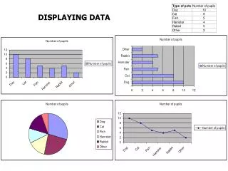
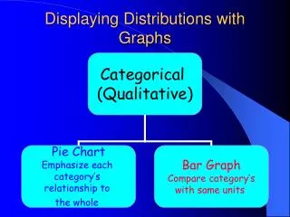
Ways to chart categorical data When a variable is categorical, the data in the graph can be ordered any way we want (alphabetical, by increasing value, by year, by personal preference, etc.). Most common ways to graph categorical data: • Bar graphsEach category is represented by a bar that represents the counts of individuals in that category or their relative frequency (percent of all categories shown). • Pie chartsEach category is represented by a slice of the whole pie that represents its relative frequency. Peculiarity: The slices must represent the parts of one coherent whole.
Example: Top 10 causes of death in the United States, 2001 For each individual who died in the United States in 2001, we record what was the cause of death. The table above is a summary of that information.
The number of individuals who died of an accident in 2001 is approximately 100,000. Bar graph Here the bar’s height shows the count of individuals for that particular category. Top 10 causes of death in the U.S., 2001
Top 10 causes of death in the U.S., 2001 Bar graph sorted by rank Easy to analyze Sorted alphabetically Much less useful
Pie chart Each slice represents a piece of one whole. The size of a slice depends on what percent of the whole this category represents. Percent of people dying from top 10 causes of death in the U.S., 2001
Make sure all percents add up to 100. Percent of deaths from top 10 causes Make sure the labels match the data. Percent of deaths from all causes
Common ways to chart quantitative data • Histograms This is a summary graph for a single variable. Histograms are useful to understand the pattern of variability in the data, especially for large data sets. • Dotplots and stemplots These are graphs for a the raw data. They are useful to describe the pattern of variability in the data, especially for small data sets. • Line graphs: time plots Use them when there is a meaningful sequence, like time. The line connecting the points helps emphasize any change over time. • Other graphsto display numerical summaries(see chapter 2)
Histograms The range of values that a variable can take is divided into equal-size intervals. The histogram shows the number of individual data points that fall in each interval. The first column represents all states with a percent Hispanic in their population between 0% and 4.99%. The height of the column shows how many states (27) have a percent Hispanic in this range. The last column represents all states with a percent Hispanic between 40% and 44.99%. There is only one such state: New Mexico, at 42.1% Hispanic.
How to create a histogram It is an iterative process—try and try again. What bin size should you use? • Not too many bins with either 0 or 1 counts • Not overly summarized that you lose all the information • Not so detailed that it is no longer summary Rule of thumb: Start with 5 to10 bins. Look at the distribution and refine your bins. (There isn’t a unique or “perfect” solution.)
Not summarized enough Too summarized Same data set
Interpreting histograms When describing a quantitative variable, we look for the overall pattern and for striking deviations from that pattern. We can describe the overall pattern of a histogram by its shape, center, and spread. Histogram with a line connecting each column too detailed Histogram with a smoothed curve highlighting the overall pattern of the distribution
Question 3 3. In drawing a histogram, which of the following suggestions should be followed? A) No bar should be taller than it is wide. B) Generally, bars should be square, so both the height and width equal the class count. C) The scale of the vertical axis should be that of the variable whose distribution you are displaying. D) None of the above
Histogram In a statistics class with 136 students, the professor records how much money each student has in his or her possession during the first class of the semester. The following histogram is of the data collected.
Question 5 first Then six 5.The number of students with under $10 is closest to A) 40. B) 50. C) 60. D) 70. 6.The histogram A) is skewed right. B) has an outlier. C) is asymmetric. D) All of the above
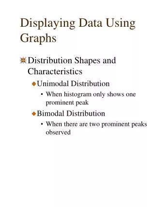
Most common distribution shapes A symmetric distribution the right and left sides of the histogram are approximately mirror images of each other Right skewed the right side (side with larger values) extends much farther out than the left side. Left skewed the left side extends much farther out than the right side.
Symmetric Skewed to the right Complex, bimodal distribution Not all distributions have a simple shape (especially with few observations).
Outliers An important kind of deviation is an outlier. Outliersare observations that lie outside the overall pattern of a distribution. Always look for outliers and try to explain them. Fairly symmetric but 2 states clearly don’t belong to the main trend Alaska and Florida have unusual percents of elderly in their population. A large gap in the distribution is typically a sign of an outlier. Alaska Florida
STEM LEAVES Stemplots How to make a stemplot: • Separate each observation into a stem, consisting of all but the final (rightmost) digit, and a leaf, which is that remaining final digit. Stems may have as many digits as needed, but each leaf contains only a single digit. • Write the stems in a vertical column with the smallest value at the top, and draw a vertical line at the right of this column. • Write each leaf in the row to the right of its stem, in increasing order out from the stem. Original data: 9, 9, 22, 32, 33, 39, 39, 42, 49, 52, 58, 70
Step 1: Sort the data Step 2: Assign the values to stems and leaves Percent of Hispanic residents in each of the 50 states
Stemplots versus histograms Stemplots are quick and dirty histograms that can easily be done by hand, therefore, very convenient for back of the envelope calculations. However, they are rarely found in scientific or laymen publications.
Stem Plot For a Physics course containing 10 students, the maximum point total for the quarter was 200. 7 The point totals for the 10 students are given in the following stemplot. A) 58%. B) 75%. C) 90%. D) 116%.
IMPORTANT NOTE:Your data are the way they are. Do not try to force them into a particular shape. It is a common misconception that if you have a large enough data set, the data will eventually turn out nice and symmetrical.
Dotplots Like stemplots, dotplots show the entire raw data and are well suited for describing small data sets. Each individual in the data set is shown as one dot on the horizontal axis representing the variable’s scale. Individuals with identical value are superimposed vertically. Skin healing rates of 18 anesthetized newts. Each newt is shown as a dot. The plot indicates no obvious outlier.
Line graphs: time plots Time always goes on the horizontal (x) axis. The variable of interest goes on the vertical (y) axis. Look for an overall trend and cyclical patterns. Overall upward trend in pricing over time: It could simply be reflecting inflation trends or more fundamental changes in this industry. Regular pattern of yearly variations: Seasonal variations in fresh orange pricing most likely due to similar seasonal variations in the production.
Scales matter How you stretch the axes and choose your scales can give a different impression. A picture is worth a thousand words, BUTthere is nothing like hard numbers. Look at the scales.