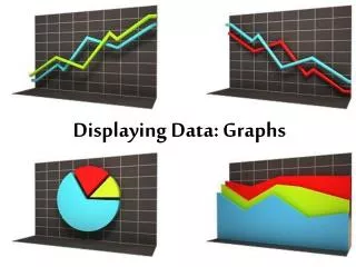
Displaying Distribution with Graphs
110 likes | 240 Views
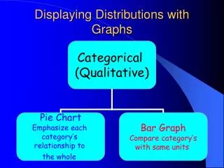
When describing the distribution of data using graphs, it is essential to analyze the SOCS: Spread, Outlier, Center, and Shape. Histograms are effective tools for displaying quantitative variables within defined classes and showing the percentage of observations in each class. To create a histogram, divide the data range into equal-width classes and summarize the statistics. Explore the shape of your data—whether it is symmetric, bimodal, or skewed—and use tools like the TI-84 calculator for efficient analysis. Understanding these concepts enhances data interpretation.

Displaying Distribution with Graphs
E N D
Presentation Transcript
Distribution When describing the distribution of your graph, always remember to tell something about the S.O.C.S. Spread, Outlier, Center, Shape
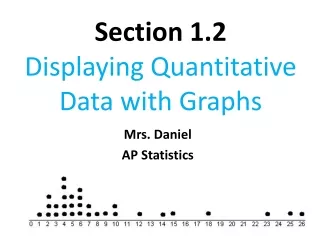
Histograms Displays quantitative variables in classes and shows only the percent of the observations that fall into each class .
STEP 1: divide the range into classes of equal width Range: 81-145 width: 10 75≤ IQ<85 Classes: 85≤ IQ<95 95≤ IQ<105
S O C S Range from 80-150 No apparent outlier Around 110 Roughly symmetric
T1-84 Generated Histogram • Using your calculator to speed things up
Use breaking strength of selected wires • STAT>1: Edit • Type the values into L1 • |2nd| > |Y=| (stat plot) > enter • Go to histogram then press enter. • Zoom 9 Syntax:
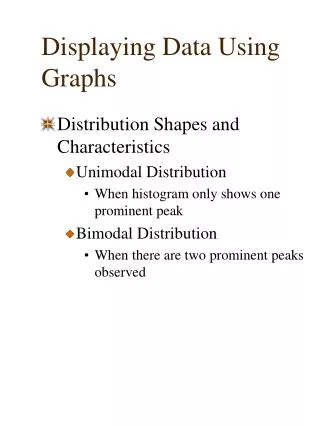
More about shape symmetric If the right and the left sides of the distribution is approximately mirror image of each other bimodal If there are two obvious peaks in your distribution
Skewed to the left Skewed to the right skewness Grab the whale by its tail