Analyzing Quantitative Data with Graphs: A Visual Exploration Guide
Learn how to construct and interpret dotplots, stemplots, and histograms to describe shapes and compare distributions of quantitative data. Discover the art of displaying and analyzing data effectively.

Analyzing Quantitative Data with Graphs: A Visual Exploration Guide
E N D
Presentation Transcript
Chapter 1: Exploring Data Section 1.2 Displaying Quantitative Data with Graphs The Practice of Statistics, 4th edition - For AP* STARNES, YATES, MOORE
Chapter 1Exploring Data • Introduction:Data Analysis: Making Sense of Data • 1.1Analyzing Categorical Data • 1.2Displaying Quantitative Data with Graphs • 1.3Describing Quantitative Data with Numbers
Section 1.2Displaying Quantitative Data with Graphs Learning Objectives After this section, you should be able to… • CONSTRUCT and INTERPRET dotplots, stemplots, and histograms • DESCRIBE the shape of a distribution • COMPARE distributions • USE histograms wisely
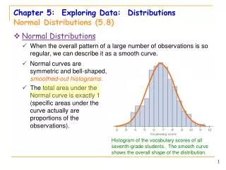
Displaying Quantitative Data • Examining the Distribution of a Quantitative Variable • The purpose of a graph is to help us understand the data. After you make a graph, always ask, “What do I see?” How to Examine the Distribution of a Quantitative Variable • In any graph, look for the overall pattern and for striking departures from that pattern. • Describe the overall pattern of a distribution by its: • Shape • Outlier • Center • Spread • Note individual values that fall outside the overall pattern. These departures are called outliers. Don’t forget your SOCS!
Displaying Quantitative Data • Describing Shape • When you describe a distribution’s shape, concentrate on the main features. Look for rough symmetry or clear skewness. Definitions: A distribution is roughly symmetric if the right and left sides of the graph are approximately mirror images of each other. A distribution is skewed to the right (right-skewed) if the right side of the graph (containing the half of the observations with larger values) is much longer than the left side. It is skewed to the left (left-skewed) if the left side of the graph is much longer than the right side. Symmetric Skewed-left Skewed-right
Shape • Types of Shape: • Symmetric Skewed Right • Skewed Left
Shape • Types of Shape: • Unimodal Bimodal • Uniform
Example • Smart Phone Battery Life • Here is the estimated battery life for each of 9 different smart phones (in minutes). Make a dotplot of the data and describe what you see.
Displaying Quantitative Data • Comparing Distributions • Some of the most interesting statistics questions involve comparing two or more groups. • Always discuss shape, center, spread, and possible outliers whenever you compare distributions of a quantitative variable. Example: Energy Cost: Top vs. Bottom Freezers How do the annual energy costs (in dollars) compare for refrigerators with top freezers and refrigerators with bottom freezers? The data below is from the May 2010 issue of Consumer Reports. Compare the distributions of energy cost for these two freezers. Don’t forget your SOCS!
Displaying Quantitative Data • Stemplots (Stem-and-Leaf Plots) • Another simple graphical display for small data sets is a stemplot. Stemplots give us a quick picture of the distribution while including the actual numerical values. How to Make a Stemplot • Separate each observation into a stem (all but the final digit) and a leaf (the final digit). • Write all possible stems from the smallest to the largest in a vertical column and draw a vertical line to the right of the column. • Write each leaf in the row to the right of its stem. • Arrange the leaves in increasing order out from the stem. • Provide a key that explains in context what the stems and leaves represent.
Displaying Quantitative Data • Stemplots (Stem-and-Leaf Plots) • These data represent the responses of 20 female AP Statistics students to the question, “How many pairs of shoes do you have?” Construct a stemplot. Key: 4|9 represents a female student who reported having 49 pairs of shoes. 1 93335 2 664233 3 1840 4 9 5 0701 1 33359 2 233466 3 0148 4 9 5 0017 1 2 3 4 5 Stems Add leaves Order leaves Add a key
Displaying Quantitative Data • Types of Stem Plots: • Splitting Stems and Back-to-Back Stemplots • When data values are “bunched up”, we can get a better picture of the distribution by splitting stems. • Two distributions of the same quantitative variable can be compared using a back-to-back stemplot with common stems. Females Males Females 333 95 4332 66 410 8 9 100 7 Males 0 4 0 555677778 1 0000124 1 2 2 2 3 3 58 4 4 5 5 0 0 1 1 2 2 3 3 4 4 5 5 “split stems” Key: 4|9 represents a student who reported having 49 pairs of shoes.
Back-to-Back Stemplots Example • Try the example from your notes on your own. • Which gender is taller, males or females? A sample of 14-year olds from the United Kingdom was randomly selected using the CensusatSchool website. Here are the heights of the students (in cm). Make a back-to-back stemplot and compare the distributions. • Male: 154, 157, 187, 163, 167, 159, 169, 162, 176, 177, 151, 175, 174, 165, 165, 183, 180 • Female: 160, 169, 152, 167, 164, 163, 160, 163, 169, 157, 158, 153, 161, 165, 165, 159, 168, 153, 166, 158, 158, 166
Answers • Back-to-back Stemplot 9 7 4 1 15 2 3 3 7 8 8 8 9 9 7 5 5 3 2 16 0 0 1 3 3 4 5 5 6 6 7 8 9 9 7 6 5 4 17 7 3 0 18
Displaying Quantitative Data • Histograms • Quantitative variables often take many values. A graph of the distribution may be clearer if nearby values are grouped together. • The most common graph of the distribution of one quantitative variable is a histogram. How to Make a Histogram • Divide the range of data into classes of equal width. • Find the count (frequency) or percent (relative frequency) of individuals in each class. • Label and scale your axes and draw the histogram. The height of the bar equals its frequency. Adjacent bars should touch, unless a class contains no individuals.
Displaying Quantitative Data • Example: The following table presents the average points scored per game (PPG) for the 30 NBA teams in the 2009–2010 regular season. Make a histogram of the distribution.
Displaying Quantitative Data • Using Histograms Wisely • Here are several cautions based on common mistakes students make when using histograms. Cautions • Don’t confuse histograms and bar graphs. • Don’t use counts (in a frequency table) or percents (in a relative frequency table) as data. • Use percents instead of counts on the vertical axis when comparing distributions with different numbers of observations. • Just because a graph looks nice, it’s not necessarily a meaningful display of data.
Section 1.2Displaying Quantitative Data with Graphs Summary In this section, we learned that… • You can use a dotplot, stemplot, or histogram to show the distribution of a quantitative variable. • When examining any graph, look for an overall pattern and for notable departures from that pattern. Describe the shape, center, spread, and any outliers. Don’t forget your SOCS! • Some distributions have simple shapes, such as symmetric or skewed. The number of modes (major peaks)is another aspect of overall shape. • When comparing distributions, be sure to discuss shape, center, spread, and possible outliers. • Histograms are for quantitative data, bar graphs are for categorical data. Use relative frequency histograms when comparing data sets of different sizes.
Looking Ahead… In the next Section… • We’ll learn how to describe quantitative data with numbers. • Mean and Standard Deviation • Median and Interquartile Range • Five-number Summary and Boxplots • Identifying Outliers • We’ll also learn how to calculate numerical summaries with technology and how to choose appropriate measures of center and spread.