Download
1 / 58
580 likes | 928 Views
Choosing an appropriate color combination in the website design process in considered one of the most important elements in creating a successful website.It has the ability to generate a positive impact to the visitor and as a result,make the visitor stay longer.

E N D
ADMEC Multimedia Institute
ID : AD/RH/WP/12-15/23 Course : Web Premium Submitted to : Ravi Sir Submitted by: Kajal Gulati
P R O J E C T
Importance of colors in a design…… Color plays a vitally important role in the world we live. Choosing an appropriate color combination in the website design process in considered one of the most important elements in creating a successful website.It has the ability to generate a positive impact to the visitor and as a result,make the visitor stay longer. Remember- As a rule,we recommend that your website employ the use of 2-3 colors at man.Often the biggest statement you site can make is in its simplicity.
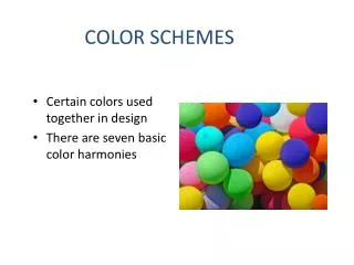
COLOR MODES There are 8 types of color modes in a color,wheel are:- 1. RGB 2. CMYK 3. Grayscale 4. Bitmap 5. Lab 6. Indexed 7. Duotone 8. Multichannel
RGB Color Mode The RGB color model is an additive color model in which red, green & blue light are added together in various ways to reproduce a broad array of colors. The name of the model comes from the initials of the three additive primary colors, red, green, blue.
CMYK Color Mode CMYK is a subtractive color model, used in color printing, and is also used to describe the printing process itself.CMYK refers to the 4 inks used in same color printing: Cyan, Magenta, Yellow & key(Black).
Grayscale Color Mode It is a range of shades of grey. It is a range of monochromatic shades of grey & no color. While digital images can be saved as grayscale images contain grayscale information.
Bitmap Color Mode Photoshop image in the bitmap color mode is an effective but a less versatile alternative to vector graphic art work. A photoshop raster image saved in the bitmap color mode is effectively hard edged line art.
Lab Color Mode A lab color space is a color- opponent space with dimension L for lightness, a & b for the color opponent dimensions, based on non linearly compressed coordinates.
Indexed Color Mode It is a technique to manage digital images colors in a limited fashion, in order to save computer memory & file storage, while speeding up display refresh & file transfers. It is a term of vector quantization compression.
Duotone Color Mode It is a halftone reproduction of an image using the super imposition of one contrasting color halftone over another color halftone. This is the most often used to bring out middle tones & highlights of an image.
Multichannel Color Mode The colormode, a mode, designed for storage of masks & for specialized printing. When you convert image to multichannel mode, you no longer have a composite channel withwhich to work.
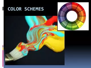
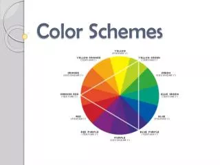
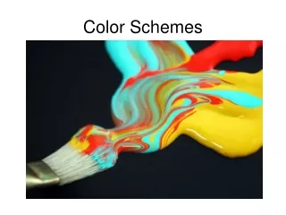
COLOR SCHEMES Types of color schemes are:- 1. Monochromatic 2. Complementary 3. Analogous 4. Triadic 5. Split Complementary 6. Tetradic
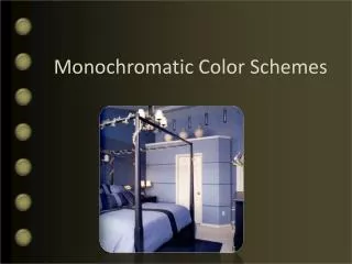
Monochromatic Scheme Monochromatic colors are all the colors (tints, tones & shades) of a single hue. These schemes are derived from a single base hue, & extended using its shades, tones & tints .
Complementary Scheme That are opposite each other on the color wheel are considered to be complementary colors.
Analogous Scheme Use colors that are next to each other on the color wheel. They usually match well.
Triadic Scheme That are evenly spaced around the wheel. They tend to be quite vibrant.
Split-Complementary Scheme It is a variation of the complementary color scheme. It has a strong visual contrast.
Tetradic Scheme It uses our colors arranged into two complementary pairs. This rich color scheme offers plenty of possibilities for variation.
Difference Between Complementary Color Scheme & Triadic Color Scheme
Triadic Scheme Complementary Scheme The triadic color scheme uses three colors equally spaced around the color wheel. The easiest way to place them on the wheel is by using a triangle of equal sides. Use:- This scheme is very popular among artists because it offers strong visual contrast while retaining balance, and color richness.. Colors that are opposite each other on the color wheel are considered to be complementary colors. Use:- The contrast of complementary colors creates a vibrant look especially when used at full saturation. They are pairs of colors which,when combined, cancel each other out.
Triadic Scheme Complementary Scheme
Complementary Scheme Examples
Triadic Scheme Examples
Different Colors & Their Moods..
Red Color It is color of evoking powerful emotions such as fear, anger & passion. Magenta color is variously defined as purplist red.
Green Color It is considered the most restful color of the eye. It promotes comfort & togetherness. Parrot green color indicates the cowardness.
Blue Color It is said to bring down blood pressure & slow respiration & heart rate. Dark blue has the opposite effect, evoking feelings of sadness. Cyan makes you feel & appear analytical & intelligent.
Purple Color It is rich, dramatic, sophisticated. It is associated with luxury & creativity; as an accent or secondary color, it gives a schemed depth.
Pink Color It is intuitive & insightful, showing tenderness and kindness with its empathy & sensitivity.
Yellow Color It is color of sunshine & communicates happiness. In large amounts, this color tends to create feelings of frustration & anger. Pale yellow indicates sickness, jealousy, caution, decay, etc.
Golden Color It is a color of success, achievement and triumph. Associated with abundance & prosperity, luxury and quality, prestige & sophistication, value & elegance.
Orange,Cream & Brown Color It evokes excitement & enthusiasm, and is an energetic color. In ancient cultures, orange was believed to heal the lungs & increase energy levels.