Download
1 / 10
100 likes | 231 Views
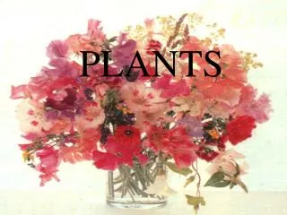
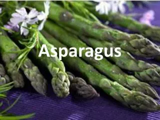
In my art research project, I delve into the beauty of plants through diverse techniques, reflecting on my choices in design. I create a collage using materials in harmonious tones while employing fine liners for delicate details. Inspired by artists like Yuken Teruya, Kristina Schluter, and Lars Hallstrom, I explore both positive and negative spaces, blending natural colors and textures. Through the use of a viewfinder, I improve the accuracy of my work, celebrating the emotional expressions that various plant forms evoke.

E N D
Completing “Plants are not boring” Adrianna Gumula UAL Diploma in Art & Design Level 2
Unit 1, 1.1. Assessing your choices This is my collage, where I add some pieces of the different materials which are in similar tones. I also draw few part of the flower by fine liner. I wanted to mix few different techniques to create more interesting piece of work. I really like it because its giving a positive and friendly emotions by the natural colours and the light shapes which are very delicate and glamourous.
Unit 1, 1.1. Assessing your choices This photo which I took and on that photo I like the composition of the water lily and the massive leaves. By using my photo I was trying create something different so I decide to use the black pen and fine liner to create some shades and dark tones. I also did a very simple sketch of that composition to show the structure but the last drawing is zoomed a little bit. I don’t like that development because its quite boring and it doesn’t show any emotions. My favourite image is the photo.
Unit 2, 2.3. Assessing your artist research Yuken Teruya is the artist that I took my idea from. To make it more interesting I decide to stick some different types of materials to the paper rolls to make the piece of work more textiles. This artist study is also relating to my project so it was easier to create something like this. The effect is really nice because of the burned parts. This piece of work is presenting a positive and negative space.
Unit 2, 2.3. Assessing your artist research This is my artist study of Kristina Schluter in my opinion her piece of work is very similar to Salvador Dali. In that picture the flower is going apart, so that’s mean that the flower is losing something. This artist study is very depressed because the tones and shades are very dark and its also showing that’s nothing is staying the same and some parts are dying. I like this artist study because its very interesting as the shapes are not very strong and its showing thatsomething is happening on the picture. I choose this picture because its showing very strong emotions and the picture is standing out.
Unit 2, 2.3. Assessing your artist research This is my artist study of Lars Hallstrom. I used that artist study to create a positive and negative space in my opinion its looks very well. It’s a lot of the small details on that picture so the eyes are running around the composition. On that type of pictures some parts are standing out more then the others because of the two limited colours.
Unit 3, 2.3. Assessing the measurement systems you used This technique of using a view finder effected the appearance of my work because the drawing is more accurate. By using a view finder I had to be more concentrate on what I’m observing. I thing that make my drawing much better because I can make sure that the drawing is really accurate. The successful thing about this image is that it is the same as the thing that I’m looking at.
Unit 3, 2.3. Assessing the measurement systems you used I think the view finder was really helpful to create that piece of work of the ‘mirroring’ effect because I know that all parts will be exactly the same. That make my big piece of work more accurate. The thin lines making a very nice effect and making the design more soft. The difference between the view finder and measuring by the pen with thumb is that view finder is more accurate and structured so you don’t lose your place. As the pen and thumb approach was harder to interpret.