DATA PRESENTATION
DATA PRESENTATION. Part 5. WHAT needs to be reported?. In case of any data presented we need to show: Data + description (title, categories etc.) Data source (survey, administrative statistics etc.) Any note (e.g. if data refer only to selected regions). WHAT needs to be reported?.

DATA PRESENTATION
E N D
Presentation Transcript
DATA PRESENTATION Part 5
WHAT needs to be reported? In case of any data presented we need to show: • Data + description (title, categories etc.) • Data source (survey, administrative statistics etc.) • Any note (e.g. if data refer only to selected regions)
WHAT needs to be reported? In case of the tracer study report (any microdata): • Introduction (purpose, content, structure) • Method report (data collection and data quality) • Presentation of findings (descriptive statistics) • Conclusion Be open about your methodology and the quality of data source!!
Method report • Background of the study (e.g. tracer study) • Objectives • Development of research instruments (questionnaire) • Pre-test of the questionnaire • Target population • Quality and quantity of used addresses • Update procedures of addresses • Timing of the survey • Response statistics • Check of representatively (comparison with existing statistics) • Data entry and coding • Kind of plausibility checks and data cleaning • Data analysis • Critical reflection about the quality of the data (Schomburg, 2014)
Data presentation: general rules • Use percentages – easier to understand than absolute numbers (but better to add the total number of valid answers) • Do not use decimals (correct – 14%) • Use tables and graphs – easier to understand • Reporting of missing values
Data presentation: general rules • Do you work at the moment? • Do you work at the moment? Note: 35% (7 cases) – missing responses
Data presentation: general rules • Do you work at the moment? • Yes – 100 respondents (66.7%) • No – 50 respondents (33.3%) • In which sector do you work? Out of 100 employed respondents, 50% of them work in Services, 30% of them in Agriculture and 20% in Industry.
ROW COLUMN Whatis a table? TITLE: Number of students in VET Schools GENDER
Number of students in VET Totals by ROW Totals by COLUMN Number of students in VET (%) Number of students in VET (%)
Whatis a graph? It is a tool to DESCRIBE the information VISUALLY Main objectives: • improve the perception • emphasize relationships • show trends over time and space
EXAMPLE improve the perception
EXAMPLE emphasize relationships
EXAMPLE show trends over time and space
Whatshould be included in a graph? Title: what we are analysing Y labels: the mesaurment unit Source: Who is providing the data X labels: which are the dimensions of our observation Legend: who/what is involved in the observation
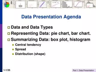
Typesof graphs • Column/Bar charts • Line charts The list is not exhaustive!!! • Pie charts • Scatter plots • Pictographs • Map charts
Whydifferenttypes of graph? • Observed phenomenon (qualitative/quantitative data) • Statistics used (shares of totals, observed values, means, etc.) • Complexity of data to be presented (simple frequency table, cross-tables, time series, etc)
Column/Bar chart It is the simplest and most popular graph used to represent data. It’s built using columns or bars in which the height represents the value we want to display. EX1
Line chart This graph is the most used when dealing with time series. It plots couple of valueslinked with a line in order to facilitate the trend analysis. It is often used to compare different series in the same graph. EX2
Pie chart It is used to represent a single distribution. Each area section is proportional to the value linked to a category of the variable. CAN BE USED ONLY WHEN DATA ARE ADDED TO 100%!!!! DO NOT USE IT WITH RATES!!! BEST FOR 3 TO 7 CATEGORIES EX3
Scatter-plot The scatter plot is a particular graph used to analyse the correlation between two different variables, observed on the the same population.
Scatter-plot EX: Analyse the perfomance of different units • Steps: • Identify the information to analyse • (N° of reports per year and N° of conforming products: in line in-house standards and approved by external organisations) • Create ah hoc indicators • (Productivity and Quality) • Plot the indicators and analyse information
Pictograph It is built using icons, associating a reference value to each icon. It is not accurate, can be used when dealing with few categories and its main objective is to capture the audience’s attention. • Easy to read • Visually appealing • Hard to quantify partial icons • Best for few categories • Very simplistic = 15%
Country A Country B Pictograph Another type of pictograph uses only icons giving only a simple visual information: Average number of Household members
Map chart It displays data associating colours to the different sections of a map. It is used to highlight spatial difference immediately. It must be equipped with a legend linking colors to their meaning. Good visual appeal • No exact numerical values • Limited categories • Color key can skew interpretation Source: Eurostat
Lessonslearnt There are different ways to show information: the bar chart is not the only one! Each graph has a meaning: choosing the right one will help data interpretation Graphs are tools for analysis, not only a “choreographic” way to display values