Creating a Composition in Art
Creating a Composition in Art. Organize. Proportion Position Path Perspective. Organize. Proportion:

Creating a Composition in Art
E N D
Presentation Transcript
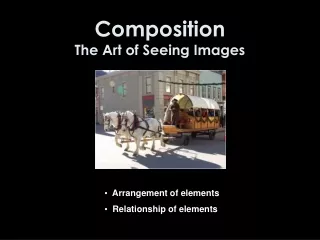
Creating a Composition in Art
Organize Proportion Position Path Perspective
Organize Proportion: Proportion refers to the size relationship of visual elements to each other and to the whole picture. When the principle of proportion is applied to a work of art it is usually in the relationship of size. For example: * The height, width and depth of one element to that of another * The size of one area to the size of another area * The size of one element to the size of another element * The amount of space between two or more elements
Organize Position: Studies show that in front-facing conditions people prefer the subject to be located near the center (center bias). And that the most aesthetically pleasing paintings generally have their major area of interest located distinctly to the right of the physical center of the picture. In left- or right-facing conditions preference was for the subject to face inward (inward bias)
Organize Path: Another way to express “path” is “eye movement.” Both of these terms refer to the way a viewer’s eye “moves” throughout a work of art. By manipulating the placement of objects, lines, values, shapes, color, etc., the artist controls the relative path a viewer’s eye may travel.
Organize Perspective: Linear perspective is a mathematical system for projecting the three-dimensional world onto a two-dimensional surface. In brief, this type of perspective begins with a horizon line, which defines the farthest distance of the background and a central vanishing point. To this vanishing point, diagonal lines are drawn from the bottom of the picture plane, which defines the foreground of the space. The diagonals, vanishing point, and horizon line establish the space in which the artist may arrange figures, objects, or architecture so that they appear to exist in three dimensions.
Viewpoint Viewer’s Position Fill the Frame
Viewpoint Viewer’s Position: The position of the viewer can strongly influence the aesthetics and the psychological effect of an image. For example, if a small child is painted by looking down from above, perhaps from the eye level of an adult, they are diminished in stature. But a painting done at the child's level would treat them as an equal, while one painted from ground level could result in an impression of dominance by the child. Therefore, the artist’s choice of the viewer's position affects how the viewer responds to the painting.
Viewpoint Fill the Frame: A subject can be rendered more dramatic when it fills the picture frame. This technique is also called “cropping.” There exists a tendency for the human eye to perceive objects as larger than they actually are, and filling the picture frame fulfills this psychological mechanism.
Rules Rule of Thirds Rule of SpaceRule of “Odds”
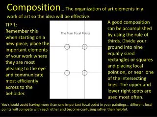
Rules Rule of Thirds: The Rule of Thirds is a guideline commonly followed by visual artists. The objective is to stop the subjects and areas of interest (such as the horizon) from cutting the image in half by placing them near one of the lines that divide the image into three equal columns and rows, ideally near the intersection of those lines.
Rules Rule of Space: The rule of space applies to artwork where the artist wants to create the illusion of movement. This can be achieved by leaving open space in the direction the eyes are looking in a portrait painting, or when picturing someone moving by adding open space in front of the subject rather than behind to indicate movement in that direction.
Rules Rule of Odds: The "rule of odds" states that by framing the object of interest in an artwork with an even number of surrounding objects, it becomes more comforting to the eye. The "rule of odds" suggests that an odd number of subjects in an image is more interesting than an even number. Thus if you have more than one subject in your picture, the suggestion is to choose an arrangement with at least three subjects.
Break the Rules Add Excitement
Break the Rules Add Excitement: Breaking the rules can create tension or unease, however, it can also add excitement and interest to the picture if used carefully. Consider artists such as Salvador Dali, whose sole aim is to disrupt traditional composition and challenge the viewer to rethink balance and design elements within art works.
Sketch the Design Elements of Art Principles of Design
Sketch the Design Elements of Art: Line Color Value Shape Form Texture SpaceThe Elements of Art are the visual components used to create works of art
Line In terms of art, line is defined as a moving dot having weight and direction. Line is perhaps the most basic of the seven Elements of Art. Line is also a fundamental part of drawing. Understanding how to use line to it's fullest potential is absolutely essential to any artist's success.
Color Color is the most expressive element of art and is seen by the way light is reflected off a surface.
Value Value is the lightness or darkness of a surface. It is often referred to when shading in black and white but value is also important in the study of color
Value Drawing Don't use outlines.The aim of realistic value drawing is to show the light and shadow and surface tones, creating a three-dimensional illusion. Outlines only define visible edges and don't tell us anything about light and dark. Linear drawing and value drawing are two different 'systems' of representation. Mixing up the two can be confusing, if realistic drawing is your aim. Change your approach.When creating a value drawing, you need to shift out of line-drawing mode, and the best way to do this is to forbid yourself to draw a line, and focus on areas of value. You might use the lightest of lines to get down the basic shapes. From there, build up the shading. Often the 'outline' will be at the join between two different values, and is created by the contrast between the light and dark area.
Shape Shape is an area enclosed by line. It is 2-dimensional and can be organic or geometric in design.
Form Technically speaking, Forms are 3-Dimensional as opposed to shape which describes 2-Dimensional elements. Forms occupy actual space and can be seen from all angles and re-positioned. Shapes only give the illusion that they occupy space. However, the two terms are often used to refer to the same thing
Texture Texture is the actual surface feel of an area or, in the case of 2-Dimensional work, the simulated appearance of roughness, smoothness or other textures.
Space Space can be positive or negative. On a 2-Dimensional surface the drawn objects constitute the positive space, while the background or surrounding area is the negative space. With a 3-Dimensional object positive space is the object itself while the negative space is the area cut through or surrounding that object.
Sketch the Design Principles of Design: Balance Rhythm Emphasis Movement Contrast Pattern Unity (Harmony) The Principles of Design are a set of guidelines used to plan a work of art so it will have the strongest impact on the viewer.
Balance Balance is the visual weight of an artwork. There are 3 types of balance: Symmetrical Balance: When both sides of an artwork appear to be similar. Asymmetrical Balance: When two sides of an artwork are different. Radial Balance: Emanating from a central point
Rhythm Rhythm is best described as the repetition of elements. Rhythm helps the eye travel around the artwork and can make the artwork seem active. Rhythm can be produced by shape, color, line, and/or pattern * Regular Rhythm: Arepetition of elements that are evenly spaced. * Irregular Rhythm: Elements that are repeated but not exactly similar. * Progressive Rhythm: As elements repeat, they increase or decrease in size.
Emphasis Emphasis is a focal point that strongly draws the viewer’s attention to an area of interestin a composition. Emphasis is when a particular area is stressed rather than the presentation of a maze of details of equal importance. Emphasis calls attention to important areas of the painting. By placing emphasis on certain areas of the composition, an artist creates centers of interest which causes the eye to return to that area again and again.
Movement Movement is the path our eyes follow when we look at a work of art. Movement ties the work together. By arranging the composition elements in a certain way, an artist controls and forces the movement of the viewer‘s eyes in and around the composition of the painting. For example, the eye will travel along an actual path such as solid or dotted line, or it will move along more subtle paths such as from large elements to smaller elements, from dark elements to lighter elements, from color to non color, from unusual shapes to usual shapes, etc.
Contrast Contrast in art occurs when two related elements; size, shape, value, color, etc. are different. The greater the difference the greater the contrast. Contrast adds variety to the total design and creates unity. It is what draws the viewer's eye into the painting and helps to guide the viewer around the art piece. Contrast also adds visual interest. Most designs require a certain amount of contrast. Too much similarity of the components in any design becomes monotonous.
Pattern Pattern uses the elements in planned or random repetitions to create unity and continuity in a composition. Pattern increases visual interest by enriching surface appeal.
Unity (Harmony) • Unity or Harmony is the hallmark of a good design. It's the final result in a composition when all the design elements work harmoniously together. Unity creates a sense of order. When a design possesses unity there will be a consistency of sizes and shapes, as well as a harmony of color and pattern. One way this is accomplished is by repeating the key elements, balancing them throughout the composition, and then adding a little variety so that the design has its own sense of personality. When a composition has unity the design will be viewed as one piece, as a whole, and not as separate elements within the painting.
Simplify Remove Unnecessary Content
Simplify Remove Unnecessary Content: Images with clutter can distract from the main elements within the picture and make it difficult to identify the subject. By decreasing the extraneous content, the viewer is more likely to focus on the primary objects. Clutter can also be reduced through the use of lighting, as the brighter areas of the image tend to draw the eye, as do lines, squares and color. In painting, the artist may use less detailed and defined brushwork towards the edges of the picture.
Go For It!
References http://www.bluemoonwebdesign.com/art-lessons/.asp http://www.uen.org/utahlink/tours/tourFames.cgi http://faculty.indy.cc.ks.us/jnull/introelements2.htm http://en.wikipedia.org/wiki/Composition_%28visual_arts%29 Complied by: Dan DeProspero, Knightdale High