Download
1 / 38
430 likes | 727 Views
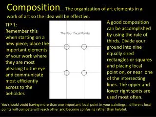
Composition … The organization of art elements in a work of art so the idea will be effective.

E N D
Composition… The organization of art elements in a work of art so the idea will be effective. A good composition can be accomplished by using the rule of thirds. Divide your ground into nine equally sized rectangles or squares and placing focal point on, or near one of the intersecting lines. The upper and lower right spots are used most often. TIP 1: Remember this when starting on a new piece; place the important elements of your work where they are most pleasing to the eye and communicate most efficiently across to the beholder. You should avoid having more than one important focal point in your paintings… different focal points will compete with each other and become confusing rather than helpful.
‘Golden Mean’, or the best spot in which to place your center of interest (focal point). This golden rule originates from the Ancient Greeks. They came to the conclusion that there needed to be a certain balance in composition for it to be pleasing to the eye. Notice that the main focal point sits right almost directly over one of the “golden means.” Additionally, other objects are placed near the other converging lines (the bird, for example) but, not directly on them, since that would create competition for the focal point.
Basically it is the division of a line in two sections, where the ratio between the smallest section and the largest section is identical to the ratio between the largest section and the entire length of the line. In other words A/B = B/(A+B). The ratio is about 1/1.618. Honestly, I’m still not exactly sure what that all means? but, I do know that it is successful. http://www.youtube.com/watch?v=zyLjT8sodlw&feature=player_detailpage
Another composition approach is using Implied Forms’. These are a combination of ‘Implied Lines’ and they help to hold a painting together. The eye enjoys these interesting forms and will stay in the picture area to examine each one of them, if they are present. The Circle is made up of a continuous ‘Curve’ and it’s circular movement keeps the eye in the picture frame. There are many circles in nature and man made objects. You can use the circle in a very obvious way in your composition or simply suggest it.
Another example of circular composition! This type of composition is used to enhance the feeling of motion in the piece. You can see how the eye follows the circular shapes across the picture plane to the focal point. Something interesting to note with this image, it actually uses two composition approaches at one time; circular composition and iconic composition
. Triangle: Simplest form of landscape composition. It is symbolic of great strength and stability. It provides a strong pull into the picture toward the center of interest.
The Radii is a connection of ‘Lines’ meeting near the Center and an expansion of ‘Lines’ leaving the Center. The Radii is usually found in Nature Subjects. The best example of the man made Radii is the spokes of a wheel. The eye has two ways to go when it comes upon the Radii. It can either be drawn in to the picture area or it can be led out of the picture area. You must be careful how you used the Radii and try to have the eye led into the picture.
Using the Cross shows ‘Opposing Force’ that will gives the picture a feeling of Cohesion and Relationship. The horizontal bar of the Cross will act as a “stopper’ while the vertical pole can act as a leading line. In this paintingHongKuang uses the cross composition subtly. One could argue this piece is also using an “L Composition.” The strong line across the horizontal center that’s being formed by the characters body suggests “The Cross.”
Daryl Mandryk successfully combines a Cross composition with iconic composition. This is common composition choice for themes of heroism or comics.
The ‘L’ or Rectangle makes an attractive ‘frame’. It can be used to accentuate important subjects. Many times it is a ‘frame’ within a ‘frame’.
A tree with an overhanging branch at the ‘right’ side of the picture area will form a ‘Rectangle’ and help frame the Main Subject in the picture. By doing this you will make the Center of Interest stand out and be noticed clearly.
‘S’ curve: Through a meandering line or repetition the viewer’s eyes are drawn throughout the art work.
Eventide"8" X 10" William Palluth Silhouette Composition: any picture in which a dark subject is contrasted against a lighter background. It is usually combined with another compositional form. Vaule and color variations within the silhouette should be subdued so the main interest is the outline of the silhouette itself.
Grouped Mass Composition: When objects are placed at random in front of others it adds to interest and realism.
Balance Scale Composition: A formal arrangement with the main interest in the center and equal masses of lesser importance on each side.
Diagonal Line : any picture containing one o more major diagonal lines as its major motif. The main diagonal should be counterbalanced by smaller diagonals or masses to help keep the eye from wandering right out of the picture.
Steelyard Composition: The most popular format for landscapes. A large mass on one side of the balance point is counterbalanced by a smaller mass on the other side and further from the balance point. The center of interest should be close to the lager mass or may been be the larger mass itself.
Tunnel Composition: a view through a doorway, arches, heavily wooded area… The main interest is usually though the opening.
U Composition: A picture wit large vertical masses on each side connected by a strong horizontal, usually the ground plane. Very common in nature
The Iconic Composition or “Formal Subdivision: In general iconic composition should and can be used to describe a subject in a certain way. This composition applies best to subjects of a dignified or religious nature. Usually Iconic composition is used to describe symbolic subjects, heroic subjects, or religious subjects. It is used by many illustrators to help define the division of space and focal point when creating an iconic illustration.
Tong Wu uses Iconic composition perfectly here! Notice how the character again falls nearly at center of the canvas. I’ve taken the division of space a bit further on this imagery and have broken down the image into smaller segments so you can so how the artist balances everything in the piece.When creating iconic composition, it’s not necessary to duplicate each side exactly, but there should be a feeling of complete equalization of the units or masses, the line and spaces of one side with the other
Dynamic Composition Camera Tilt: In this image the viewer really feels like they are part of the action, simply by slanting the camera a bit. This is approach is especially useful when you are trying to depict action in your environment.
Lead the Eye: You can use perspective as a tool to create dynamic compositions that appear to have motion and lead the eye to the focal point clearly and concisely. In the painting many of the objects that appear in the painting are used as opportunities to further guide the viewer to the “payoff.” The camera has been tilted a bit to add to the action.
Simple Rules of Composition Odds and Space An artwork is more interesting and appealing to the eye whena) displaying an odd number of objects - in contrast to picturing an even number of objects, and whenb) there is room for the eye to “breathe” and add its own context.
Group your subjects of importance within the center of interest. Don’t scatter them around where they would compete for attention.
If possible include a vertical, horizontal and diagonal movement in your painting. Only one should be predominant in length though. Diagonals are the most preferable because they never run parallel to the frame. These contour lines should not be straight rather just give the sense of direction.
If you are uncertain from where you want to start your visual path such as a river or road you may want to consider this concept. Most of us read from left to right, so by sheer habit the eye will follow this sequence.
It is preferable not to place animals sideways to avoid a flat pasted on look. When positioned at ¾ they will have a three dimensional volume
Common Mistakes to Avoid Do not start your visual path from a corner.
Avoid duplicating forms, lines, movement, and size. This will make them compete and conflict with each other
Avoid leaning your objects outward. Always have them lean inwards. Do not line them parallel to the frame. That applies in vertical or horizontal format.
Never divide your painting into equal parts. This will make it look too deliberate and artificial. The horizontal line should not go across the middle.
Keep the corners subdued with little texture and the values dark.
Avoid pushing the viewer out of the painting. This can be avoided if the elements don't point towards the edge or run out of the picture, such as tree trunks, roads, and rivers. You can add "stops" to avoid the viewer from exiting. A rule of thumb; animals and people should be facing and looking inwards.
Do not place the center of interest in the center of the page! It creates a target effect and decreases eye movement across the composition.
http://www.cgsociety.org/index.php/CGSFeatures/CGSFeatureSpecial/phil_straub_composition_tutorialhttp://www.cgsociety.org/index.php/CGSFeatures/CGSFeatureSpecial/phil_straub_composition_tutorial http://www.wetcanvas.com/Articles2/135/120/