Download
1 / 11
110 likes | 261 Views
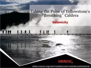
Wildfires (Yellowstone 1988) http://earthobservatory.nasa.gov/NaturalHazards/view.php?id=40681.

E N D
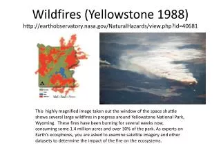
Wildfires (Yellowstone 1988)http://earthobservatory.nasa.gov/NaturalHazards/view.php?id=40681 This highly magnified image taken out the window of the space shuttle shows several large wildfires in progress around Yellowstone National Park, Wyoming. These fires have been burning for several weeks now, consuming some 1.4 million acres and over 30% of the park. As experts on Earth’s ecospheres, you are asked to examine satellite imagery and other datasets to determine the impact of the fire on the ecosystems.
Arc 2 Satellite imagery shows that the wildfires have finally subsided. Using the most current datasets, make an evaluation of how the fires affected earth’s ecosystems in the area and how they will continue to do so in the near future.
All Teams:Fires in progress Animation of progression of fires see http://svs.gsfc.nasa.gov/vis/a000000/a002900/a002909/index.html For higher resolution NOTE: Date on the bottom left needs to be removed. Also the date on the legend.
Examine the satellite imagery taken over the last four months, turning layers on and off to compare differences over time. The fire took place over images 2 and 3 below. Each image shows the average AOD from a four week period. Send your answer to COM: Summarize for NASA how the AOD changed as a result of the fire. From before the fire to after the fire, there appears to be little change in AOD (images 2 and 5). During the fire (images 3 and 4) there are two spots (very deep red) where AOD is extremely high, but the extent is not widespread. On the whole, these images show the monthly levels of aerosols across the majority of the park to be unaffected. AERO MC: Measuring Aerosol Optical Depth (AOD) can reveal the severity of the aerosols and other particles produced by a wildfire. Simply put, a high AOD means sunlight is unable to penetrate through the various gases, aerosols and particles in the air to reach the ground. 1. Yellowstone National Park 2. One Month Before 3. Fire Starts 4. Fire Ends 5. One Month Later This is a one frame interactive. The user may turn the layers on or off
OCEAN SS ARC 2 El Niño/La Niña-Southern Oscillation, or ENSO, is a climate pattern that occurs across the equatorial Pacific Ocean every three to seven years. It is characterized by variations in temperature and air pressure, which may cause unpredictable and extreme weather in North and South America. El Niño is known as the warm phase and La Niña as the cold phase. The graph shows the ENSO cycles over the last 60 years, showing warm periods in red and cold periods in blue. The map images show how precipitation is affected by either a cold phase or a warm phase. The colors indicate the precipitation ‘anomaly’ or difference from a typical year. For instance -25 mm/month means that it is expected that there will be 25 mm less rainfall than normal. Do you think the ENSO phase we are in right now may have helped create conditions which led to such a large wildfire event? How has the El Nino Southern Oscillation contributed to wetness/dryness conditions this year? • Use the Multivariate ENSO Index to determine what phase we are in right now- a warm phase or cold phase. • Use either the ENSO Warm Phase or ENSO Cold Phase graphics to determine what to expect in terms of precipitation for the next few months in the area around Yellowstone. • Send your answers to COM: ENSO is in a cold, negative phase. Forecast is for higher precipitation as shown by light blue colors on map (0-25 mm). 60 years to present ENSO+ warm phase ENSO- cold phase Precipitation anomaly- mm/month
AO Index CRYO MC ARC 2 Arctic air pressure oscillates between positive and negative phases, sometimes once a year, other times every few years. During a positive phase, low air pressure over the Arctic keeps the jet stream farther north than average. Frigid air doesn’t plunge as far south into North America, meaning warmer winters for much of the U.S. east of the Rocky Mountains. During a negative phase, the high Arctic air pressure shifts the jet stream southward causing cold polar air to move southward, intensifying winter as well as other seasonal precipitation events in the mid-latitudes. • Look up the current Arctic Oscillation phase. • Predict temperatures based on research and look up precipitation conditions for the correct AO phase in the region affected by the severe storm. • Send your answer to COM : How have patterns in the Arctic Oscillation (AO) contributed to wetness/dryness conditions this year? AO is in a positive phase. Forecast is for -0.2 to -0.4 mm/mo. Lower precipitation as shown by light tan colors on map. Seasonal AO phase patterns for Precipitation 15 years to present
BIO MC: The public wants to know what to expect the recovery in Yellowstone National Park to look like. Using satellite imagery scientists can quantify the effects of the wildfire upon the vegetation. The Normalized Difference Vegetation Index (NDVI) is a measure of the greenness or vigor of vegetation on the land surface. Values range from -1.0 to 1.0.1. Examine the data from the recent fire in Prescott National Forest, Arizona and consider how Yellowstone might fare. Using NDVI, the graph shows the vegetation health of two areas in– one that burned and one that didn’t (for reference). 2. Send your answer to COM: Using the Prescott data as a model, predict and summarize the what might happen with respect to vegetation regeneration in Yellowstone National Park over the next seven years. Over 7 years, the NDVI from a burned area is about 0.2 less than the unburned area, until about the 5th year where it starts to catch up. Extrapolating from this trend, one would expect the NDVI of the burned area to be within 0.05 of the unburned area within ten years.
BIO SS: The public wants to know what we can expect the process of recovery in Yellowstone National Park to look like. Using satellite imagery scientists can quantify the effects of the wildfire upon the vegetation. The Normalized Difference Vegetation Index (NDVI) is a measure of the greenness or vigor of vegetation on the land surface. Values range from -1.0 to 1.0.1. Examine the images below which show NDVI for Yellowstone National Parkover four months, turning layers on and off to compare differences over time. 2. Send your answer to COM: For each time frame, describe the state of the vegetation in the park.2 Months/ 1 Month before: the western half of the park shows very dense foliage, while the eastern half is more sparse, or even bare. During the fire and afterward: There are only small pockets of dense foliage left in the western half of the park.Two Months Before One Month Before The Month of the Fire Current Month This is could be a one frame interactive. The user may turn the layers on or off. OR, lay the four images side by side for comparison.
CLOUD SS: The forest rangers in the park are always looking for more information about conditions that lead to major wildfires. Satellite imagery may be able to paint a picture for how wet or dry the area was before the fires.1. Examine the images which show precipitation data for Yellowstone National Park, turning layers on and off to compare differences. The legend shows that areas colored yellow, orange or red received an average of 1 inch of rain a month, while areas colored blue, green or purple received little rain. 2. Send your answer to COM: For each time period below, create a summary which describes the precipitation patterns in the park. 2 Mo: high precipitation, especially in the NE area of the park (possibly creating a growth spurt?) 1 Mo: Severe drought All the growth from the months before died off, creating a tinderbox of dead plant materials. After the fire: precipitation rates seem to have normalized.Two Months Before One Month Before the Fire The Month After the Fire Historical Average (Normal Month) This is could be a one frame interactive. The user may turn the layers on or off. OR, lay the four images side by side for comparison.
![Romare Bearden [1911 – 1988]](https://cdn0.slideserve.com/854198/romare-bearden-1911-1988-dt.jpg)