

JMP Example 5
E N D
Presentation Transcript
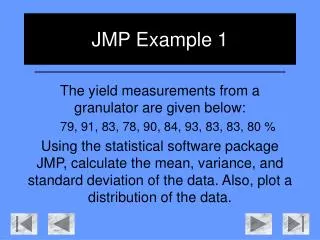
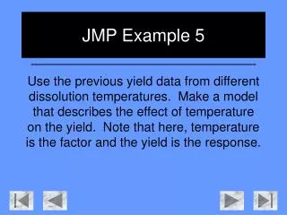
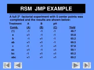
JMP Example 5 Three samples of size 10 are taken from an API (Active Pharmaceutical Ingredient) plant. The first one was taken at a batch reactor pressure of 3 bar, the second at 3.5 bar, and the final at 4 bar. Use regression analysis to build a model describing the effect of pressure on the yield of the API, using a squared term if necessary.
As has been shown in previous examples, open JMP and insert the data. Note: if you would like to extend the range of the data table, you may maximize the window. Left click on the middle box in the upper right hand corner of any window to do this.
This is what the maximized window looks like in JMP. Although it is useful to see all the data in the data table, sometimes it is easier to keep the window at its original size, for easy access to other operations.
Again, we will be using the “Fit Model” operation on this data.
As was shown in the previous example, the model specifications are made.
The primary purpose of this example is to show how a regression plot sometimes needs to be altered to account for the data. A simple variance in pressure from 3 bar to 4 bar would have created a very simple straight line regression model. However, by including a ‘centre-point’ such as 3.5 bar, we can see that this model is definitely not appropriate for all ranges of pressure. This concept will crop up again in the Experimental Design section of the course. Note the very small “R-Square” value as well. This indicates the plot is wholly unsatisfactory.
As can be seen from the error data in the ANOVA table, this regression plot is unacceptable. There is something more that needs to be accounted for in the plot. The simplest way to account for a lack of fit is by adding or taking away factors. Let’s try to add a squared term.
We return to the “Fit Model” Window. To add a squared term, left click on the “Pressure (bar)” in the “Select Columns” box. Then left click in the “Pressure (bar)” under the “Construct Model Effects” box.
These two items should now be highlighted, as shown. Now, left click on the “Cross” button under “Construct Model Effects”.
This will add what is known as a cross-term or a squared term. It is the equivalent of [Pressure (bar)]2, a polynomial term of the second order. We then run the model.
It is easy to see how the model has changed. The regression plot fits the data much better (note the “R-Square” value). The actual by predicted plot also gives a much tighter confidence interval.
A good way of determining a real increase in the accuracy of the plot is by looking at the “Error” data in the ANOVA table. The “Error Sum of Squares” value has been reduced by almost 1300, and the “Error Mean Square” value has also significantly decreased.
A comparison of the two plots more starkly reveals the greater accuracy of the plot including a squared term. Note: The “R-Square” value (a.k.a. coefficient of determination) should never be used alone to measure the appropriateness of the model, as it can be artificially inflated by the addition of higher-order polynomial terms. However, it is a good indicator, and this can be validated by the ANOVA table data discussed earlier.