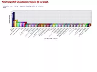
Bar graph PTE tips and practice sample
The bar graph PTE task presents you with a visual representation of data, typically in the form of bars of varying heights. Your mission? To analyze the information effectively and deliver a clear, concise description within a limited time frame. You'll be assessed on your ability to:

Bar graph PTE tips and practice sample
E N D
Presentation Transcript
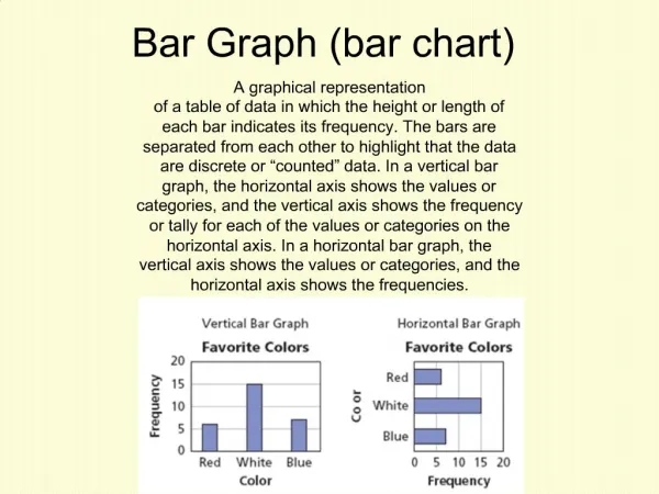
Bar graph PTE tips and practice sample The bar graph PTE task presents you with a visual representation of data, typically in the form of bars of varying heights. Your mission? To analyze the information effectively and deliver a clear, concise description within a limited time frame. You'll be assessed on your ability to: Identify key features: Grasp the title, labels (on the x and y-axis), and data represented by the bars. Organize your thoughts: Structure your description logically using a template. Speak fluently: Express yourself clearly and confidently with proper vocabulary and grammar. Highlight trends: Identify patterns and relationships within the data. The Power of Preparation: Crafting a Describe Image PTE Template Preparation is paramount for success in the PTE Describe Image task. Here's a versatile template to guide you through describing bar graphs: 1. Introduction: Briefly introduce the image as a bar graph and mention its title (if provided). 2. Overall description: Describe the general trend of the data (increasing, decreasing, fluctuating). 3. Specific details: Focus on specific bars (highest, lowest, significant changes). 4. Comparisons (optional): If relevant, compare and contrast different categories or periods. 5. Conclusion: Briefly summarize the key takeaways from the bar graph. Deconstructing the Bar Graph: Essential Elements to Analyze Before diving into the description, take a moment to dissect the bar graph PTE presents. Here's what to pay close attention to: Title: This clarifies the subject matter of the data. X-axis label: This indicates the categories or periods being compared. Y-axis label: This specifies the unit of measurement for the data (e.g., percentage, number of people). Bars: The height of each bar represents the value for a specific category on the x- axis. Legends (optional): These differentiate between data sets represented by different colours or patterns on the bars. Charting Your Course: A Step-by-Step Guide to Describing Bar Graph Now, let's put the theory into practice! Imagine you see a bar graph titled "University Applications by Country" on the PTE exam. Here's how to tackle it using the template: 1. Introduction: "The image is a bar graph titled 'University Applications by Country.'" 2. Overall description: "The graph shows the number of university applications received from different countries. Overall, there seems to be a significant variation in the number of applications across the countries." 3. Specific details: "The highest number of applications appears to be from China, with a bar reaching (mention the value). On the other hand, countries like France and
Germany seem to have received considerably fewer applications, with bars reaching around (mention the value)." 4. Comparisons (optional): "It's interesting to note that the number of applications from China is almost double that of India, which has a bar reaching (mention the value)." 5. Conclusion: "In conclusion, this bar graph highlights the disparity in the number of university applications received from different countries, with China leading the pack." If you found this blog interesting you can read more Bar graph PTE tips and practice sample