Download
1 / 8
80 likes | 231 Views
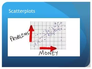
Aim: How do we use SPSS to create and interpret scatterplots ?. SPSS Assignment 1 Due Friday 2/12. Scatterplots. Scatterplot is a statistical figure that displays the relationship between two scale variables A scatterplot has two axes (one for each variable)

E N D
Aim: How do we use SPSS to create and interpret scatterplots? SPSS Assignment 1 Due Friday 2/12
Scatterplots • Scatterplotis a statistical figure that displays the relationship between two scale variables • A scatterplot has two axes (one for each variable) • The two scores for each participant are represented with a single dot • The pattern of the dots indicates the direction and strength of the relationship between the variables
When to use a scatterplot • A scatterplot should be examined before calculating a correlation coeffient • The nature of the relationship revealed by a scatterplot will help determine which correlation coefficient is appropriate
Creating a Scatterplot • When one variable is intended to predict another, the predictor variable should be named Variable X and the variable being predicted should be named Variable Y • Dependent Variable = Y-axis • Independent Variable = X-axis • While prediction is a major purpose of examining the relationship between two variables, sometimes researchers are interested in the relationship for other reasons, such as examining a relationship suggested by theory. When prediction is not involved, it is okay to put either variable on the x-axis and the other on the y-axis.
Interpreting the SPSS Output • Each dot on a scatterplot represents two scores for one participant. • Patterns of dots indicate positive/direct, negative/inverse relationship. • If there is a scatter, the dots do not form a perfectly straight line but are somewhat scatter. However the direction of the pattern can still be clear despite the scatter. The presence of a scatter indicates that the relationship is not perfect. • The relationship is strong, this is indicated by the fact that the dots are not scattered throughout the figure. Instead, they follow a clear pattern. • The relationship is linear. This means that the dots generally follow a straight line.
Perfect, Direct, Linear Relationship • Dots form a single straight line with no scatter of dots around it, the relationship is perfect • Also it is direct because the higher the y variable, the higher the x variable • It is linear because the dots form a straight line
Strong, Inverse, Linear Relationships • The relationship is inverse because participants with better x variables have fewer y variables • This creates an inverse pattern of dots, going from upper left to lower right of the scatterplot
Strong, Curvilinear Relationship • For one part of the relationship it goes up and for the other part of the relationship, it changes directions and goes down (like a parabola) • The relationship is neither direct or inverse • It is curvilinear