Download
1 / 7
70 likes | 139 Views
"‘Lyrical’ magazine is a unique take on R&B/Hip Hop and rock magazine conventions, blending standard features with fresh twists to engage the target audience effectively. Explore how this publication challenges traditional norms and introduces new elements to stand out."

E N D
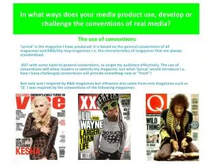
The use of conventions In what ways does your media product use, develop or challenge the conventions of real media? ‘Lyrical’ is the magazine I have produced. It is based on the general conventions of all magazines and R&B/Hip Hop magazines i.e. the characteristics of magazines that are always standardised. BUT with some twist to general conventions, to target my audience effectively. The use of conventions will allow readers to identify my magazine, but what ‘lyrical’ would introduce i.e. how I have challenged conventions will provide something new or “fresh”! Not only was I inspired by R&B magazines but influence also came from rock magazines such as ‘Q’. I was inspired by the conventions of the following magazines:
Conventions of a front cover from a music magazine We have analysed a selection of rock magazines in class e.g. ‘Q’. This gave us a ground understanding of magazines general conventions, which allows a document to become a music magazine. Headline- linked to the masthead, is short and snappy. Masthead- this feature governs the page. It distinguishes one magazine from another. The fronts used are clear, and colours are no more than two. Eyebrow- generally displays eye-catching information because it tends to be a differing colour to the masthead. Concerning the content of a magazine. E.g. a popular song, exclusive feature or simply names of artist well-known to the target audience and who will also be featured in the magazine. Cover-lines- demonstrate the most interesting articles or features on the contents page. Normally in the form of a variety of fronts i.e. size and colour Play on words- In this case alliteration ‘fights, feuds , feathers’ Main cover-line- As the copy of ‘Q’ shows the main article is linked to the central image. Usually it will contain the name of the model e.g. this magazine cover has a central image of Lana Del Rey and her name is written on the main cover-line. It will also reveal the name of the article or feature Price Barcode Central image- This is usually a human model, can be an artist or someone linked to the music industry. The model always gives eye contact to reader in order to capture their attention. Along with the masthead, it also dominates the page. Can be a headshot or full-length body shot. Three main colours – Normally there three main colours used on the front cover. However there can be more which is demonstrated in this case. There is a use of 5 colours. This is usually the maximum, the use of limited colours keeps the front page simple and easy to read.
Conventional contents pages of music magazines Contents pages tend to have features listed on one side of the page. Each feature will have a snappy title, e.g ‘ Young and gettin’ it future’. (Taken from the XXL contents page on the right) They will also have a picture of a model linked to a key feature in the magazine, normally looking away from the camera.
Conventional double page spreads of a music magazine Another convention is a pull quote. An interesting sentence, taken from the body of the copy. Usually placed on a image or at the top of the copy but, in a different colour. Page number Magazine logo Image Title Gutter Kicker Drop Cap Named writer and photographer Copy
How did I use and challenge conventions of a front cover ‘Music speaks’ is my conventional headline, this is because it continues the notion from ‘lyrical’. The idea that music has important meaning. Also it’s catchy and flows off the tongue, like ‘Q’ headline, ‘Discover great music’. Masthead- I named my magazine ‘Lyrical’. This is conventional, in terms of a magazine like ‘vibe’ as it’s an positive adjective which describes music or what music provides. Arguably it’s also conventional because it contains an image. The image of the microphone reinforces the content of my magazine to the reader. This is due to a microphone being associated with music. Central image – quite unconventional due to the use of wide angle lens to foreshorten image e.g. the photography of Bill Brandt. In order to maker Amber’s face dominant, and eye catching as she is most known by face. I was careful to balance the proportioning , to avoid ‘fisheye’ effects. Is also an high angle photograph, to show her vulnerability as she’s opening up in the article ‘Rule of three’- the page should be laid out in three vertical sections ‘Kerrang’ is example of a masthead which uses a image, in this case a shattered glass look. The use of ‘word play’. A conventional feature of cover-lines. I used alliteration in order to capture the audiences attention, as it allows the cover-line to stand out. An example of Bill Brandt’s photography. The feet is the main focus. The use of three main colours, black, white and gold. This is very conventional. It provides a professional and clear page layout. The usual use of barcode and price gives the front cover a professional finish. It makes the document recognisable as a magazine.
How did I use and challenge conventions of a contents page • Although I did challenge some conventions, I primarily used conventions in order to make my magazine recognisable and create a conventional magazine as required. • The conventions I used in my contents page: • An image dominating my contents page of a recognisable face to my target audience. In this case I used Nick Minaj, a famous singer well known to my target audience. • The image is also linked to a key article in my magazine, ‘Our Barbi Nicki’ shown on right hand side of my cotents page. • Like other music magazines such as ‘Vibe’ and ‘XXL’ shown earlier, I eye catching titles for my feature such as ‘Fiery Cole’ and ‘Bajan Beauty Rihanna’. Their bold titles due to their adjectives and play on words such as alliteration in ‘Bajan Beauty’. • Also I stated who the magazine was edited by, styling team, make-up artist and photographer. Also done on my ‘vibe’ example of the contents page on slide 3. This allows the contents page to look professional
How did I use and challenge conventions of a double page spread The logo of lyrical- a conventional feature I used to display professionalism. Drop cap-I used this because it’s usually in double page spreads and draws attention to the first line of the copy Title- a good magazine requires a bold and catchy title which makes the audience excited to read on. Pull quote – I used the pull quote in a conventional way. In order to encourage my audience to read the article. As they may what to find out the reason behind this statement. I produced my kicker in a unconventional way. I did this by allowing it to be on a page alone, without the body of the copy. The idea behind this was for the reader not to see the whole copy and be overwhelmed. But to have a short introduction to the article, which makes them want to read on Image- the image compliments the article and creates a visual aspect of the article, allowing the reader to have a better experience. Gutter- a conventional feature which breaks up the copy, making it easier on the eye and less overwhelming.