Download
1 / 14
140 likes | 270 Views
Typography. The study of all elements of type as a means of visual communication—from calligraphy to the use of digital type; includes the shape, size, and spacing of characters. . The Right Choice. Choosing the right font is about readability and legibility

E N D
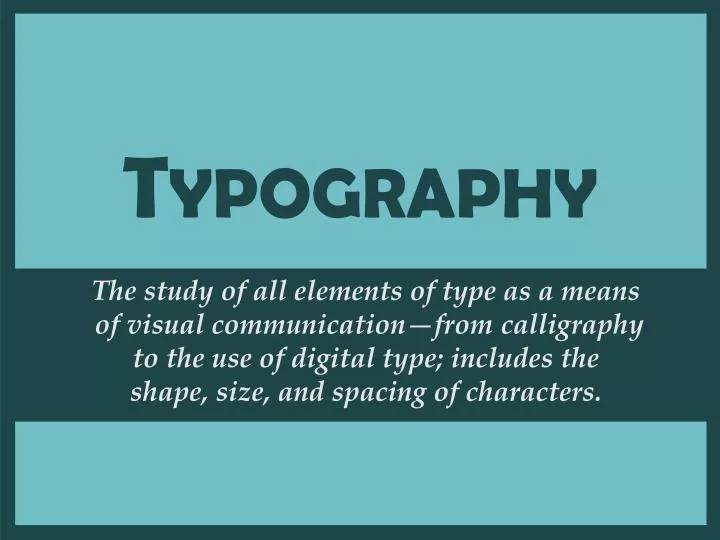
Typography The study of all elements of type as a means of visual communication—from calligraphy to the use of digital type; includes the shape, size, and spacing of characters.
The Right Choice • Choosing the right font is about readability and legibility • Readability—how easily words, phrases, and blocks of text can be read • Always consider your audience when selecting typefaces for your production • Legibility—the ease with which individual letters can be distinguished
Typeface (Font) • Typeface—A family of alphabetic characters, numbers, punctuation marks and other symbols that share a consistent design • Example: Times New Roman, Arial, etc.
The Point System • Typefaces are measured by a system called points. In the United States, one point = 1/72” • If one point is 1/72 of an inch, then 72 points should equal one inch—but it is not an exact measurement • Font size is measured from the height of the highest ascender to the bottom of the lowest descender within the entire typeface. Arial Black: Q g h j x @ $ () Q b f g k x $ Mistral:
Typeface Classifications • Serif • Sans Serif • Display/Decorative • Script
Serif • A serif is the little extra stroke found at the end of main vertical and horizontal strokes of some letterforms. • Serif typefaces are typically easier to read; usually used for large bodies of text. • Examples: Times New RomanGaramond TSA
Sans Serif • Type which does not have serifs • “Sans” is French for without • Used for displays, special emphasis and small bodies of text--is difficult to read in large bodies of text • Example: Arial Black Verdana TSA
Display & Decorative • Designs are unusual and unique and are designed to attract attention • One of the newest categories of decorative fonts is grunge type, which typically has a rough, coarse look. • Used in limited situations in larger sizes like headlines, titles, and advertisements • Not appropriate for body text • Example: Gigi Chiller Curlz
Script • Designed to resemble handwriting, with styles ranging from formal to whimsical • Should NEVER be set in all capital letters • Generally reserved for invitations, greetings, advertisements • Examples: Magneto Vladimir Script
Font Selection • Consider the audience when selecting typefaces and point sizes. • Consider the type of production and the media being used. • Match the personality of the typeface with the production. • Limit typefaces—between one and three. • Be consistent in the use of fonts—all headlines the same, all body text the same, etc.
Font Styles • Style—special formatting applied to text; the most common styles are: • Bold—appears darker than the surrounding text • Italics—slopes to the right • Underline • Other effects that are commonly available are: • Shadow–adds depth to text or other objects, making them appear more three-dimensional • Small cap—lowercase letters display in a smaller size than the regular uppercase letters, typically the height of lowercase letters in that font • --creating the illusion of depth Outline 3-D
Special Formats Contour • Text that follows an outline in a curved or irregular pattern • Lightcolor text on a dark background—typefaces with heavier letters and/or serifs are easier to read • Thefirst letter in a story is enlarged and lowered below the normal baseline so the top of the letter is even with the first line of text • The illusion of actual textures such as wood, metal, objects in nature, etc. • Textflows around a graphic image • Self-explanatory D Reverse type rop cap Texture Text Wrap Color
Alignment • Definition: lining up text or graphic elements to the top, bottom, sides, or middle of a page or box • Center • Justified—formal • Left—friendly, informal • Right—used to catch the viewer’s attention
Alignment Center Justified Left Right Located where the Ozarks meet the Delta, the Bald Knob School District covers approximately 178 square miles and is located in north central Arkansas, about 60 miles from Little Rock. With a school population of just over 1300, the district services its students in a K-4, 5-8, 9-12 environment. Located where the Ozarks meet the Delta, the Bald Knob School District covers approximately 178 square miles and is located in north central Arkansas, about 60 miles from Little Rock. With a school population of just over 1300, the district services its students in a K-4, 5-8, 9-12 environment. Located where the Ozarks meet the Delta, the Bald Knob School District covers approxi-mately 178 square miles and is located in north central Arkansas, about 60 miles from Little Rock. With a school population of just over 1300, the district services its students in a K-4, 5-8, 9-12 environment. Located where the Ozarks meet the Delta, the Bald Knob School District covers approximately 178 square miles and is located in north central Arkansas, about 60 miles from Little Rock. With a school population of just over 1300, the district services its students in a K-4, 5-8, 9-12 environment.