How to Create and Design Effective Bar Graphs for Data Comparison
This guide outlines the process of creating bar graphs, which effectively showcase comparisons between different groups of data, such as categories and amounts. Learn how to draw axes, label dependent and independent variables, and choose appropriate scales and intervals. We provide examples and tips for titling your graph accurately to reflect your data. This resource also includes guidance on ensuring that your bars are consistent in size and properly spaced, along with online tools to create your graph seamlessly.

How to Create and Design Effective Bar Graphs for Data Comparison
E N D
Presentation Transcript
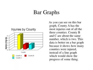
Bar Graphs • Bar graphs are descriptive. • They compare groups of data such as amounts and categories. • They help us make generalizations and see differences in the data.
Draw the Axes • Use a ruler • Draw ON the blue lines, not floating in the boxes • Leave enough room at the bottom and side to label each axis • About 3 boxes Y X
Label the Axes Y What is observed and measured? (Dependent Variable) # of M&Ms X Color of M&Ms What is changed by the scientist? (Independent Variable)
Title • Write an appropriate title for the graph at the top. • The title should contain both the independent and dependent variables. • What you wrote on the X and Y axis • Ideas for a title?? • Amount of M&Ms in a Fun Size Bag
Scale • Decide on an appropriate scale for the y axis. • The scale refers to the min and max numbers used on each axis. They may or may not begin at zero. • The min and max numbers used for the scale should be a little lower than the lowest value and a little higher than the highest value. • This allows you to have a smaller range which emphasizes the comparisons/trends in the data.
Scale • The Y-axis scale is from 0-100. • The largest value though is only 35.
Scale • The Y-axis scale is now from 0-40. • This does a better job emphasizing the comparisons between coins. • What should our scale be?
Intervals • Look at your minimum and maximum values you set • Decide on an appropriate interval for the scale you have chosen. • The interval is the amount between one value and the next. • It is highly recommended to use a common number for an interval such as 2, 5, 10, 25, 100, etc. • Let’s try a few intervals…
Once you’ve decided… • Draw tick marks ON blue line • Do NOT label every #
Now let’s draw the bars • Start 1 box over from the Y-axis • Each bar must be the same size • Leave a box or 2 of space between each bar • Use a ruler to draw each bar (3-4 boxes wide) • Label the color underneath • Write values on top of each bar • Color!
Create-a-Graph Online! Click here to use the online tool!