Bar Graphs and Line graphs
Bar Graphs and Line graphs. Graphs. A Graph is used to display data shown in a table. It is easier to see data when it is displayed in a graph. A BAR GRAPH is used to compare categories of data. A LINE GRAPH is used to show how data changes over time .


Bar Graphs and Line graphs
E N D
Presentation Transcript
Graphs • A Graph is used to display data shown in a table. • It is easier to see data when it is displayed in a graph. • A BAR GRAPH is used to compare categories of data. • A LINE GRAPH is used to show how data changes over time.
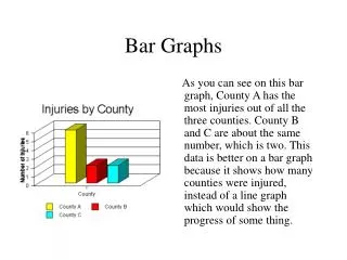
Parts of a Bar Graph The SCALE is written on the vertical axis (y-axis). It must include the smallest number and the largest number The scale is separated into equal parts called INTERVALS. On this scale the interval is 100. The categories are across the bottom of the graph( x axis)
Identify the: scale title interval x axis categories y axis Price of Corn versus Quantity Demanded
Parts of a Line Graph The scale and interval are shown on the vertical axis. The time interval is written on the horizontal axis. The TREND is the general slant of the line.
Identify the: scale title interval x axis y axis general trend?
Example Given the graph at right, below, answer the following questions.
What is this graph about? • What span of scores occurs the most often? • What span of scores occurs the least often? • About how many more students scored between 500-599 than scored between 400-499? • Those students scoring between 500-599 occurred about how many more times than those scoring between 600-699?
What is the title of this graph? • What was the value of Sarah’s car in 2004? • What was the value of Sarah’s car in 2007? • How much more was Sarah’s car worth in 2001 than in 2006? • What is the general trend of the value of Sarah’s car?
What is the title of this line graph? • What is the range of values on the horizontal scale? • What is the range of values on the vertical scale? • How many points are in the graphs? • What was the lowest temperature recorded? • What was the highest temperature recorded? • On what day did the temperature go down?
Which statement is not supported in the line graph? There were more people in the store at 2pm than were there at 4pm From 4-5pm there were the same number of people in the store. There were twice as many people in the store at 12pm than were there at 11am. d. There were 5 more people in the store at 12pm than at 2pm.