
Sometimes, Tables can be confusing
Sometimes, Tables can be confusing. Power of charts. Why use charts and graphs? Gives reader a compact and structured version of the data. Many details can be shown in a small space. Shows the differences and patterns in a set of data.
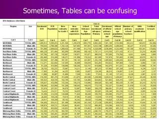

Sometimes, Tables can be confusing
E N D
Presentation Transcript
Power of charts • Why use charts and graphs? • Gives reader a compact and structured version of the data. • Many details can be shown in a small space. • Shows the differences and patterns in a set of data. • Reader can see immediately major similarities and differences without having to compare and interpret figures.
Main Purpose • The main purpose of graphs is to show information that cannot be easily read from a data table. • It can be very difficult to readily ‘see’ trends and contrasts in a table.
These days, presenting data is quite easy • There is a lot of computer software available that makes it easy for the user to input data, make charts and graphs, present information creatively, and write reports. • MS PowerPoint is presentation software commonly used to prepare a slide show presentation. • MS Excel is spreadsheet software that allows the user to easily input data as well as create colorful charts and graphs. • MS Word is word-processing software that can help the user put together a final report.
General Principles • Make sure to choose an appropriate graph. • The graph/chart should help the reader see the overall patterns and details. • The graph should be easy to interpret and analyze.
Commonly used visual tools • Charts/Graphs: • Bar • Line • Pie • XY Scatterplot • Pictograph • Thematic Map
Bar Chart/Graph • Bar graphs compare the values of different items in specific categories or at specific points in time. • Bar graphs are simple to create and easy to interpret.
Bar Chart (Example) Vertical Bar Chart Horizontal Bar Chart • Normally, we use a horizontal bar chart when there are: • variables with long names • many variables
Group bar chart and Stacked bar chart Stacked Bar Chart Group Bar Chart Total value of categories are easily visible. Easy to compare the different categories with one another.
Line Graph • Line graphs show the progression of values over time. • Easy for the eye to follow. • Easy to get a clear picture of the trends in data. • Easy to see when major changes occurred.
Take a ride on a line graph Click on the link below to take a ride on a line graph that shows the price of housing from 1895-2005. As you are watching, try to feel the trend that is happening. Feel each dip and bump along the way. Try to visualize what the line graph looks like. http://www.speculativebubble.com/videos/real-estate-roller-coaster.php
Area graphs • Area graphs show the actual value each series contributes to the total. • Area graphs show patterns created over time. • Good for illustrating situations with only a fewparts that have simple development patterns.
Area Graph (Example) Source: GMR 2002
Pie Chart • Suitable for illustrating percentage distributions. • Displays the contribution of each value to a total. • Best suited for overviews. • Should not have too many sectors – max. 5 or 6.
XY ‘Scatter-Plot’ Graph • XY ‘scatter-plot’ graphs plot values in one series against those in another. • Compares pairs of values (coordinate pairs). • Shows correlations between data topics – • e.g. shoe size to height.
Central Highlands Thematic Maps • Thematic maps plot values on geographical maps, showing variation in the values by geographical boundaries.
Central Highlands Thematic Map (Example) Primary Completion Rate – Viet Nam 2002-2003 1992-1993 Extracted from presentation of DEVINFO - UNICEF
Before Preparing Charts • Who is the target audience? • What is their level of understanding? • What are their interests? • Role of charts in conveying your message • To show trends • To show contrast • To show magnitude, percentage • How will the charts be presented? • In color, B&W? • In a publication, as a presentation using overhead projector? • What chart is the best? • Bar, pie, line, maps…..
After Making Charts • Is it easy to understand? • Too fancy, too dull, too much, too little? • Does this give the message that I would like to convey? • Does it show what I want it to? • Can this chart be misinterpreted? • Am I giving the wrong message? • Is it self-contained? • Title • Legend • Axis title • Scale • Sources • Other relevant information • Is the chart in right place?
Conclusion The main purpose of a graph/chart is to show information that cannot be easily read from a data table.


![download⚡️[EBOOK]❤️ The Prostate Monologues: What Every Man Can Learn from My Humbling, Confusing, and Sometimes Co](https://cdn7.slideserve.com/12923745/the-prostate-monologues-what-every-man-can-learn-dt.jpg)