Download
1 / 20
200 likes | 322 Views
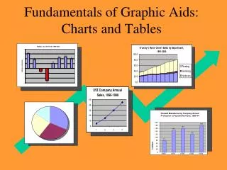
Generation of atlas graphs & charts. Objective. The major objective this training session is to equip participants with the knowledge and skills of creating graphs & charts.

E N D
Objective The major objective this training session is to equip participants with the knowledge and skills of creating graphs & charts. Graphs & charts will enable users to exhaustively communicate their findings as they are excellent tools for making comparative analysis in precise and concise way
Generation of charts & Graphs Data By this point each participant should have their data already exported to excel. NB: • Users can always log into the database and generate the data they would like to present in graph & chart format. The database can be accessed through the internet via www.mwe.go.ug
Bar chart generation Exercise : Prepare access bar chart for your District • Open the file District Access Functionality and population density in Excel • Make sure the cursor is outside the data range • Select the graph you want to make by selecting “insert” from the upper tool bar, then “column” . You screen will then look like the next page • Drag the chart frame to below the data area. Please zoom out if necessary by clicking the little circle in the bottom corner of you screen, click once more if you can still not see all data
Bar chart generation 3 Now this screen should be there (enlarge the graph frame by clicking the frame and drag one of the corner points ): Now we have to add the data to our chart. Click the outer frame of the graph frame and then right click and select “Select Data”, then the following screen will appear. Legend entries = series = data you want to plot against Y axis (could be more than one item like functionality and access at same time with different color bar) Horizontal (Category) = axis labels = categories you want to plot on horizontal axis (categories can be type of sources or sub counties, each type will be listed) Press “add” around the center of the window
Bar chart generation 4 1. This window on the right will appear, then press the red arrow box with the word “series name”. 2. A new small window on the left will appear. Click the red arrow button then click the cell that has the name of the values to give the value series a name. After select the name of the values click the red arrow button again. 3. The window on the right will appear again the cell for “series name” filled. Now click the red arrow button next to the “series values” cell. 4. The window on the left will appear. Now click the red arrow button then select all the values from the excel column. You will notice a chart/graph
Bar chart generation 4 Bar chart generation 4 1. The window on the right will appear, then click the “ok” button. press the red arrow box with the word “series name”. The window below will appear. 2. The window on the right will appear again the cell for “series name” filled. Now click the red arrow button next to the “series values” cell. 3. Now click the edit button on the right side. The window on the right will appear.
Bar chart generation 4 1. To select the label for the values by simply select all the names as shown on the right. 2. The window on the right will reappear. After this click “OK” on this window and you will have your graph /chart.
Bar chart generation 5 This window on the left will appear, then press edit to define the categories that you want to plot on the x-axis. In this case these are the Sub Counties> the window below appears Highlight the cells with the sub counties and then press OK We have now defined the data we want to show, the window on the next page appears
Bar chart generation 6 Press OK and you will see the chart again as well as the data Now click on the title frames and change the title names If the names of the Sub Counties can not be read or there is any other overlapping text then drag the inner frame and /or outer frame in such a way that the graph looks good again The green frame shows the series name, the blue frame shows the values and the purple frame the categories. Quick changes to data plotted by dragging the frames to other cells
Pie chart generation 1 Exercise : Please prepare funding pie chart for your District • Open the file National Source of Funding report • Make sure the cursor is outside the data range • Select the graph you want to make by selecting “insert” from the upper tool bar, then “pie” . You screen will then look like the next page • Drag the chart frame to below the data area. Please zoom out if necessary by clicking the little circle in the bottom corner of you screen, click once more if you can still not see all data
Pie chart generation 3 Now we have to add the data to our chart. Click the outer frame of the graph frame and then right click and select “Select Data”, then the following screen will appear. Legend entries = series = data you want to plot against Y axis (could be more than one item like functionality and access at same time with different color bar) Horizontal (Category) = axis labels = categories you want to plot on horizontal axis (categories can be type of sources or sub counties, each type will be listed) Press “edit” on top of the left bottom window and the window below appears: With a pie chart we do not need to define a name (but you could choose the District Name for example – this name will now appear as Title above the graph) so immediately go to series values. Highlight the values you want to include in the pie chart, in this case the values under the categories of funding, see next slide
Pie chart generation 4 Then Press the red arrow box again and the OK button the window that appears afterwards.
Pie chart generation 5 Now click on the title frames and change the title names. If there is any overlapping text then drag the inner frame and /or outer frame in such a way that the graph looks good again To change the labels, click in the chart, then right click and select “Format Data Labels” and tick what format the labels has to be or where you want to place it. If the number format is not as you want it select “Number” and select the appropriate format.
Chart exercises Exercises • Make sure you create all the charts that are displayed in the Atlas for your own District. These are now the 2010-2011 data for your district • See whether there is any difference in technology mix within 3 sub counties in your district by showing the 3 different pie charts • Check the website www.devtrac.ug
Generation of atlas charts NB: Maps • TSUs have been trained in the preparation of maps and could help the Districts preparing the maps. The templates and shape files as well as a manual can be obtained through the MWE website www.mwe.go.ug • Districts could contract private sector actors and tell them to use the same guidelines and files • A list with recommended GIS consultants and companies will be given on the same website • UNICEF initiated a project to show the spatial distribution of water sources through a web based mapping application. The website will show the data of the WSDB soon. Please check the maps on www.devtrac.ug