TYPOGRAPHY
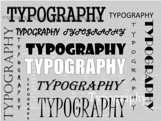
TYPOGRAPHY. TYPOGRAPHY. TYPOGRAPHY. TYPOGRAPHY. TYPOGRAPHY. TYPOGRAPHY. T Y P O G R A P H Y. TYPOGRAPHY. TYPOGRAPHY. TYPOGRAPHY. T Y P O G R A P Y. TYPOGRAPHY. TYPOGRAPHY. What is TYPOGRAPHY?. the style and appearance of printed matter.

TYPOGRAPHY
E N D
Presentation Transcript
TYPOGRAPHY TYPOGRAPHY TYPOGRAPHY TYPOGRAPHY TYPOGRAPHY TYPOGRAPHY T Y P O G R A P H Y TYPOGRAPHY TYPOGRAPHY TYPOGRAPHY T Y P O G R A P Y TYPOGRAPHY TYPOGRAPHY
What is TYPOGRAPHY? • the style and appearance of printed matter. • the art or procedure of arranging type or processing data and printing from it. • is the art and technique of arranging type in order to make language visible.
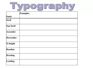
Typefaces • Point size • Line length • Leading (line spacing) • Tracking • Kerning
Other Important Terms: Weight- describes how heavy a type will appear. e.g. light, heavy, extra-bold Condensed Typefaces- they are types that fit more into small quarters. Expanded Typefaces- types that are usually wider than its given height.
Other Important Terms: Italic- “slanted” the sloping kind of typeface used especially for emphasis or distinction and in foreign words. Oblique- typefaces that are simply slanted versions of their regular.
Six Categories into which most fonts fall: • Serif • Sans Serif • Script • M o n o s p a c e • Novelty • dingbat (Dingbat)
TYPEFACE LEGIBILITY LEGIBILITY Designer Letter-spacing BOLD FONTS Novelty Audience Script Eyesight Factors that affect legibility Reversed Text Colors Serif Fonts Impossible to read fonts All-caps
TYPE ALIGNMENT It determines the readability and relation to other elements in a composition. The most common methods of alignment are: Flush Left Flush Right Justified Centered
Flush Left Text is aligned vertically; helps reassure readability by providing the viewer’s eye with a consistent and predictable starting point.
Flush Right The text is vertically aligned on the right edge; it is not reader-friendly; useful in making short blocks of text.
Justified Is vertically aligned along both its left and right margins. Justified text presents itself in a formal, readable manner.
Centered It is vertically centered; readability is reduced because of the dual ragged edges.
Factors: • font choice • Size • Color • Letter-spacing • Case (upper and lower) • Backdrop of the text
Three sub-categories of Serifs: Old-style Serif (Cambria) D Modern Serif (Fang Song) D Slab Serif ( BatangChe) D Serif: • Fonts that are particularly suited to longer passages of text; their serifs help provide a horizontal line- of – reference for the viewer’s eye as it readsthrough the content.
Sans Serif: DESIGN Calibri DESIGN Aharoni DESIGN Arial Black DESIGN Century Gothic - Typefaces that does not have serifs--- sans means “without” in French.
Script: Design Blackladder ITC Design Brush Script MT Design Freestyle Script Design Harlow Solid Italic - “hand-lettered forms; forms may be calligraphic or based on letterforms of handwriting.
Monospace: - Monospaced fonts are identical. It is used in letterforms; often contain a combination of serif and sans serif characters.
Novelty: Design Chiller Design Snap ITC DESIGN Playbill - Anything that goes with this category - from the slightly tweaked to the utterly bizarre.
Dingbat; Ornament: Asdfgjiyop Webdings Qwerttyuiopkmng Wingdings Qwsjvccodopo,mnc Wingdings 3 - Comprised of images, graphic elements and flourishes.
Typefaces: -is a specific set of typographic characters that are designed to work together, also referred to as FONTS. * Individual fonts are often part of FONT FAMILIES that contains variations of that font (regular, bold, italic, and others)
regular Click to add text Click to add text Click to add text Click to add text bold italic bold italic
Point Size: - is the smallest unit of measure, being a subdivision of the larger pica. It is commonly abbreviated as pt. The point has long been the usual unit for measuring font size and leading and other minute items on a printed page.
Line Length: -is the width occupied by a block of typeset text, measured in inches, picas and points.
Line Spacing: -refers to the distance between the baselines of successive lines of type.
Tracking: - refers to a consistent degree of increase (or sometimes decrease) of space between letters to affect density in a line or block of text.
Kerning: - (less commonly mortising) is the process of adjusting the spacing between characters in a proportional font, usually to achieve a visually pleasing result.
