Mastering Design Principles: Contrast, Alignment, and Proximity
Unlock the secrets of effective design with our comprehensive guide on the foundational principles of visual communication. Explore the importance of contrast to draw attention, bold choices in typography, and the power of repetition for unity. Learn about alignment to create visual connections between elements, and how proximity can enhance clarity by grouping related information. This resource is essential for anyone looking to elevate their design skills and create eye-catching, readable layouts that engage and inform.

Mastering Design Principles: Contrast, Alignment, and Proximity
E N D
Presentation Transcript
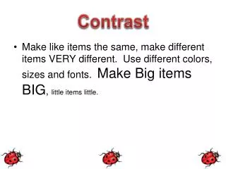
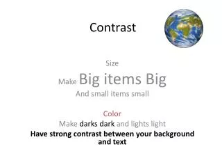
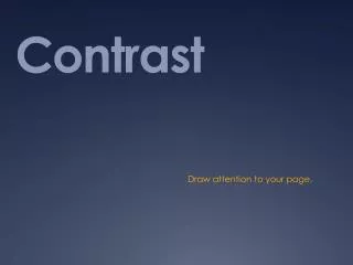
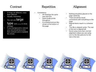
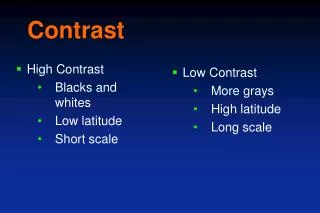
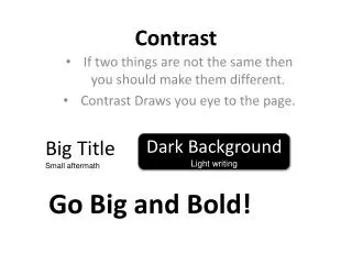
Contrast Big Title Small aftermath Dark Background Light writing If two things are not the same then you should make them different. Contrast Draws you eye to the page. Go Big and Bold!
Repetition • Repeat some aspect of the design throughout the entire piece. • A conscious effort to unify all parts of a design.
ALIGNMENT • Nothing should be placed on the page arbitrarily. • Every item should have a visual connection with something else on the page. Left alignment is more sophisticated Centered Alignment is Boring and is formal! Right alignment is more daring and modern
Proximity • Grouping related items together • If the information is organized and grouped together it is more likely to be read. Apples… Apples are red, Green or Yellow Apples have stars in the middle They have a stem Another part of an apple is the skin Pumpkins… Pumpkins are Orange Pumpkins have seeds inside They have stems They grow on a vine
Fonts Sans Serif • “Sans” means “without” • Sans Serif does not have feet on the letters • It has classic grace of an oldstyle, but with the serifs removed Apple Symbols Ayuthaya Geneva • Serif • Serif’s have feet on the letters • Serifs are very high on the readability scale • Baskerville Chaparral • Black Oak std