PowerPoint Presentations
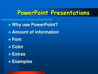
PowerPoint Presentations. Why use PowerPoint? Amount of information Font Color Extras Examples. Why use PowerPoint?. Reach different learning styles Reinforce key information Give clear prompts for assignments Move presentation directly to your web site

PowerPoint Presentations
E N D
Presentation Transcript
PowerPoint Presentations • Why use PowerPoint? • Amount of information • Font • Color • Extras • Examples
Why use PowerPoint? • Reach different learning styles • Reinforce key information • Give clear prompts for assignments • Move presentation directly to your web site • Keeps instructor organized and on task • Serves as Ockham’s razor
Amount of information • Ockham’s razor: “entities are not to be multiplied beyond necessity” • Less is more A good rule of thumb: No more than 6 words per line. No more than 6 lines per slide. • What do I really want them to know? • What can they see / read / take in?
Why use PowerPoint? • PowerPoint allows me to reach students of different learning styles because it adds a visual element to my oral presentation. This is especially important because today’s students seem to be more visual than other generations. • It helps reinforce the key information in my presentation and keeps student interest focused on the front of the room. • It allows me to give students clear prompts for their assignments, especially in-class assignments. They can always look up to refocus their attention to the assigned task. • A PowerPoint presentation can be moved directly to your web site so that students can look at it again after class and as many times as they want. • PowerPoint forces an instructor to organize his or her lecture and presentation material and keeps them on track and focused. • It serves as Ockham’s razor by helping me structure my thoughts.
Why use PowerPoint? • Reach different learning styles • Reinforce key information • Give clear prompts for assignments • Move presentation directly to your web site • Keeps instructor organized and on task • Serves as Ockham’s razor
Font • Choose font size and type for your particular context. • Use same font for continuity. • Use 2 contrasting fonts to organize information, for emphasis. -- Comic Sans & Arial --
Font Legibility • ALL CAPSvs. Upper & Lower case
Font Style • SerifWhich of these is easier to read? (Times New Roman 36) • Sans SerifWhich of these is easier to read? (Arial 32)
Font Size • 12: Read this. • 20: Read this. • 32: Read this. • 36: Read this. • 40: Read this. • 44: Read this. • 60: Read this.
Color • Uses: contrast, emphasis, interest • Contrast between text & background -- computer projection: dark background, light text -- overhead projector: light background, dark text • With newer computer projectors, this difference is minimal
Color • Uses: contrast, emphasis, interest • Contrast between text & background -- computer projection: dark background, light text -- overhead projector: light background, dark text light background, dark text
Color • Use a consistent color scheme for continuity. • Avoid reds & greens. • Use color sparingly for emphasis. • Don’t get carried away!
Slide Transitions • Chose one transition and use for all sides • Transition should be (almost) transparent • Used to draw viewer to the next slide
Group Discussion How do maps influence our thinking about the world?
Individual Midterm Grades A B C D F 16 41 49 43 22
Font Color Content Amount Extras Images • Generate interest • Illustrate points • Decorate • Visual Literacy
Visual Literacy Russia: From Empire to Federation
Russia: From Empire to Federation
Russia: From Empire to Federation
Russia: From Empire to Federation
It is a period of peace, with explorers setting off to find and study new ideas. A group of students, working together, have managed to reach a new galaxy, and are looking for ‘nirvana’ there. You are those students, and you have to decide where you will touch down to look for ‘nirvana’. . . . A long time ago in a galaxy far, far away. . . .
With your group, list things in the picture that help us determine the location of this picture. What does this scene suggest? Group Writing
Make your own! • Create your own presentation on one of the articles from the Learning section of your notebook or your class material --a minimum of 2 slides --design for this room