Download
1 / 5
70 likes | 709 Views
This is a presentation I created to show the process of creating my school magazines front cover for Media Studies.

E N D
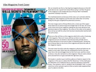
The Process… The process of creating this front cover was a little long but was well worth it in this end. I started off by taking a photograph of a friend, who is a student, at a close-up/mid shot. I directed her to a certain position (a positive, happy one) and made sure she was smiling, this giving off an enthusiastic, cheerful feeling. By taking a picture like it, it represents the school nicely and smartly. I then proceeded onto editing the picture and creating a front over…
This was the editing process of the photo. I started off my fixing any marks or colours that I thought would make the girl not look quite as happy, including making her smile a little wider. By doing this, I could ensure the picture looked very positive and cheerful. I then played with lighting and desaturated the background. By doing this, it makes the main focus of the pictures stand out, in this case it being the girl. I then made the image a lot lighter than it was previously, as this gives off a much softer and sweeter look to it rather than a harsh, dark dramatic looking piece…
I started adding rounded boxes and titles to my piece, making sure to use colours, fonts and shapes that compliment each other nicely. Playing with opacity effects had a huge role in this piece, as it determined and balanced out the dominance of the photo and wording. I then started adding in my main articles, along with brief summaries, using wording that would make a reader want to read the pieces. Positive language was visible and I tried to include questions that would make the reader feel like the magazine was made for THEM, so they would relate to be interested. I then, adjusted the lighting so it wasn’t so bright and started finishing up with effects.
Final Cover And this is my final piece. I created it at a large size so I could really focus and put detail into it. The subjects/articles I chose were all placed evenly around the page and contained positive information to attract the reader in. The final editing of the girl is very effective, in my opinion. I created a slight distortion in the background so that the attention is drawn to the girl rather than the things in the background. But overall, the lightness and focus on the image is a really nice piece to look at. I also like how I used rounded boxes rather than square, sharp ones. It just makes the magazine look a bit more casual/modern. The final cover can also be viewed below, at a bigger size.