Download
1 / 8
80 likes | 218 Views
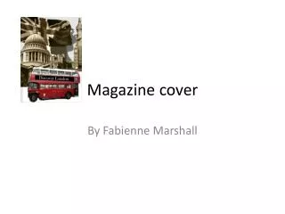
Progression of School Magazine Cover. By Tom Brain. Image that I started with… . Out of all the photographs that I took, I chose to use this one because it has lots of features that I wanted for my magazine cover, these include:.

E N D
Progression of School Magazine Cover By Tom Brain
Image that I started with… Out of all the photographs that I took, I chose to use this one because it has lots of features that I wanted for my magazine cover, these include: The background is quite plain, and there is lots of room for information… The model is looking directly past the camera, as it shows them as not coping which the magazine has signs of… It is a medium close up of a sixth form student…
I then smudged the Background… I smudged the background in this stage for two reasons, and the effect given, I feel was a good one for the outcome of the magazine. This works well with one of the sell lines that come later on, the says “just focus on you”, as the model is the only thing in focus… I think that with the smudged back it is easier to find a font for the sell lines that contrasts well…
I added the title… I added the title of “Sheldon Sixes” and the subtitle of “Just Focus On You!” in this stage of the progression. The title of ‘Sheldon Sixes’ is an appropriate one to use because the magazine is intended for Sixth Form students at Sheldon. The bold red colour contrasts well against the background… The green ‘Just Focus On You’ contrasts well with the background and also with the red title. This means that this section fits in well to the magazine cover…
I put some Sell Lines on the cover… I added some sell lines to the magazine front cover, to make my audience become interested in the magazine after they know partly what is to come in this particular issue. The sell lines are in a black font that is smaller than the other main components… The sell lines are appropriate to the magazine as they are sixth form related, as the magazine is…
Changing the Font… In this stage of the progression, I changed the font of the title, to make it look more professional, I added a bar code, as it will be sold in Wiltshire, to give prospective students an insight, and added ‘Work vs. Play’. With the new font, the title is now more professional looking than it was and will hopefully attract a wider audience… I made the ‘Just focus on you’ smaller, to show that it is not a subtitle… I added the WORK vs. PLAY, so that it shows what the issue is about mainly in 3 words… I added to bar code to the magazine cover…
Reducing the amount of text… I wanted to make the text on the front cover, a bit more easier to read by reducing the amount of text in the sell lines. I added 3 white bubbles as well to make the main stories in the magazine stand out a bit more, so the audience can quickly see what the magazine is about. With the bubbles that I added to the magazine cover, it now looks more professional and makes it easier to see what is happening in the magazine… I made the sell lines shorter, so that whilst the audience is looking at the magazine, they don’t get bored straight away whilst on the cover. It also gives more attention to the main picture.
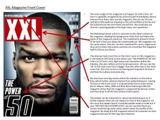
The finished front cover… The magazine cover, in my opinion, looks quite professional. This is because the red of the masthead contrasts well against the smudged background. The model in the main picture is looking away from the camera which gives a relaxed feel to the magazine. The bubbles will hopefully make the magazine, stand out more to the target audience because there is not that much text which will probably appeal to 16 year olds. The bar code is on the magazine because it will be sold to prospective students that may like to go to Sheldon Sixth Form, ad will be sold around the Chippenham area.