Download
1 / 21
210 likes | 344 Views
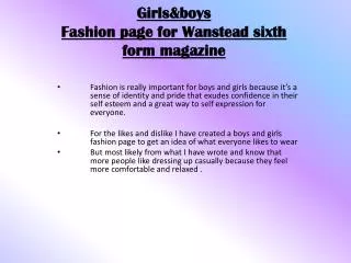
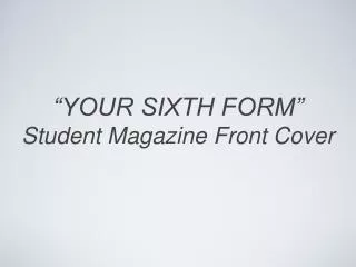
“YOUR SIXTH FORM” Student Magazine Front Cover. “...revision tips”. “... university guides designed for our age”. “A calendar with upcoming school events would be good”. “sixth form fashion”. Market Research.

E N D
“...revision tips” “... university guides designed for our age” “A calendar with upcoming school events would be good” “sixth form fashion” Market Research • I began my research by interviewing four people, asking them what they would like to see in their new Sixth form magazine...
I then decided to research other existing Sixth Form magazines to gain some inspiration and find out what the level of professionalism was I needed to reach...
From my initial research, I was then able to come up with a list of possible sell lines to include on my front cover, and had a rough idea in my head about the layout of text and image on the page… Charity appeals? Fashion guide? University guide? Revision tips? Interviews? Upcoming events? • Planning
I then decided upon a certain theme for my student magazine. • It occurred to me that starting Sixth Form as a student from an outsider school would probably be quite a daunting prospect… • So maybe if they had some sort of guide to help them settle in, it could help to make the transition much more manageable…
So I decided to theme my magazine as a guide for all new starting sixth formers to help them get off to the best start in their new environment… “THE indispensible survival guide...” • With the tagline...
Sheldon Emblem Original black and white picture taken from Google images, to which I cut away a portion of text, stretched outwards to give the impression that it is coming out of the page, and reduced the brightness to give a watermark effect... • Added Barcode • To add a sense of professionalism and make the magazine appear more realistic
Tagline In a slightly different font from the title, with a lot of emphasis on the word “THE”, by enlarging and colouring it • Magazine Title • I used a crisp, clear font, and arranged the horizontal and vertical elements of the title in order to create a tidy shape, tying it all together
Sell lines Chosen specifically to entice the reader, with use of bold lettering to allow certain words such as NOT and FOOLPROOF to stand out • Information bar • Designed using a special brush on Photoshop which includes the regular monthly features of the magazine
Theme colour The same purple colour (Sheldon colour) that runs throughout the front cover helps to tie everything together, making it more appealing to a reader Main Image The figure was lassoed from the original photo, the edges smoothed out, with the scale, transparency and colour scheme altered... Layering Several layers to add interest and allow the main image to stand out
Overall I am pleased with the end result. If I were to make any alterations to this piece, it would be to somehow use up some of the white space around the main image as there is a fair bit of emptiness that could be filled up, possibly with callouts or interesting text boxes in the form of stickers for example... I am particularly happy with the emblem and the chosen colour scheme
Contents bar The same spattered paint effect with the same theme colour is continued on the contents page The initials YSF (Your Sixth Form) adds a sense of professionalism and gives the impression of a long lasting magazine name that people will recognize Front cover Ties the contents and front page together
Editors note Notepaper image used to create a sense of layers, adding interest and referring to the “quick note” Page numbers Larger font used to emphasise, all situated on the left for easy readability Categories The contents are split into features and monthly articles to replicate some of the other contents pages I looked at during research
I am particularly happy with the way my contents page turned out I think I have managed to sort out the blank space problem by using more layering and I am pleased with the way both pieces tie together through the use of the paint effect, repetition of font and colour, all creating a theme. If I had more space and time, I would have liked to taken a few more practice photos and included them somewhere on the page