Frequency Distribution
Topic of Business Statistics

Frequency Distribution
E N D
Presentation Transcript
Frequency Distribution Muhammad Osama Ajmal
Definition of Frequency Distribution. 1 2 A frequency distribution is a representation, either in a graphical or tabular format, that displays the number of observations within a given interval. The interval size depends on the data being analyzed and the goals of the analyst. The intervals must be mutually exclusive and exhaustive. Frequency distributions are typically used within a statistical context. Generally, frequency distributions can be associated with the charting of a normal distribution. A frequency distribution describes the number of observations for each possible value of a variable. Frequency distributions are depicted using graphs and frequency tables.
3 Slide 3 • Types of Frequency Distributions. • There are four types of frequency distributions: • Ungrouped Frequency Distributions: The number of observations of each value of a variable. • You can use this type of frequency distribution for categorical variables. • Grouped Frequency Distributions: The number of observations of each class interval of a variable. Class intervals are ordered groupings of a variable’s values. • You can use this type of frequency distribution for quantitative variables. • Relative Frequency Distributions: The proportion of observations of each value or class interval of a variable. • You can use this type of frequency distribution for any type of variable when you’re more interested in comparing frequencies than the actual number of observations. • Cumulative Frequency Distributions: The sum of the frequencies less than or equal to each value or class interval of a variable. • You can use this type of frequency distribution for ordinal or quantitative variables when you want to understand how often observations fall below certain values. 4
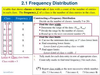
How To Make A Frequency Table • Frequency distributions are often displayed using frequency tables. A frequency table is an effective way to summarize or organize a dataset. It’s usually composed of two columns: • The values or class intervals • Their frequencies • The method for making a frequency table differs between the four types of frequency distributions. You can follow the guides below or use software such as Excel, SPSS, or R to make a frequency table.
How To Make A Relative Frequency Table • How to make a relative frequency table • Create an ungrouped or grouped frequency table. • Add a third column to the table for the relative frequencies. To calculate the relative frequencies, divide each frequency by the sample size. The sample size is the sum of the frequencies.
How To Make A Cumulative Frequency Table • How to make a cumulative frequency table • Create an ungrouped or grouped frequency table for an ordinal or quantitative variable. Cumulative frequencies don’t make sense for nominal variables because the values have no order—one value isn’t more than or less than another value. • Add a third column to the table for the cumulative frequencies. The cumulative frequency is the number of observations less than or equal to a certain value or class interval. To calculate the relative frequencies, add each frequency to the frequencies in the previous rows. • Optional: If you want to calculate the cumulative relative frequency, add another column and divide each cumulative frequency by the sample size.
How To Graph A Frequency Distribution • Pie charts, bar charts, and histograms are all ways of graphing frequency distributions. The best choice depends on the type of variable and what you’re trying to communicate. • Pie chart • A pie chart is a graph that shows the relative frequency distribution of a nominal variable. • A pie chart is a circle that’s divided into one slice for each value. The size of the slices shows their relative frequency. • This type of graph can be a good choice when you want to emphasize that one variable is especially frequent or infrequent, or you want to present the overall composition of a variable. • A disadvantage of pie charts is that it’s difficult to see small differences between frequencies. As a result, it’s also not a good option if you want to compare the frequencies of different values.