Download
1 / 50
510 likes | 760 Views
Discover how to compare and interpret student performance in a class of 40 by constructing a frequency distribution for Perceptual Speed test scores. Learn about class interval sizes, tallying frequencies, and avoiding grouping errors. Follow step-by-step instructions to create a grouped frequency distribution table.

E N D
A class of 40 students has just returned the Perceptual Speed test score. Aside from the primary question about your grade, you’d like to know more about how you stand in the class • How does your score compare with other in the class? What was the range of performance • What more can you learn by studying the scores?
Score of PERCEPTUAL SPEED Test Taken from Guilford p.55
OVERVIEW • When a researcher finished the data collect phase of an experiment, the result usually consist pages of numbers • The immediate problem for the researcher is to organize the scores into some comprehensible form so that any trend in the data can be seen easily and communicated to others • This is the jobs of descriptive statistics; to simplify the organization and presentation of data • One of the most common procedures for organizing a set of data is to place the scores in a FREQUENCY DISTRIBUTION
GROUPED SCORES • After we obtain a set of measurement (data), a common next step is to put them in a systematic order by grouping them in classes • With numerical data, combining individual scores often makes it easier to display the data and to grasp their meaning. This is especially true when there is a wide range of values.
TWO GENERAL CUSTOMS IN THE SIZE OF CLASS INTERVAL • We should prefer not fewer than 10 and more than 20 class interval. • More commonly, the number class interval used is 10 to 15. • An advantage of a small number class interval is that we have fewer frequencies which to deal with • An advantage of larger number class interval is higher accuracy of computation
TWO GENERAL CUSTOMS IN THE SIZE OF CLASS INTERVAL 2. Determining the choice of class interval is that certain ranges of units (scores) are preferred. Those ranges are 2, 3, 5, 10, and 20. These five interval sizes will take care of almost all sets of data
Score of PERCEPTUAL SPEED Test Taken from Guilford p.55
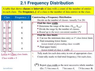
HOW TO CONSTRUCT A GROUPED FREQUENCY DISTRIBUTION Step 1 : find the lowest score and the highest score Step 2 : find the range by subtracting the lowest score from the highest Step 3 : divide the range by 10 and by 20 to determine the largest and the smallest acceptable interval widths. Choose a convenient width (i) within these limits
Score of PERCEPTUAL SPEED Test Range = 42 42 : 10 = 4,2 and42 : 20 = 2,1
WHERE TO START CLASS INTERVAL • It’s natural to start the interval with their lowest scores at multiples of the size of the interval. • When the interval is 3, to start with 24, 27, 30, 33, etc.; when the interval is 4, to start with 24, 28, 32, 36, etc.
HOW TO CONSTRUCT A GROUPED FREQUENCY DISTRIBUTION Step 4 : determine the score at which the lowest interval should begin. It should ordinarily be a multiple of the interval. Step 5 : record the limits of all class interval, placing the interval containing the highest score value at the top. Make the intervals continuous and of the same width Step 6 : using the tally system, enter the raw scores in the appropriate class intervals Step 7 : convert each tally to a frequency
Score of PERCEPTUAL SPEED Test Taken from Guilford p.55
FREQUENCY DISTRIBUTION TABLE X max = 67 X min = 25 RANGE = 42 Interval = 3 C.i = 15 Interval = 4 C.i = 11
TALLYING THE FREQUENCIES • Having adopted a set of class intervals, we locate it within its proper interval and write a tally mark in the row for that interval. • Having completed the tallying, we count up the number case within each group to find the frequency (f), or the total number of case within the interval.
SCORE LIMITS OF CLASS INTERVAL • The intervals are therefore labeled 24 to 27, 28 to 31, 32 to 35 and so on. • The top and bottom for each interval are called the score limit. • They are useful for labeling the intervals and in tallying score within the intervals.
EXACT LIMITS OF CLASS INTERVAL • In computations, however, it’s often necessary to work with exact limits. • A score of 40 actually means from 39.5 to 40.5 and that a score of 55 means from 54.5 to 55.5 • Thus the interval containing scores 39 through 41 actually covers a range from 38.5 to 41.5
WARNING!! • Although grouped frequency distribution can make easier to interpret data, some information is lost. • In the table, we can see that more people scored in the interval 48 – 51 than in any other interval • However, unless we have all the original scores to look at, we would not know whether the 11 scores in this interval were all 48s, all, 49s, all 50s, or all 51 or were spread throughout the interval in some way • This problem is referred to as GROUPING ERROR • The wider the class interval width, the greater the potential for grouping error
STEM and LEAF DISPLAY • In 1977, J.W. Tukey presented a technique for organizing data that provides a simple alternative to a frequency distribution table or graph • This technique called a stem and leaf display, requires that each score be separated into two parts. • The first digit (or digits) is called the stem, and the last digit (or digits) is called the leaf.
Data Stem & Leaf Display 83 82 63 • 93 78 71 68 33 76 52 97 85 42 46 32 57 59 56 73 74 74 81 76 3 2 3 4 5 6 7 8 9 2 6 6 2 7 9 2 2 8 3 6 1 4 3 8 4 6 3 5 2 1 3 7
GROUPED FREQUENCY DISTRIBUTION HISTOGRAM AND A STEM AND LEAF DISPLAY 2 3 2 6 6 2 7 9 2 8 3 1 6 4 3 8 4 6 3 5 2 1 3 7 7 6 5 4 3 2 1 3 4 5 6 7 8 9 0 30 40 50 60 70 80 90
LEARNING CHECK • Place the following scores in a frequency distribution table 2, 3, 1, 2, 5, 4, 5, 5, 1, 4, 2, 2 X f 5 4 3 2 1 3 2 1 4 2
LEARNING CHECK • A set of scores ranges from a high of X=142 to a low X=65 • Explain why it would not be reasonable to display these scores in a regular frequency distribution table • Determine what interval width is most appropriate for a grouped frequency distribution for this set of scores • What range of values would form the bottom interval for the grouped table?
Initstereng!! Aoccdrnig to a rscheearch at an Elingsh uinervtisy, it deosn't mttaer in waht oredr the ltteers in a wrod are, the olny iprmoatnt tihng is that frist and lsat ltteer is at the rghit pclae. The rset can be a toatl mses and you can sitll raed it wouthit porbelm. Tihs is bcuseae we do not raed ervey lteter by it slef but the wrod as a wlohe.
MAKING GRAPH POLIGONand HISTOGRAM
MAKING GRAPH POLIGON
POLIGON f 12 10 8 6 4 2 Class Interval’s MIDPOINT X 0 21.5 29.5 37.5 45.5 53.5 61.5 69.5 25.5 33.5 41.5 49.5 57.5 65.5
PERCEPTUAL SPEED f 12 10 8 6 4 2 X 0 21.5 29.5 37.5 45.5 53.5 61.5 69.5 25.5 33.5 41.5 49.5 57.5 65.5
MAKING GRAPH HISTOGRAM
HISTOGRAM f 12 10 8 6 4 2 Class Interval’s EXACT LIMIT X 0 27.5 35.5 43.5 51.5 59.5 67.5 23.5 31.5 39.5 47.5 55.5 63.5
POLIGON and HISTOGRAM f 12 10 8 6 4 2 X 0 27.5 35.5 43.5 51.5 59.5 67.5 23.5 31.5 39.5 47.5 55.5 63.5
THE SHAPE OF A FREQUENCY DISTRIBUTION It is possible to draw a vertical line through the middle so that one side of the distribution is a mirror image of the other Symmetrical Skewed positive negative The scores tend to pile up toward one end of the scale and taper off gradually at the other end
LEARNING CHECK • Describe the shape of distribution for the data in the following table X f 5 4 3 2 1 4 6 3 1 1 The distribution is negatively skewed
PERCENTILES and PERCENTILE RANKS • The percentile system is widely used in educational measurement to report the standing of an individual relative performance of known group. It is based on cumulative percentage distribution. • A percentile is a point on the measurement scale below which specified percentage of the cases in the distribution falls • The rank or percentile rank of a particular score is defined as the percentage of individuals in the distribution with scores at or below the particular value • When a score is identified by its percentile rank, the score called percentile
Percentile Rank refers to a percentagePercentile refers to a score • Suppose, for example that A have a score of X=78 on an exam and we know exactly 60% of the class had score of 78 or lower….… • Then A score X=78 has a percentile of 60%, and A score would be called the 60th percentile
CUMMULATIVE FREQUENCY and CUMULATIVE PERCENTAGE X f cf c% • What is the 95th percentile? • Answer: X = 4.5 • What is the percentile rank for X = 3.5 • Answer: 70% 20 19 14 6 2 100% 95% 70% 30% 10% 5 4 3 2 1 1 5 8 4 2
INTERPOLATION • It is possible to determine some percentiles and percentile ranks directly from a frequency distribution table • However, there are many values that do not appear directly in the table, and it is impossible to determine these values precisely
INTERPOLATION Using the following distribution of scores we will find the percentile rank corresponding to X=7 Notice that X=7 is located in the interval bounded by the real limits of 6.5 and 7.5 The cumulative percentage corresponding to these real limits are 20% and 44% respectively X f cf c% 25 23 15 11 5 1 100 92 60 44 20 4 10 9 8 7 6 5 2 8 4 6 4 1
Scores (X)–percentage STEP 1 7.544% For the scores, the width of the interval is 1 point. For the percentage, the width is 24 points 7.0 …….. ?? 6.520% STEP 2 STEP 3 Our particular score is located 0.5 point from the top of the interval. This is exactly halfway down the interval Halfway down on the percentage scale would be ½ (24 points) = 12 points For the percentage, the top of the interval is 44%, so 12 points down would be 32% STEP 4
Using the following distribution of scores we will use interpolation to find the 50th percentile A percentage value of 50% is not given in the table; however, it is located between 10% and 60%, which are given. These two percentage values are associated with the upper real limits of 4.5 and 9.5 X f cf c% 20 - 24 15 - 19 10 - 14 5 - 9 0 - 4 2 3 3 10 2 20 18 15 12 2 100 90 75 60 10
Scores (X)–percentage STEP 1 9.560% For the scores, the width of the interval is 5 point. For the percentage, the width is 50 points ?? …….. 50% 4.510% STEP 2 STEP 3 The value of 50% is located 10 points from the top of the percentage interval. As a fraction of the whole interval this is 1/5 of the total interval Using this fraction, we obtain 1/5 (5 points) = 1 point The location we want is 1 point down fom the top of the score interval Because the top of the interval is 9.5, the position we want is 9.5 – 1 = 8.5 the 50th percentile = 8.5 STEP 4
LEARNING CHECK • On a statistics exam, would you rather score at the 80th percentile or at the 40th percentile? • For the distribution of scores presented in the following table, • Find the 60th percentile • Find the percentile rank for X=39.5 • Find the 40th percentile • Find the percentile rank for X=32 X f cf c% 40 - 49 30 - 39 20 - 29 10 - 19 0 - 9 4 6 10 3 2 25 21 15 5 2 100 84 60 20 8
H O M E W O R K • Make a polygon or histogram graph for the distribution of scores presented in the following table • Describe the shape of distribution • Find the 25th, 50th, and 75th percentile • Find the percentile rank for X=25, X=50, and X=75
Make a polygon or histogram graph for the distribution Polygon Xc Histogram E.L.