Download
1 / 6
60 likes | 81 Views
There are several ways to represent the production plan u2013 a list of orders, calendar, and various charts. Regarding capacity, the most useful and easy is a Gantt chart. Read about production capacity overview with Gantt charts from our blog:<br><br>https://www.mrpeasy.com/<br><br>

E N D
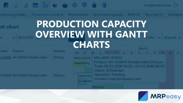
PRODUCTION CAPACITY OVERVIEW WITH GANTT CHARTS
Knowing production capacity and utilization is extremely important for efficient manufacturing. Well visualized production plan can help to find idling and full capacity. If gaps are found beforehand, they are opportunities to produce more. Otherwise, they just decrease efficiency. Similarly, full capacity can mean higher productivity or bottleneck that leads to delays. There are several ways to represent the production plan – a list of orders, calendar, and various charts. Regarding capacity, the most useful and easy is Gantt chart. Depending on how the data is grouped, it can be used for scheduling resources as well as for project management.
Production capacity by work stations This chart shows a list of workstations grouped by type and jobs that are scheduled for the period. It can be from one day to one year. The scale of the chart changes depending on the length of the period. Jobs are color-encoded. Green – planned for the future, blue – in progress, yellow – paused, purple – done, red hatching means that job is late. Moving the mouse (or finger on tablets) over the job shows additional information. Clicking the job opens corresponding manufacturing order. This chart gives a clear overview about the load level of each workstation and overall progress. Depending on the scale, it allows to manage current production capacity as well as to do long-term planning.
Production capacity by manufacturing orders While being quite similar to the previous chart, this chart shows manufacturing orders and their jobs. The main question that this chart answers is “When the manufacturing order will be ready?”. Also, it gives a complete overview how the answer is formed. What are the jobs? When do they start? How long do they take? Do they overlap? Are there any gaps between jobs? Knowing all this information allows to keep manufacturing under control and make intelligent decisions when it is needed to accelerate. To sum up, though knowing capacity utilization is crucial for efficient production planning and management, only measuring it is not enough. In real life the volume of information is huge. Without proper data management tools it is still impossible to get a complete overview.
Gantt charts in MRPeasy Dynamic production rescheduling in Gantt charts with MRPeasy. It is possible to drag and drop Manufacturing Orders or operations to new times and at the same time have MRPeasy automatically check the resource availability, both of materials and capacity.