Download
1 / 77
1.18k likes | 1.92k Views
Statistics Chapter 2 Organizing Data. Quick Talk. Think of a situation where you need to organize data? (any kind of data) What can you do after you collected the data and organized it?. Answer. You can graph it, calculate the range, midpoint, find a frequency then analyze the data.

E N D
Quick Talk • Think of a situation where you need to organize data? (any kind of data) • What can you do after you collected the data and organized it?
Answer • You can graph it, calculate the range, midpoint, find a frequency then analyze the data.
Please Draw this frequency table in your notebook,we will be filling it out
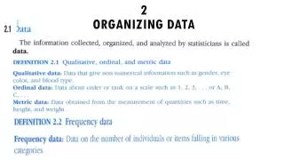
Frequency Table • A frequency table partitions data into intervals and shows how many data values are in each interval. The intervals are constructed so that each data value falls into exactly one interval. • Note: intervals are known as classes. The book uses the word “classes”, but I use “intervals” because it makes more sense.
How do you create a frequency table? • Consider this situation: You are collecting how many minutes each student study for a particular class. You interviewed 50 students and here is the chart.
How do you create a frequency table? • 1) Determine how many intervals you want. • between 5-15 is usually preferred • Anything less than 5, you risk losing information • Anything more than 15, data might not be sufficiently analyzed • Let’s use 6 intervals for this case. (remember you can any number between 5 and 15) • With this, you can find the width of each interval.
Finding the width of the interval • Interval width= • So in our case: • Note: You always round to the next whole number, even if the number is 2.3. 2.3 would become 3 • So in each interval, it will include 8 numbers and this tells you the limit of each interval
The lower interval limit is the lowest data value that can fit in an interval. • The upper interval limit is the highest data value that can fit in an interval. • The interval width is the difference between the lower class limit of one interval and the lower class limit of the next interval. • In our case, our lowest number is 1, so 1+8=9, therefore, 9 would be the start of the next interval (remember we will have 6 intervals total)
Activity • Find the starting number of each interval
Answer • Start of 1st interval=1 • Start of 2nd interval=9 • Start of 3rd interval=17 • Start of 4th interval=25 • Start of 5th interval=33 • Start of 6th interval=41 • Start of 7th interval=49
Now tally all the numbers that fall in each interval • Tally is the mark that is used to count the amount of numbers that lies in each interval. • Frequency (represented by ) is the number of tally marks corresponding to that interval
Activity • Now tally up all the numbers that fall in each interval. Find the frequency also
Midpoint (within the interval) • Midpoint=
Activity • Find the midpoint of each interval
Finding interval boundary • Upper interval boundaries, add 0.5 to the upper interval limit. • Lower interval boundaries, subtract 0.5 from the lower interval limits.
Activity • Find the interval boundaries for all interval.
Relative Frequency • Relative Frequency shows the probability of data values that falls in each interval • Relative frequency=
Activity • Find the relative frequency of each interval
Review • How to create frequency table. • Determine how many intervals you want • Find interval width • Determine the lower/upper interval limit for each interval • Determine the lower/upper interval boundaries for each interval • Do the tally and find the frequency (they are the same number) • Find the midpoint • Find the relative frequency
Group activity: Now try to do this by yourself or with a partner. This is a data represent glucose blood level after 12 hour fast for a random sample of 70 women. Use 6 intervals (classes)
Homework practice • Pg 46-47 #1-4 all, 5-10 (only do frequency table) (Will start in class if time permits)
Before we talk about how to graph a histogram, let’s talk about different shapes of a distribution
Distribution definitions • Mound-shaped symmetrical: the term refers to a histogram in which both sides are the same when the graph is folded vertically down the middle. (Normal curve) • Uniform or rectangular: These terms refer to a histogram in which every interval has equal frequency. From one point of view, a uniform distribution is symmetrical with added property that the bars are of the same height • Skewed left or skewed right: These terms refer to a histogram in which one tail is stretch out longer than the other. • Bimodal: This term refers to a histogram in which the two classes with the largest frequencies are separated by at least one interval. The top two frequencies may have slightly different values.
Graphing a histogram • You use the frequency table to graph a histogram (use the example we did together in class about study minutes with 50 students) • You use lower/upper interval boundaries for the x axis because you don’t want any gaps. • Let’s graph both frequency histogram and relative-frequency histogram
Activity • Compare the two graphs. What do you guys notice? What can you say about the distribution of data?
Quick talk • If we were to construct a normal distribution curve or mound-shaped symmetrical histogram for IQ, Newton and Einstein would be considered an “outlier”. What do you guys think outlier mean?
What is outlier? • Outliers are data values that are very different from other measurements in the data set. • Two types: or
Cumulative Frequency • Cumulative Frequency for an interval is the sum of the frequencies for that interval and all the previous intervals. Example: Let’s take a look at the class example again.
Ogive Graph • Ogive is a graph that displays cumulative frequencies
So then what does this graph tell us? • Example: I can say that 31 students had studied no more than 16 minutes, because it is cumulative.
Activity • Find the cumulative frequency and do an ogive graph
Quick Talk • What can you conclude about 88 minute?
Homework Practice • Pg 46-47 #6-10 (do cumulative frequency and draw ogive graph) (Will start in class if time permits)
Are there other types of graphs? • Yes! There are bar graphs, circle graphs, and Time-Series Graphs
Bar Graph • Bars can be vertical or horizontal. • Bars are of uniform width and uniformly spaced. • The lengths of the bars represent values of the variable being displayed, the frequency of occurrence, or the percentage of occurrence. The same measurement scale is used for the length of each bar. • The graph is well annotated with title, lables of each bar, and vertical scale or actual value for the length of each bar.