Download
1 / 22
220 likes | 346 Views
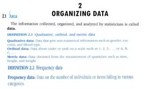
Organizing Data. Lecture 2 Vernon E. Reyes. Collecting Data. Collecting data entails a serious effort to organize information Data collection also entails that “raw” materials are organized in order to analyze data… obtain results and test the hypotheses. Frequency Distribution.

E N D
Organizing Data Lecture 2 Vernon E. Reyes
Collecting Data • Collecting data entails a serious effort to organize information • Data collection also entails that “raw” materials are organized in order to analyze data… obtain results and test the hypotheses.
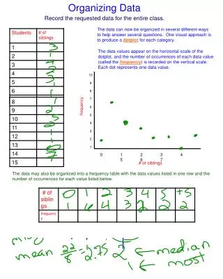
Frequency Distribution • Frequency distribution is simply counting the number of incidences or occurrence • This can be done on nominal level and ordinal level of measurements. • Making a frequency distribution makes our data easy to understand • First step is to construct a frequency distribution table.
Frequency distribution of Nominal Data • Frequency distribution table: • Example: response of you boys tyo removal of toy
------------------------------------------- Response of Child f ------------------------------------------- Cry 25 Express Anger 15 Withdraw 5 Play with another toy 5 N = 50
Notice the elements • Heading/title • 2 columns • f = frequency • N = TOTAL The table therefore shows a clear indication that boys cry or show anger as compared to withdrawal or playing with other toys in response to toy removal
Comparing Distributions ----------------------------------------------------------- Gender of Child Response of Child Male Female ----------------------------------------------------------- Cry 25 28 Express Anger 15 3 Withdraw 5 4 Play with another toy 5 15 N = 50 50
Proportions and percentages • When we study distributions of equal size, its easy to compare groups. (e.g. 50 children each group) • However, when they are not equal (this is often the case) we can use proportions and percentages
Proportions and percentages • Proportion: compares the number of cases in a given category with the total size. We convert any frequency into a proportion (P) by dividing the number of cases in a category (f) by the total number of cases (N). Formula: P = f /N Example: .30 = 15/50 girls that play with another toy
However many people prefer to see categories in terms of percentages, a frequency of occurrence per 100 cases. To compute simply multiply by 100. • Formula % = (100)f/N • Example 30% = (100) 15/50
Gender of students majoring in Engineering at College A and B --------------------------------------------------------------------- Engineering Majors Gender of student Col. A Col. B f % f % --------------------------------------------------------------------- Male 1,082 ? ? 80 Female 270 ? ? 20 Total 1,352 100 183 100
Simple frequency distribution of ordinal and interval data • For nominal data, they can be listed in ANY order. Any of these are acceptable! Religion f Religion f Religion f Protestant 30Catholic 20 Jewish 10 Catholic 20 Jewish 10 Protestant 30 Jewish 10 Protestant 30 Catholic 20 Total 60 Total 60 Total 60
For ordinal and interval • Arrange from highest to lowest or lowest to highest (based on the categories) to increase readability! Which one is correct? Attitude towards Attitude towards a tuition hike f a tuition hike f Slightly favorable 2 Strongly favorable 0 Somewhat favorable 21 Somewhat favorable 1 Strongly favorable 0 Slightly favorable 2 Slightly unfavorable 4 Slightly unfavorable 4 Strongly unfavorable 10 Somewhat favorable 21 Somewhat favorable 1 Strongly unfavorable 10 Total 38 Total 38
Grouped frequency distribution • Most interval data a spread over a wide range, thus single frequency distribution is long and difficult
Example Grade f Grade f Grade f Grade f 99 0 85 2 71 4 57 0 98 1 84 1 70 9 56 1 97 0 83 0 69 3 55 0 96 1 82 3 68 5 54 1 95 1 81 1 67 1 53 0 94 0 80 2 66 3 52 1 93 0 79 8 65 0 51 1 92 1 78 1 64 1 50 1 91 1 77 0 63 2 90 0 76 2 62 0 89 1 75 1 61 0 88 0 74 1 60 2 87 1 73 1 59 3 86 0 72 2 58 1
Simply grouped Class Interval f % 95 – 99 3 4.23 90 – 94 2 2.82 85 – 89 4 5.63 80 – 84 7 9.86 75 – 79 12 16.90 70 – 74 17 23.94 65 – 69 12 16.90 60 – 64 5 7.04 55 – 59 5 7.04 50 – 54 45.63 Total 71 100 %
Cross Tabulations -------------------------------------------------------------------- Gender of Child Response of Child Male Female Total -------------------------------------------------------------------- Cry 25 28 53 Express Anger 15 3 18 Withdraw 5 4 9 Play with another toy 5 15 20 N = 50 50 100 You can also get the percentages of each (row, column, total)
Graphic presentations • Pie Charts: a cicular group whose pieces add up to 100%. This is usually helpful in presenting percentages!
Graphic presentations B. Bar graphs (histogram): can accommodate any number of categories at any level of measurement and widely used than pie charts
Graphic presentations B. Bar graphs (histogram): it can also look like this!
Graphic presentations B. Bar graphs (histogram): this can also be used to compare groups
Graphic presentations B. Frequency Polygon: usually shows continuity rather than being different