Download

1 / 10
120 likes | 462 Views
§5.7 Scatter Plots and Trend Lines. 1. 2. x. y. x. y. 1. 2. 1. 21. 2. –3. 2. 15. 3. 8. 3. 12. 4. 9. 4. 9. 5. –25. 5. 7. Warm-Up. Choose one of the two sets of data and use the data in the table to draw a scatter plot. . 2. Graph the points: (1, 21)

E N D
1. 2. x y x y 1 2 1 21 2 –3 2 15 3 8 3 12 4 9 4 9 5 –25 5 7 Warm-Up Choose one of the two sets of data and use the data in the table to draw a scatter plot.
2. Graph the points: (1, 21) (2, 15) (3, 12) (4, 9) (5, 7) Warm-Up (solutions) 1. Graph the points: (1, 2) (2, –3) (3, 8) (4, 9) (5, –25)
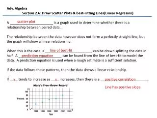
Vocabulary Line of Best Fit: Line of Best Fit: the trend line that shows the relationship between two sets of data most accurately. Correlation Coefficient: Correlation Coefficient: tells you how closely the equation models the data ( r ).
Example 1: Making a Scatter Plot and Describing Its Correlation • Step 1: Given a table, treat the data as a ordered pairs and plot each individual data point. • Step 2: Describe the general correlation of the data. As you move from left to right, does the data generally rise (positive correlation), generally fall (negative correlation), or follow no recognizable pattern (no correlation).
Miles 5 10 14 18 22 Time (min) 27 46 71 78 107 Step 1 Draw a scatter plot. Use a straight edge to draw a trend line. Estimate two points on the line. Example 2: Writing an Equation of a Trend Line Make a scatter plot to represent the data. Draw a trend line and write an equation for the trend line. Use the equation to predict the time needed to travel 32 miles on a bicycle. Speed on a Bicycle Trip
y2 – y1 x2 – x1 120 – 27 25 – 5 93 20 Example 2: Writing an Equation of a Trend Line (con’t.) Step 2 Write an equation of the trend line. m = = = 5 y – y1 = m(x – x1) Use point-slope for m. y – 27 = 5(x – 5) Substitute 5 for m and (5, 27) for (x1, y1). Step 3 Predict the time needed to travel 32 miles. y – 27 = 5(32 – 5) Substitute 32 for x. y – 27 = 5(27) Simplify within the parentheses. y – 27 =135 Multiply. y = 162 Add 27 to each side. The time needed to travel 32 miles is about 162 minutes.
Use a graphing calculator to find the equation of the line of best fit for the data below. What is the correlation coefficient? U.S. Crime Rate (per 100,000 inhabitants) No. of Crimes Year 1995 5275.9 1996 5086.6 1997 4930.0 1998 4619.3 1999 4266.8 [Source: Crime in the United States, 1999, FBI, Uniform Crime Reports] Example 3: Finding the Line of Best Fit
Step 2 Use the CALC feature in the screen. Find the equation for the line of best fit. Example 3: Finding the Line of Best Fit (con’t.) Step 1 Use the EDIT feature of the screen on your graphing calculator. Let 95 correspond to 1995. Enter the data for years and then enter data for crimes. The equation for the line of best fit is y = –248.55x + 28,945.07 for values a and b rounded to the nearest hundredth. The value of the correlation coefficient is –0.9854908654.
Assignment: Pg. 341 7-16 Left