Download
1 / 15
150 likes | 247 Views
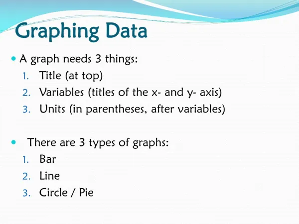
Graphing Data in Excel. The Chart Wizard Making a Chart Perfect Making New Charts Without Making New Charts. Let’s Get Some Data to Chart (Graph). Open the Training Materials folder on the desktop icon next to heading of Agenda & Materials page of CD when you’re home

E N D
Graphing Data in Excel The Chart Wizard Making a Chart Perfect Making New Charts Without Making New Charts
Let’s Get Some Data to Chart (Graph) • Open the Training Materials folder on the desktop • icon next to heading of Agenda & Materials page of CD when you’re home • Double Click on MMS Reading.xls • When it opens it should look very familiar
The Chart Wizard • Highlight the data you want to put on a Chart • We’ll start with 5th grade change data (M12:P15) • Tap the Chart Wizard icon (tool bar).
The Chart Wizard (Cont.) • 1st Page of the Wizard (Chart Type) • Tap on a picture of Chart • It tells you what type of Chart • Clicking the bar below shows a small version of what it would look like • Select the Clustered Column with 3-D Visual Effect (Select it and Click Next).
The Chart Wizard (Cont.) • 2nd Screen (Selecting X / Y data) • Defaults to Series being in rows • Click Columns to see what it does • Go back to Rows before you click Next.
The Chart Wizard (Cont.) • 3rd Screen (Labeling and Formatting) • Labeling the Chart and the Axes* • Axes* • Gridlines* • Legend* • Data Labels* • Data Table* • When everything is right, click Next.
The Chart Wizard (Cont.) • 4th Screen (Where to put the chart) • As a new sheet • Inserts a new worksheet in your workbook and puts the chart there • Type a name for the chart (5th Chng 01-02) • As an object in • Puts the chart as a picture on the existing sheet of your choice • Select As a new sheet but… DON’T CLICK FINISH YET!
The Chart Wizard (Cont.) • Moving back and forth in Wizard • Click on back to move to the previous screen • Next to move to the next • Only click Finish when you’ve got it right • When you have the Chart looking like you want and headed for a new sheet, click on Finish • You can re-enter the Wizard at any time by selecting the chart and again clicking the Chart Wizard Icon
Formatting / Editing a Chart • Select the element you want to change • Little black boxes will appear at corners • Go to Format / Selected… • What appears behind selected depends on what you have selected • You can now change whatever appears for the element you’re working on • Format Y Axis / Scale (min -15 to max 15) • Format Data Series / Fill Effects / Pattern • Click OK to change the chart.
Charting Equivalent Data (Cont.) • Copying the Chart • Select the Sheet with 5th Chng 01-02 • Edit / Move or Copy Sheet or Right Click / Move or Copy Sheet • Click box by Copy Sheet • Select sheet in front of which the new sheet will go • Click OK • Rename the new sheet (8th Chng 01-02) • Format / Sheet / Rename or Right Click / Rename
Charting Equivalent Data (Cont.) • Changing Data on Chart • Chart / Source Data • Select Equivalent 8th Grade Data Table • Click OK • The Chart now reflects the 8th grade numbers • Could you copy this data table so that it calculates 02-03 change?
Using the Chart Wizard • Select the 5th grade total met data table • Click on the Chart Wizard icon • Use the wizard to create your chart • Save it on a new worksheet (5th Total Met)
Adjust the Scale • Right Click on the vertical axis • Click on Format Axis • Click Scale tab • Adjust Maximum to 100 • Make any other changes to the chart you see fit
Replicating the Chart • Copy the chart to a new worksheet • Rename the new worksheet • Chart / Source Data • Select the 8th grade data • Make needed changes to make it the 8th grade graph
Okay Charters Extraordinaire… • You can now • Create data tables suitable for the Chart Wizard • Use the Chart Wizard to create graphs • Make changes to the resulting chart • Copy graphs • Retarget the graph’s source data to create graphs of new data