Download
1 / 50
510 likes | 524 Views
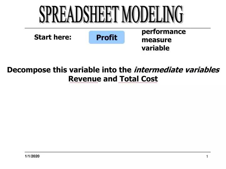
Decompose this variable into the intermediate variables Revenue and Total Cost. SPREADSHEET MODELING. performance measure variable. Profit. Start here:. Total Cost. Revenue. SPREADSHEET MODELING. Profit.

E N D
Decompose this variable into the intermediate variables Revenue and Total Cost SPREADSHEET MODELING performance measure variable Profit Start here:
Total Cost Revenue SPREADSHEET MODELING Profit Now, further decompose each of these intermediate variables into more related intermediate variables ...
Total Cost Processing Cost Ingredient Cost Required Ingredient Quantities Pies Demanded Unit Pie Processing Cost Unit Cost Filling Unit Cost Dough Pie Price Fixed Cost SPREADSHEET MODELING Profit Revenue
Step 3: Model Construction SPREADSHEET MODELING Based on the previous Influence Diagram, create the equations relating the variables to be specified in the spreadsheet.
SPREADSHEET MODELING Profit Total Cost Revenue Profit = Revenue – Total Cost
SPREADSHEET MODELING Profit Revenue Revenue = Pie Price * Pies Demanded Pies Demanded Pie Price
SPREADSHEET MODELING Profit Total Cost Processing Cost Ingredient Cost Total Cost = Processing Cost + Ingredients Cost + Fixed Cost Fixed Cost
SPREADSHEET MODELING Profit Total Cost Processing Cost Processing Cost = Pies Demanded * Unit Pie Processing Cost Pies Demanded Unit Pie Processing Cost
SPREADSHEET MODELING Profit Total Cost Ingredients Cost = Qty Filling * Unit Cost Filling + Qty Dough * Unit Cost Dough Ingredient Cost Required Ingredient Quantities Unit Cost Filling Unit Cost Dough
Pie Price Pies Demanded and sold Unit Pie Processing Cost ($ per pie) Unit Cost, Fruit Filling ($ per pie) Unit Cost, Dough ($ per pie) Fixed Cost ($000’s per week) $8.00 16 $2.05 $3.48 $0.30 $12 SPREADSHEET MODELING Simon’s Initial Model Input Values
Present input variables together and label them. Clearly label the model results. Give the units of measure where appropriate. Store parameters in separate cells as data and refer to them in formulas by cell references. Use bold fonts, cell indentations, cell underlines and other Excel formatting options to facilitate interpretation. SPREADSHEET MODELING To represent this model in an Excel Spreadsheet, you should adhere to the following recommendations:
SPREADSHEET MODELING Initial Simon Pie Weekly Profit Model
For example, what would the resulting Profit be if the Profit for Pie Price and Pies Demanded changed to $7.00 and 20,000 or $9.00 and 12,000, respectively. Simply change the values of these parameters in the spreadsheet to view the resulting Profit. SPREADSHEET MODELING “What if?” Projection Allows you to determine what would happen if you used alternative inputs.
What if we change the values of two parameters? SPREADSHEET MODELING What effect will that have on Total Cost and Profit?
Pies Demanded = 48 – 4 * Pie Price ($0 < price < $12) SPREADSHEET MODELING Refining the Model After reviewing the results, Simon has determined that this model treats the variables Pie Price and Pies Demanded as if they were independent of each other. Knowing this is not the case, Simon developed the following mathematical (linear) relationship:
Refining the Model Now, modify the spreadsheet to include this relationship. Keep in mind that the physical results should be separated from the financial or economic results.
More “What if?” You can copy the model into adjacent columns and change specific values in order to compare and contrast the changes.
More “What if?” Using Excel’s Chart Wizard, the resulting changes can be graphed in an X-Y Scatter plot for viewing. Note that Profit is largest at a Pie Price of about $9.00 and that the break-even point of zero occurs at about $6.25.
Examines what happens to one variable (usually a performance variable) when you change the values of another variable (usually an input variable). For example, examine the effect of a percentage change in Pie Price on the percentage change in Profit. Sensitivity Analysis Now you can use trade-off analysis to determine how much of one performance measure (Profit) must be sacrificed to achieve a given improvement in another performance measure (Pies Demanded & Sold).
Simon suspects that the previous model’s Processing Cost formula produces the correct historical cost for the base case of 12 thousand Pies Demanded, but not for other values of Pies Demanded. Validate the model by using actual Processing Cost data for different levels of pie production. Use Excel’s Trendline capability to fit a trend equation directly to the actual cost data. SPREADSHEET MODELING Example 2: Simon Pie Revisited
First, historical data (column B) are plotted along with projected data (column C) based on the initial model of 2.05*Pies Demanded (column A)
Next, right-click on the Processing Cost (Actual) series in the graph and choose the option Add Trendline.
Next, click on the Options tab and select Custom as the Trendline Name. This will allow you to enter Linear Fit. After clicking this option, a dialog will open in which you can select Linear as the Type (for simplicity) and Processing Cost (Actual) as the Based on Series. Finally, click on the Display equation on chart option and click OK.
The resulting trend line gives a much better fit to the Processing Cost data and provides a more accurate equation: Processing Cost = 3.375*Pies Demanded and Sold – 14.339
“What if?” Projection Applying this new Processing Cost equation to the spread-sheet model, you can see what will happen to your Profit.
Sensitivity Analysis As in the previous example, use sensitivity analysis to determine what would happen to Profit if you change the values of Pie Price and Pies Demanded $ Sold.
Sensitivity Analysis Again, using Excel’s Chart Wizard, the resulting changes can be graphed in an X-Y Scatter plot for viewing.
Note that you can print and display these spreadsheet models such that technically oriented parameters can be hidden from higher level management reports. To do this, highlight the desired rows and then click on the Data pull down menu and choose the Group andOutline– Group option. SPREADSHEET MODELING Printing and Displaying the Spreadsheet Models
Clicking on this button will collapse, i.e., hide those rows from display and printing. Printing and Displaying the Spreadsheet Models When the Group option is in effect, you will see a “-” button on the left side of the spreadsheet.
Clicking on this button will reveal the rows for modeling and analysis. Printing and Displaying the Spreadsheet Models While in this “hide” mode, a “+” button will be displayed on the left side of the spreadsheet. NOTE: Collapsing cells which comprise a data series in an Excel chart will temporarily remove the series from the chart.
Modeling using Time Intervals Columns in a spreadsheet may be designated as time intervals (in this case weeks). With a Total column summarizing the time periods.
In addition to apple pies, Simon is considering expanding his business to begin producing and selling lemon, strawberry, and cherry pies. Since each pie product shares the same basic model form, each column in the spreadsheet model will be devoted to a different pie type. Start by copying the Apple Pie model to the new columns. Since no historic data exist, some parameter values for the new pie products are based on judgment. SPREADSHEET MODELING Example 3: Simon Pies
Example 3: Simon Pies Note that fixed overhead cost includes rent, interest expense, etc. and is now a fixed cost common to the entire operation and not attributable to any single pie type. This cost was moved to the consolidated Totals column. Because of this, Revenue minus Total Cost is now labeled Contribution to conform with Accounting practices.
Example 3: Simon Pies Also note that pie Price Difference is given as a function of Apple pie price. This will facilitate sensitivity analysis of the multi-product model.
For easy comparison, use a Stacked Column chart in Excel to give the percentage breakdown of Revenue, Costs and Contribution of each pie type in the model.
After reviewing the model results, Simon decides that he will have to add a second shift in order to produce 33 thousand pies per week. However, adding a second shift will add overtime payments to his Processing Cost. Therefore, he must modify the model. After consulting his plant manager, he decides that if he introduces the new pie types, he will have capacity to produce a total of 25 thousand pies of any type per week. Production above that capacity limit will incur second shift overtime costs that will add $0.80 to the Processing Cost of any pies produced during a second shift. SPREADSHEET MODELING
Notice that there are 2 new parameters in this model: Normal Pie Processing Capacity (25 thousand pies) and Overtime Processing Cost ($.80 per pie).
Overtime Processing Cost uses an IF statement. If total Pies Demanded and Sold is greater than the 25 thousand capacity limit, then an additional unit cost of $0.80 is added to each pie produced beyond the limit.
Can some of the overtime cost penalty be mitigated by raising pie prices, and thus reducing pie demand? What would the profit benefit be if Simon could find a way to raise Normal Production Capacity above the 25 thousand limit? Sensitivity Analysis After reviewing the previous results, Simon wonders: To do this sensitivity analysis, use Excel’s Data Table command. This command allows you to systematically batch process whole collections of “What if?” projections at once and then tabulate their results into a rectangular array of cells.
Sensitivity Analysis Simon is interested in the following: Performance Variable: Total Profit Decision Variable: Apple Pie Price Parameter: Normal Processing Capacity This lends itself well to the Data Table 2 option which allows two exogenous variables to be varied over specified ranges but tabulates the results only for a single endogenous variable. Remember, since all other pie prices are related to the Apple pie price, varying Apple pie price will affect the other pie prices according to their market price differences from the Apple Pie Price.
Note that a reference to a single performance measure is entered in the upper left hand corner. A formula (=F29) is used to reference this value back to Total Profit. To begin, define the ranges of values for the two exogenous variables.
Next, select all the cells in the rectangular range, I3:016, and choose the Table item from the Data pull down menu. This will result in a Table dialog. Now you must specify the Row and Column input cells.
For the Row Input, click on the button for the Row input cell: field. The Table dialog will collapse, allowing you to go to cell F9 and click on it. This will automatically enter the absolute cell reference into the edit field. Click on the button to expand the dialog. Now, move your curser to the Column input cell: edit field and repeat the above steps to specify cell B4 for this field.
Now, click OK and Excel will use the input values in the Simon Pies model and re-calculate the worksheet, placing the resulting Profit value into the corresponding cell in the table.
For graphical display, use Excel’s Chart Wizard. Highlight the range of cells I3:016 and choose the 3-D Surface chart type.
Interesting, but sensitivity analysis is difficult to see from the 3D chart contours.
An X-Y Scatter Chart is also created using the Chart Wizard. Simon should consider raising his Apple Pie Price from the previous value of $9.38 to at least $9.50 if Normal Processing Capacity is fixed at 25 thousand pies. Also, for any given Normal Processing Capacity value above 27 thousand, Profit is relatively insensitive to Apple Pie Price for prices between $9.50 and $9.70.
First, specify the values of the input variable in an empty row or column on a worksheet. These cells contain formulas which reference their respective endogenous output quantity. Sensitivity Analysis Now let’s look at only one exogenous variable using the Data Table 1 capability in Excel. Next, labels for each endogenous consequence variable are placed in separate rows below the first. Note that cell I22 must remain empty.
Select cells I22:S26 and then click on the Data pull down menu and select Table. In the resulting dialog, specify B4 as the Row Input cell: Click OK to tabulate each of the listed endogenous output variable values from the model.
The resulting table gives the Total Pies Demanded, Total Revenue, Overtime Processing Cost and Profit for various apple pie prices. Simon can see that, unless he can raise Normal Processing Capacity (from 25 thousand), he must raise Apple Pie Price (and thus other pie prices) if he wishes to reduce his overtime processing costs.