Download
1 / 7
70 likes | 242 Views
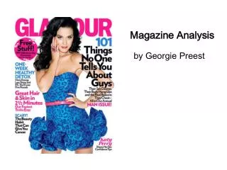
Magazine Analysis. Louis Bishop. Four Four Two Magazine. Layout. Clear title at top of page. Clear indication into what is with in the magazine. Picture of main topic with title ( messi ). Use of Images.

E N D
Magazine Analysis. Louis Bishop.
Layout. • Clear title at top of page. • Clear indication into what is with in the magazine. • Picture of main topic with title (messi)
Use of Images. • One eye catching image on the front cover, It is reasonably large and uses space on the cover well. The colour of the image blends with the colour of the title.
Use of text. • Little text on the cover. Just a large title and small sections of writing regarding what is in the magazine. The main topic (Messi) is in large bold writing to catch the readers eye.
Colour and font. • The colour of the text mixes well with the image of the footballer, it also mixes well with the background and majority colour of the cover. The font is bold and simple which means it is easy to understand. The colour of the writing also mixes in well with the background and the image.
How the colour successfully attracts the target audience. • This cover is successful due to the simple design and the clear presentation. The clear text and easily recognizable image helps the magazine be attractive to the target audience. Nothing on the cover clashes which enables the reader to have a clear understanding about what contents the magazine has.