Download
1 / 7
70 likes | 158 Views
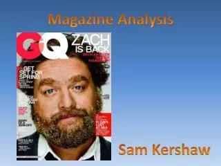
Magazine Analysis. By Toby Emery. Q Magazine august 2013. layout. -The iconic Q logo consistent in the top left hand corner to boost brand recognition -Cover story title directly below logo -Main image taking the majority of the space in the centre behind the writing

E N D
Magazine Analysis By Toby Emery
layout -The iconic Q logo consistent in the top left hand corner to boost brand recognition -Cover story title directly below logo -Main image taking the majority of the space in the centre behind the writing -Secondary story in the top right of the magazine -Extras running along the bottom of the cover as they are the minor stories
Use of images • Being the August issue of Q they have gone for a summer themed cover with a • - Sky blue background • Sun reflecting • The artists holding ice creams • I also feel the main image portrays a 3d effect with the use of layers, it being behind the text yet in front of the logo and secondary story. Through doing this it makes for a more striking cover, one that can catch the customers eye instantly.
use of text ‘UNMASKED: The secretive stars behind the sound of the summer’ From this we can deduce that Q are promoting the fact that Daft Punk are very private and mysterious, implying little knowledge of their true identities. This creates an element of excitement for the reader meaning there's something inside the magazine people may not know- a behind the scenes scoop if you will. Moreover there is a use of sibilance in ‘secretive stars’ allowing it to sound smooth- short, snappy and to the point. Also used in ‘sound of the summer’ to add relevance to the summer themed august issue. Furthermore , the use of superlatives , ‘THE WORLDS GREATEST MUSIC MAGAZINE’ makes an emphatic statement to sell the product. People are only interested in the best. ‘The Feuds. The Excess. The Music.’ Power of 3- bold and simplistic for dramatic effect.
colour and font choice The classic capital letter Q white on red in the corner religiously for every issue of the magazine. Very slick and simplistic, in conjunction with the content of the magazine. All headers in red to simply stand out and draw your eyes to the smaller stories.
The target audience I believe this magazine has a very broad age demographic being the ‘worlds greatest music magazine’. However, I think its aimed at mainstream music- what the majority of people like. Therefore, not all music genres and bands are promoted in the magazine. They may touch on certain areas but will not showcase some as much as others.