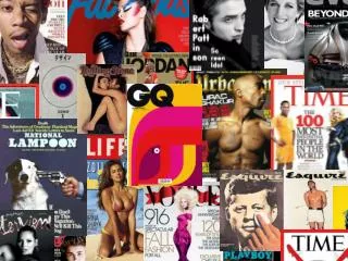
Download
1 / 17
170 likes | 283 Views
MAGAZINE ANALYSIS. MUNIRAH ISLAM. FRONT COVER. Target Audience.

E N D
MAGAZINE ANALYSIS MUNIRAH ISLAM
Target Audience The target audience for my magazine is teenagers, ranging from the ages 14-18. I believe that my style reflects the rebellious attitude that is present during that age, the eroding title has connotations of graffiti. My approach is laid back and casual, as in order to relate to the target audience you need to seem relatable.
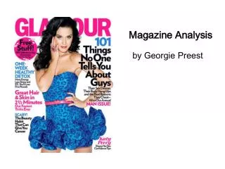
This is the title to my magazine. I believe that it is effective as it reflects ‘edgy pop’. Due to my target audience being teenagers, i wanted a hint of rebelliousness in it, hence why i have chosen the letters to look as if it is eroding away, a almost disintegrating look. The context of my title ‘rhythm’ clearly states that it is a music orientated magazine. However, the genre of my title isn’t very clear, although this was done deliberately to keep it open to a wider audience. In addition, the disorganised arrangement of the letters refers to it’s context ‘rhythm’, it almost looks as if it is on a beat. The colour coding is effective, as the white is enhanced through the black background, instantly catching the eye. I have also maintained the colours to be gender neutral, as opposed to being focused towards a particular gender. The exclamation marks adds a excitement and edginess to it. I didn’t want to limit my magazine towards a minority of people, hence why I have kept the title simple, only indicating that it is music related. After all, the title is crucial in attracting a audience. This the logo to my magazine. I find this effective as it is almost a official statement, i also like the army style approach, as i was intending to be unique and differentiate myself from the conventional logos on magazines. Once again, it is conforming to the eroding away look, enhancing the military style font. I wanted my logo to be something to do with complimenting my magazine, this logo is quite ironic as usually ‘approved’ signs are not associated with magazines
This is the slogan to my magazine, ‘music with no limits’ this is quite hard-hitting as it suggests that it has the lowdown on everything music related, more so that it is stated in capitals, and in bold Black. It emphasises the raw content of the magazine. In addition, along with my logo and title, i quite like the straightforward ‘in your face’ attitude, something which can be associated with teenagers. When you’re reading a magazine, you want a magazine that is full of entertaining info and music, something which my slogan can identify with These are towards the side of my magazine, it gives a hint of the content inside it. In terms of formatting, once again i am using a consistent black and red style. I have used a popular well known band, slightly indie/edgy pop. ‘Paramore’ is a band which teenagers can instantly recognise and identify with, hence why i have used them so that it can attract them. Moreover, i have tried to have a personal approach, ‘at home’ seems like it is more intimate, a insight into the real life of a pop band. As opposed to ‘backstage’ which is when they are in their element, and therefore may have a camera friendly attitude. ‘Glastonbury’ is also a well renowned music festival, mainly attended by teenagers- thus why i have used it. The capitals make it look exclusive, important, in addition to being eye-catching.
This is more of my content in the magazine, the arrow states ‘win red carpet tickets to the MTV awards’. As every magazine goes, freebies are a must in order to encourage people to buy my magazine. I have tried to break the conventions of mediocre freebies such as posters or key rings etc, and tried to create a competition which offers a rare opportunity to teenagers. MTV awards are attended by famous artists, so providing someone with the chance to experience a day in the life of a celebrity is quite a attractive offer. Moreover, it is ‘red carpet’ tickets- something which is definitely not easily accessible to young people. EXCLUSIVE GOSSIP! is highlighted by the red, making it seems even more exclusive and important, as a reader, we are almost voyeuristic, we take a interest in a celebrity’s personal life more then their career!. From previous research, and my own experience, magazines which have personal content are the most successful. This is the centre of my magazine, the main content of it, I have situated in the middle so more focus can be on it, the ‘exclusive’ once again hints at something important and exciting.
This is the front image of my artist. I deliberately chose a natural setting, to make it more identifiable with my audience, rather then a photo shoot style. Although this may make it seem less professional, that is kind of intentional- i think this approach is more relatable with my demographic, teenagers want to see a environment that they can identify with and relate too. This pose makes her edgy and slightly with a hint of attitude (hanging off the gate), her direct glare is also making it more intimate, making the readers feel they are staring at THEM. Although my genre is ‘edgy pop’ and at first it may seem that the suit is opposing that, i would say it is breaking conventional barriers in terms of style being a indication of your personality. The fact that she is wearing a suit yet not appearing prim and proper adds a certain edgy feel to it. Another important aspect to my artist is the ethnicity, i am breaking the conventions of pop artists being mainly white young females and using a Asian artist instead. This shows that i am reaching out to all cultures and introducing it to a more diverse audience. She is also a teenager, something else which is identifiable with my target audience. Rather then having a cheesy, conventional smile, i have opted with a ambiguous look, almost a glare. This is reflective of her edgy attitude. It is also reflective of my genre and target audience, i wanted a rebellious feel
Iam being consistent in the use of colour coding, and formatting. I believe that re-enforcing a consistent style is important so people can be familiar with the magazine, it can have it’s own identity and brand look when the readers buy it. The disorganisation of the letters makes it edgy, in particular the reversed ‘s’. The images which i have opted to use is significant in my approach to relating with my target audience, they are all teenagers- reflective of my age of the target audience. More importantly, they showcase different ethnicity’s, making it relatable with everyone. The prop which i have used, a guitar is reflective of ‘edgy pop’, it is enhanced by the outfit- ‘overalls’ giving it a festival, laid back approach. I want my models to look realistic as opposed to artificial and fake which we are so used to seeing glamorized in shops. I am breaking conventional barriers by including flaws and not having a perfects slick look. ‘Meet and greet the hottest celebs!’ Ever wanted to share the stage with likes of ‘Katy Perry’ or ‘Justin Timberlake’? here’s your golden opportunity- take a look at our rare competition. PG 17 The rhetorical question is direct communication with the reader, presumably the readers are shouting out ‘YES’!, I have deliberately not included further info, because that would prompt them to take a look into the magazine
The title of my double page spread with a font which looks like the letters are wearing away. this is my attempt on being more edgy and daring, the combination of the colours red black and white compliment each other and is not gender biased. The title’s context ‘has she got what it takes?’ also questions whether she meets the expectations of show bizness and the music industry, almost implying that it is a brutal battle to get to the top. moreover, the colours make the wearied out letters stand out. My sub-heading looks slightly like calligraphy, i chose this font deliberately in order to make it look realistic and almost like it was written as opposed to artificial text(personal feel)the context of my writing refers to a upcoming fresh artist- ‘cherry leto’, as mentioned in my proposal I attempt to be slightly more edgy on my approach and therefore did not choose a common name. the first name slightly reminds me of the famous first rock girl band ‘the runaways’, where one member went by the name ‘cherry bomb’. in a way, I'm trying to make my artist vintage/indie and more rock n roll as opposed to contemporary and modern.
CONTEXT We are at her Posh London hotel, her laid back and care-free style is clearly reflected by the state of her room- clothes scattered everywhere . various fashion magazines accompanying her bowl of haribos on her king size bed.However, we feel welcome as she greets us with a warm hug.... This is a extract from my article. A interview with ‘cherry leto’,as my magazine is based around edgy pop, i didn’t want to make her appear squeaky clean, or prim and perfect which we are so used to seeing in the teen pop genre. therefore, i tried to make her relatable by making her appear like a normal teenager, hence the care-free attitude with a messy room etc. pop artists are usually brainwashed by the media and act in a certain way, i tried to get away from all that and make her seem normal and identifiable with my target audience. ‘ALL THE FANS screaming your name gives you such a rush and the drive to own the stage’ This is one of the quotes which I used on my double spread, I didn’t use too many quotes as using a limited amount focuses the audience’s attention on it more and therefore has more of a impact. I used a simple line said by the artist A EXTRACT FROM MY INTERVIEW. I CHOSE LADY GAGA AS HER INSPIRATION AS THIS IS A ARTIST WHICH IS REFLECTIVE OF MY MAGAZINE- SOMEONE WHO IS DIFFERENT, CONTROVERSIAL YET STILL POPULAR. You look up to Lady Gaga? She is my idol and inspiration. I love her style, what she does. She’s not afraid to be different and daring, and at the end of the day that is why she has become so successful and such a hit.
This showcases the care-free attitude and eccentric personality of my artist. This is heightened by her pose, her hair covering her face. This is identifiable with teenagers, with the crazy pose. I like the idea of a air guitar, it is a slightly more ‘rock music’ feel. In addition, it can be decoded by my readers that is a pose they can re-create , more so that the brick wall suggests a natural environment. This is my attempt to identify with my audience I like the low angle shot of this image, the direct stare gives a more intimate connection with the readers, it is almost a glare, it is in some ways intimidating as it looks like she is looking ‘down’ on us, making us feel inferior.
‘It’s so strange thinking that this time last year i was at school sitting exams, and right now I'm on arena singing to a crowd of millions.’ By making her seem like a normal teenager, who used to do every day activities such as attending School is my way of relating to my teenage audience. The fact that she is 17, has the typical personality of a teenager, and is not perfected in her looks makes her relatable. It is breaking conventional barriers, where pop artists have a glamorized, Hollywood style life. This is not identifiable with readers, but rather ‘desired’
CAMERA’S COMPUTERS AND PROGRAMMES From the construction of my magazine, I have realised that modern technology is essential in order to produce a professional magazine. Computers are no doubt crucial, but more so editing technology such as adobe Photoshop. The perfected looks in which we see in magazines are a result of extensive editing to the point where the models look flawless. Of course, this is necessary because appearance is important in attracting the audience. More importantly, I have learnt that not only is computers needed, but machines to batch produce magazines and administer them to shops and a variety of mediums. The modern technology which I was provided with was sufficient in producing a basic magazine, but also made me realize that simply using publisher would not be enough in producing a professional magazine, as the look is achieved by using expensive programmes which can not be provided in schools. It also made me realize that taking pictures can be quite a difficult task! In terms of perfecting the right pose and getting a message across to the audience, again normal cameras are not sufficient in producing professional photos. Getting the right setting is also quite difficult, as magazines usually use studios. In my opinion, in modern day, we are very dependent on digital technology- however this is understandable. In order to produce a outstanding magazine, digital technology is the edge we need to make it look professional.
What have I Learnt? I have learnt a lot in the production of my magazine. I have realised that all magazines have meanings which they try and reach out to with the audience. In addition, that all aspects of a magazine are ways in trying to communicate with the readers, from the font used to the context. For e.g- the pose in the front cover is very important in communicating with the readers. The font indicates the genre of music. I have also realised that a lot of effort is needed in order to produce a professional looking magazine, and every tiny detail counts. For example, reading one quote can prompt you to read the entire article! Magazines have clever and media savvy ways in relating to the readers- many of which are not obvious at first. There are many signs and connotations associated with it. Moreover, I have learnt that music has a big influence in every day life, hence why music magazines are a large part of the industry. Music is not only a source of entertainment, but a emotional release from everyday life. During my research, i was shocked to realize that Lady Gaga made it into one of the most influential women in the ‘Times Magazine’. Music has a way of creeping into even respected and prestigious areas.
All of these have one thing on common- they are music magazines. However, the style differs quite dramatically. The Top of the pops magazine is aimed towards a slightly amateurish audience due to the use of basic, simple colours, in addition the artists used are within the pre-teen range. It is also aimed towards girls, because of the girly colours, pink purple e.t.c. In a different light, I wanted my magazine to be more edgy and sophisticated, more like the ‘Q’ magazine. Q magazine contains critical music information, it’s aimed towards a slightly more older and mature audience, it is also not gender biased. The front image I have used and the image used in Q magazine is quite similar, in the sense that they have a intense glare. I have broken the conventional pose of Top Of the Pops which is artificial, airbrushed and flawless. Moreover, the colour coding is similar, with the use of red and black.