Download

1 / 20
200 likes | 202 Views
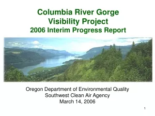
This project analyzes 12 years of IMPROVE data in the Columbia River Gorge to evaluate sources and chemical composition of air pollutants and determine if air quality is improving or deteriorating. Results suggest significant contributions from sources in the Boardman vicinity.

E N D
Analysis of 12 years of IMPROVE data in the Columbia River Gorge By Dan Jaffe University of Washington Northwest Air Quality Photo from the Wishram IMPROVE site. Photo courtesy of IMPROVE/CSU website (http://vista.cira.colostate.edu/improve)
Goals • Use IMPROVE data (Wishram) and HYSPLIT back-trajectories to evaluate possible sources for worst air quality days in CRG. • Use IMPROVE data to evaluate chemical composition for worst air quality days in CRG. • Use IMPROVE data to evaluate whether air quality in CRG is improving or deteriorating. This project was funded by the Yakima Nation between Aug.-Dec. 2006. A final report was presented to the Yakima Nation in December. This presentation reflects information in that report, but is considered “Preliminary” in that it has not been submitted for peer-review.
Why focus on IMPROVE data? • IMPROVE is a national network of air quality monitors to evaluate visibility, especially in National Parks and other class I areas. • IMPROVE uses a standard protocol and all samples are analyzed in a central lab. • IMPROVE conducts continuous QC and data evaluation. • IMPROVE is the only long-term record of air quality in the CRG (1993-present) • Samples collected approximately 2x per week.
Wishram, Washington IMPROVE site Google Earth map from: http://earth.google.com/
Wishram IMPROVE site Photo courtesy of IMPROVE/CSU website (http://vista.cira.colostate.edu/improve)
Approach • Identify the 50 worst air quality days (PM2.5 or “fine mass”) in the CRG between 1993-2004. • For each of these 50 days, calculate a set of HYSPLIT backward trajectories to evaluate the most probable sources of pollutants for that day. • Based on the trajectories, classify each day by the source region. • Examine the aerosol chemistry for each airmass type. • Examine trends in the long-term data.
May 27th, 2003Fine mass = 5.1 ug/m3 Image courtesy of USFWS Air Quality Image website: http://www.fsvisimages.com/
November 7th, 2002Fine mass = 34.7 ug/m3 This was the worst air quality day between 1993-2004, as measured by IMPROVE data. Image courtesy of USFWS Air Quality Image website: http://www.fsvisimages.com/
Overview of Wishram data Note: Proposed new PM2.5 standard is 35 ug/m3 for a 24 hour average.
Atmospheric trajectories 101 • Trajectories give an estimate of the center of mass of a diffusing airmass. • Trajectories are only as good as the meteorological data and models on which they are based. Grid resolution is an important consideration in regions of complex terrain. • Trajectories can not be used to quantitatively assign source contribution. • Trajectories can identify a likely source in one direction, compared to an alternate source in another direction.
HYSPLIT trajectories • Back-trajectories calculated using NOAA-HYSPLIT model http://www.arl.noaa.gov/ready • Calculated for 0, 100 and 500 meter arrival height (agl) at Wishram • For each date, best available meteorological data used (40, 80 or 250 km grid resolution, depending on date) • For each 24 hour sample, trajectories were calculated at 2-hour intervals for a total of 13 trajectories per sample. • Each case was classified based on consistency of all trajectories.
Back trajectories for July 30, 200413 trajectories calculated at 2-hour intervals Airflow Wishram Measured PM2.5 at Wishram = 14.2 ug/m3
Back-trajectories to Wishram for November 8th, 2004 Airflow Wishram IMPROVE site Boardman, Oregon Measured PM 2.5 on this date = 26.0 ug/m3
Distribution of 50 worst air quality days by trajectory type ~40% of the worst air quality days are associated with transport from the East end of the CRG and these days tend to have higher PM2.5 concentrations. Note that the chemical composition of category # 5 days appears to be quite different from other days, with about 30% aerosol mass due to nitrate aerosol, compared with other airmass types that have only 11% as nitrate. For details, refer to final project report.
Comparison with “Causes of Haze” study • The “Causes of Haze in the Gorge (CoHaGo)” study (Green et al., 2006), identified sources east of the gorge as significant contributors (Green et al., 2006); • Our analysis also confirms that sources in the Boardman vicinity are significant contributors to particulate matter on the worst air quality days (Jaffe 2006).
Is air quality getting better or worse in the CRG? Annual average PM2.5 concentration at Wishram Some improvement in annual average, but result is not statistically robust.
50 Highest PM2.5 days at Wishram But, possible problems with IMPROVE nitrate data between 1997-1999 (McDade 2004)
50 Highest PM2.5 days at WishramWith and w/o nitrate adjustment • PM2.5 levels adjusted based on measured nitrate plus best estimate by IMPROVE of nitrate error (MdDade 2004). • Frequency of “bad air days” is not changing and the peak concentrations are not improving.
Conclusions • While data from the Wishram IMPROVE site have an overall low average PM2.5 concentration (5.9 ug/m3) on some days, concentrations are much higher. • I evaluated the most likely sources for the 50 worst air quality days (highest PM2.5) for the period 1993-2004 using HYSPLIT back-trajectories. • For ~40% of the worst days, sources on the east end of the CRG appear to be primarily responsible (mean PM2.5 = 20.4 ug/m3) This is consistent with results presented in the CoHaGO study (Green et al 2006). • For ~20% of the worst days, sources on the west end of the CRG (Portland) appear to be primarily responsible (mean PM2.5 = 16.1 ug/m3) • While the annual mean PM2.5 concentration in the CRG shows some evidence of a decline, the frequency of bad air quality days does not appear to be changing. Many of the worst air quality days have occurred in the past 5 years.