Download
1 / 26
260 likes | 395 Views
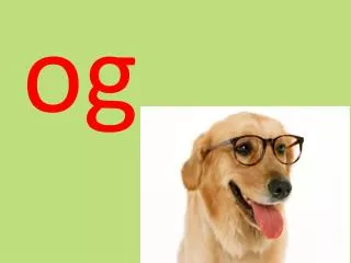
T YP og RA phy. Typography is the art and technique of creating and composing type in order to convey a message. Words are communication. What do they say? The meaning should come before the look of the type is considered.

E N D
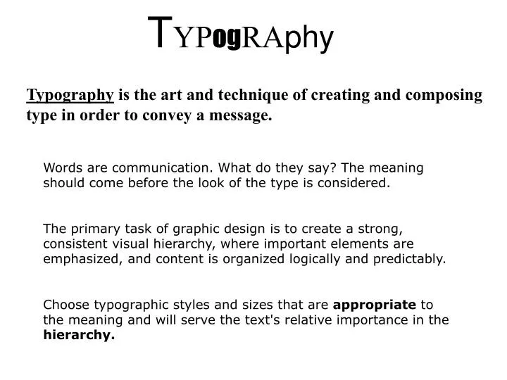
TYPogRAphy Typography is the art and technique of creating and composing type in order to convey a message. Words are communication. What do they say? The meaning should come before the look of the type is considered. The primary task of graphic design is to create a strong, consistent visual hierarchy, where important elements are emphasized, and content is organized logically and predictably. Choose typographic styles and sizes that are appropriate to the meaning and will serve the text's relative importance in the hierarchy.
From the top down: places in the hierarchy Headlines: Stop 'em and grab 'em, fast. Headlines work best when they're both visually and verbally interesting. The largest type on the page, heads should always stand out from subheads and body copy., although they don't have to be located at the top. Subheads: Hook'em into reading more, by expanding and explaining the basic idea of the headline. Distinguish from heads and copy. Body text: Make sure it's both legible and inviting. Captions: Connect readers to pictures and story. Often a bit larger than body text. Be consistent. Pullquotes and other breakouts: Add interest. Be creative.
Ascender - The lowercase character stroke which extends above the x-height. Bar - The horizontal stroke on the characters ‘A’, ‘H’, ‘T’, ‘e’, ‘f’, ‘t’. Baseline - The imaginary horizontal line to which the body, or main component, of characters are aligned. Bowl - The curved stroke which surrounds a counter. Bracket - A curved line connecting the serif to the stroke.Bracketed serifs with cupped basesBrecketed serifs with flat bases Unbracketed serifs Contrast - The amount of variation in between thick and thin strokes.Minimum contrast Extreme contrast Counter - The empty space inside the body stroke. Descender - The lowercase character stroke which extends below the baseline. Loop - The bottom part of the lowercase roman ‘g’.
Sans serif - From the French, meaning “without serif”. A typeface which has no serifs.Sans serif typefaces are typically uniform in stroke width. Serif - Tapered corners on the ends of the main stroke. Serifs originated with the chiseled guides made by ancient stonecutters as they lettered monuments. Some serif designs may also be traced back to characteristics of hand calligraphy. Note that serif type is typically thick and thin in stroke weight. Shoulder - The part of a curved stroke coming from the stem. Stem - A stroke which is vertical or diagonal. Stress - The direction in which a curved stroke changes weight. TerminalThe end of a stroke which does not terminate in a serif. X-height The height of the body, minus ascenders and descenders, which is equal to the height of the lowercase ‘x’.
Traditional text is measured in points, the standard unit of measure in software programs for creating printed documents. There are 72 points to an inch and 12 points to a pica (picas are typically used to measure text widths, images, etc.) Typical body copy sizes are 8 to 12 points, headlines from 14 points and up
Leading (line spacing) Leading is space between lines of text. Extra leading aids body copy a great deal by making type look more open and friendly, less daunting. Too much leading makes it hard to 'jump' from line to line. LEADING LEADING LEADING LEADING LEADING LEADING LEADING LEADING LEADING
Spacing between letters Kerningapplies to the space between individual letters. Certain combinations of letters typically leave too much space between the characters, such as capital "A" and "W." These examples have already been kerned, bringing the letters closer together: Tracking or letter spacing applies to whole lines of text. Add or subract tracking to give text a looser or tighter feel. LAW L A W
History of Type The design of type began with early cuneiformimages carved into stone or painted on cave walls. The tradition expanded into blackletter calligraphy in the middle ages, then flourished in the industrial age with the development of Roman (serif) and then Gothic (san serif) letterforms. Now, with the advent of PCs, anyone can create a typeface; there are literally thousands available. But that doesn't mean they are all GOOD.
Serif Fonts Serif fonts are marked by little 'feet' that extend from the stem of the letter. All fonts were Roman (serif) until the 20th century. Serifs say tradition, elegance, formal. Serifs enable reading of large blocks of printed text, hence most books, magazines, etc. use it for body text. Types of serif fonts:
Old Style With some of the earliest fonts, the serifs flow out in simple, graceful curves. Caslon Palatino
Transitional Smaller curves connect the serifs. Baskerville Times
Modern The stems are thick and the serifs thin, contrasting with each other. Didot
Egyptian (Slab Serifs) Thick. Think Circus, Westerns
Sans Serif No ‘feet.’ Clean, simple lines, less traditional looking. Hugely popular in the mid-century Swiss design movement. Helvetica Futura Gill Sans Studies show that reading on screen is easier with sans-serif typefaces.