Download
1 / 29
300 likes | 509 Views
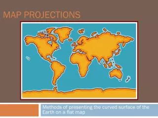
Map Projections and Map Scale. All Maps Lie. Because the world is a sphere and maps are flat, there will always be some degree of distortion. The next several slides will display some of the more popular distortions. Types of Thematic Maps. Dot Maps. Isoline Maps. Choropleth maps.

E N D
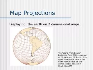
Map Projections and Map Scale
All Maps Lie.... Because the world is a sphere and maps are flat, there will always be some degree of distortion. The next several slides will display some of the more popular distortions.
Types of Thematic Maps
Proportional Symbol US Population
Scale Displaying the same geographical features at various scales may also depict misleading results.
This map shows the total number of African-Americans per state. Examine Georgia.
In the previous slide, Georgia had one of the highest number of African-Americans, but a closer look tells a different picture. The dark red is the Atlanta metropolitan area.
Using Census Tracts of the Atlanta Metropolitan Area, a different scale gives different results.
Manipulating Data Data may also distort desired results. The following slides show how population of a particular cohort may be misleading.
This map shows the percentage of African-Americans living within counties across the US.
This map shows the total number of African-Americans living in each county across the US.
These four New York counties (New York, Kings, Queens, and Bronx) have a combined African-American population of 2,121,882 and outnumbers the total number of African-Americans in the entire state of Texas 2,021,632
A similar comparison can be made with Hispanics living in the US. This map shows the total percentage of Hispanics in each county.
This map displays the total number of Hispanics in each US county.
These three Southern California counties (Los Angeles, Orange, and San Diego) have a total Hispanic population of 5,045,726 which is greater than the total Hispanic population of Texas at 4,339,905. New Mexico has the greatest percentage of Hispanics (33%), it’s total Hispanic population is 579,224.
US Population The map below shows the US population divided into Natural Breaks. In this case, the natural breaks are near the 7,000,000 mark.
US Population This map shows US population in Quintiles. In this map, states are classified into five separate categories based on population. The dark red represents the states in the top one-fifth. The total population in each state has not changed; however, the way that it is classified has changed.
Natural Breaks Quintile