Download
1 / 14
150 likes | 438 Views
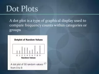
Dot plots and stem plots. AP Statistics. DOT PLOTS. Dot plots Graphical display used to compare frequency counts within categories or groups. *please note patterns in a dot plot can be described in terms of skewness or symmetry ONLY IF the variables are quantitative!

E N D
Dot plots andstem plots AP Statistics
DOT PLOTS • Dot plots • Graphical display used to compare frequency counts within categories or groups. • *please note patterns in a dot plot can be described in terms of skewness or symmetry ONLY IF the variables are quantitative! • Explain this to me…. Why?
DOT PLOTS • Step 1: Label your axis and title your graph. Draw a horizontal line and label it with the variable. Title your graph • Step 2: Scale the axis based on the values of the variable • Step 3:Mark a dot above the number on the horizontal axis corresponding to each data value.
5 0 1 0 7 2 1 0 4 0 3 0 2 0 3 1 5 0 3 0 1 0 1 0 2 0 3 Example 1: The number of goals scored by each team in the first round of the California Southern Section Division V high school soccer playoffs is shown in the following table.
SHAPES • Skewed Right: Most of the data is concentrated to the left of the graph (tail point to the right) • Skewed Left Most of the data is concentrated to the right of the graph (tail points to the left) • Symmetric: The majority of the data is concentrated in the center of the graph (shaped like a bell) • Uni-modal- one mode (frequency mound) • Bi-modal- two modes (mounds)
Center and Spread • Center: the value that divides the observations so that about half have smaller values • Spread: the smallest and larges values expressed in an interval
Dotplots • Practice: This data set gives pulse rates, in beats per minute, for a group of 30 students. 68 60 76 68 64 80 72 76 92 68 56 72 68 60 84 72 56 88 76 80 68 80 84 64 80 72 64 68 76 72
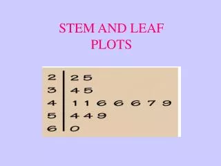
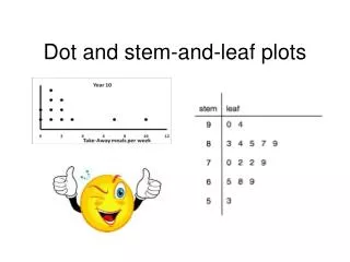
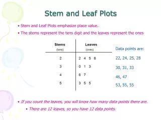
Stemplots • Step 1: Separate each observation into a stem consisting of all but the rightmost digit and a leaf, the final digit • Step 2: Write the stems vertically in increasing order from the top to bottom and draw a vertical line to the right of the stems. Go through the data, writing each leaf to the right of its stem and spacing the leaves equally. • Step 3: write the stems again, and rearrange the leaves in increasing order out from the stem. • Step 4:_ title your graph and add a key describing what the stems and leaves represent.
Stemplots • Practice: This data set gives pulse rates, in beats per minute, for a group of 30 stats students. 68 60 76 68 64 80 72 76 92 68 56 72 68 60 84 72 56 88 76 80 68 80 84 64 80 72 64 68 76 72 Now let’s try a stem plot with the same data. Compare your graphs, which is easier to analyze, why? Is this subjective?
Stemplots • Split stems- sometimes clusters of data are numericallly too close to be useful in a regular stemplot. We may need to break it down or split the stems to see differences. • When you split a stem you will separate it into a high and low section- like rounding. • Example: Nose lengths of 16 local hockey players: 2 in, 2.1 in, 2 in , 2.2 in, 2.5 in, 1.8 in, 2.2 in, 2.4 in, 2.5 in, 2.5 in, 2.6 in, 1.9 in, 2.0 in, 2.1 in, 2.5 in, 2.3 in
Example 2 Watch that CaffeineConstruct a Stem Plot with the data.
Example 2 Watch that CaffeineConstruct a Stem Plot with the data.