Download
1 / 10
100 likes | 216 Views
ARTS2090 – Publics and Publishing. Visualisation Presentation The Relationship between CO2 Emissions and Life Expectancy. Raw Data. Sources:

E N D
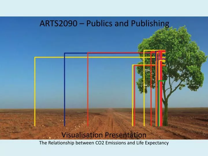
ARTS2090 – Publics and Publishing Visualisation Presentation The Relationship between CO2 Emissions and Life Expectancy
Raw Data Sources: ‘Health Statistics > Life expectancy at birth > total population (most recent) by country’, 2012, NationMaster.com, viewed 7 May 2012, <http://www.nationmaster.com/graph/hea_lif_exp_at_bir_tot_pop-life-expectancy-birth-total-population>‘List of countries by 2008 emissions’, 2008, Wikipedia, viewed 7 May 2012, <http://en.wikipedia.org/wiki/List_of_countries_by_carbon_dioxide_emissions>
Why did we chose this set of data?What are we adding to publishing? • We questioned whether C02 emissions specifically affects life expectancy • This graphic adds to the archive of scientific visualisations • Pollutionis a highly scrutinised and relevant issue in contemporary political agenda. It is becoming increasingly important to Australians
In which publics does this visualisation intervene? • It is an issue at affects all in society • Political leaders – to inform policy • Theorists – to shed light on previous independent studies
Strengths of our Visualisation • Strengths • Clear visual explaining the relationship between C02 and life expectancy; easy to decipher information • Visible breakdown of continents • Image is impactful • Message is conveyed quickly
Weaknesses of our Visualisation • Lacks detail • Limited quantity of information • Data possibly out-dated
Results • Does the relationship actually exist? • Somewhat inconclusive • Further research is required
References ‘Health Statistics > Life expectancy at birth > total population (most recent) by country’, 2012, NationMaster.com, viewed 7 May 2012, <http://www.nationmaster.com/graph/hea_lif_exp_at_bir_tot_pop-life-expectancy-birth-total-population>‘List of countries by 2008 emissions’, 2008, Wikipedia, viewed 7 May 2012, <http://en.wikipedia.org/wiki/List_of_countries_by_carbon_dioxide_emissions>