Download
1 / 48
490 likes | 919 Views
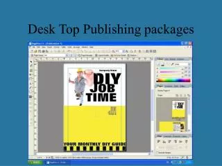
Desk-top Publishing. Six Steps to Successful Desktop Publishing. Establish goals and organize your material Answer the who, what, where, when and why question. 2. Six Steps to Successful Desktop Publishing. Choose an appropriate format and page layout

E N D
Six Steps to Successful Desktop Publishing • Establish goals and organize your material • Answer the who, what, where, when and why question 2
Six Steps to Successful Desktop Publishing • Choose an appropriate format and page layout • What is the overall look, how large, how many colours, columns, what sort of paper? • What graphics will direct the reader’s eye?
Six Steps to Successful Desktop Publishing • Make appropriate typeface, type size, and spacing decisions • The majority of messages appear as headline and body copy - create headlines and titles which attract attention with body copy that’s transparent and doesn’t interfere with reader’s ability to quickly understand
Six Steps to Successful Desktop Publishing • Add and manipulate visuals • Replace words with images/visuals where possible (photographs, illustrations, charts, graphs, tables, organization charts, flowcharts, timelines, etc) • Each requires careful placement on the page
Six Steps to Successful Desktop Publishing • Build momentum into your pages • You’ve got readers attention, now keep them interested in your publication • Break material into bite-size chunks by using organisational devices such as subheads, pull quotes and sidebars.
Six Steps to Successful Desktop Publishing • Refine and fine-tune ‘til you drop • Perfect wholes are the result of perfect detail • Break your project into component parts to fine tune (a singing group is destroyed by one bad singer)
Using design to enhance your ideas! • design enhances readership • design provides organisation • design provides unity • design sets your publication apart 3
Readership • Colin Wheildon (Australian) found: • changes in headline typography can increase readership from 57% to 92% • body copy comprehension jumped from 12% to 67% when a different typeface was used • subtle changes in line spacing increased body copy comprehension from 77 - 98% • setting body copy on a grey background could reduce comprehension from 70 - 3% • headline colours could reduce comprehension of body type from 67 -17% • revising the layout (with no change to words) can increase readership from 32-67%
Organisation • Effective design provides hierarchy making it easy for readers to tell what is important. • Reduces information overload
Unity • Create a whole from a series of pages, brochures, newsletters • consistent margins, column placement, graphic accents, typeface, type size and colour choices • can create a company identity
Individuality • Set your publication apart - project an image • conservatism, contemporary, expensive and inexpensive
Design Saves Time! You make one decision regarding: • typeface • type size • margin • colour • line settings This decision will form the template for all documents 4
Typefaces • refers to a particular design or “look” of a family of type (eg Times, Helvetica, Prestige) • within each family are variations • bold, semi-bold, condensed, italic, etc • a font is the complete character set including both upper and lower case, punctuations, etc • fonts allow you to instantly and nonverbally communicate atmosphere and image 5
Types of fonts • Scaleable - size is easily changed • resident - common fonts pre-loaded on your computer • downloadable - stored for use when needed • free downloadable • discretionary downloadable 6
Beware Expanding your font library can cause problems - it takes time to add and remove fonts when you work with them so they are usually left in memory where they reside making programs slow and clutters the font menu making the ones you need harder to find. You should only use a maximum of 2 - 3 fonts per publication.
Font Editors Examples: Altys Fontographer and Area Font Chameleon Enables you to change the appearance of letters to your requirements Font Editors 7
Kerning Editors Example: Fontographer Enable fine-tuning of letter spacing to improve appearance Kerning Editors
Free Drawing Microsoft Word 6.0 for Windows Wordart Enables you to stretch and compress type, distort it, set in circles or at an angle Specialized Drawing Aldus Freehand, Adobe Illustrator More versatile Illustration Programs- text manipulation 8
How to attract your reader’s attention! • create headlines that shout • set up a headline typography • choice of typeface and typesize • choice of line spacing • choice of alignment (columns) 9
Choice of typeface and type size • family approach larger and bolder versions of the same typeface • opposites attract approach • headline totally different from body copy • body in serif and headline in sans serif • composite approach • offers opportunity for variety and contrast because typefaces are designed to work together (choose from a family of typefaces designed to work together) 10
Hint • Generally the best looking pages are those using condensed heavy sans serif typefaces for headlines combined with body copy set in an easy-to-read serif typeface. • Condensed typefaces take up less space and have greater impact 11
This is a serif typeface - it is Times New Roman Serif typefaces have a serif Serif typefaces have different width strokes This is a sans serif typeface - it is Arial Sans serif typefaces have no serif Sans serif typefaces have regular width strokes Serif and Sans Serif b b
Headlines in Sans Serif - have greater impact but are harder to read Body copy in serif is easier to read
Headlines Linespacing • reduce linespacing so lines appear closer together - in dtp terms this is called the leading (pronounced ledding) from when printers put lead between the lines to space • saves space • creates white space around the headline 12
Headlines Alignment • centred heading are appropriate for classic, conservative or formal image • overuse indicates a novice approach 13
Centred headlines - problem 1 • dissipated white space • white space is scattered either side rather than concentrated to one side • when a headline is set left it is set off by the large pool of white space to the right, creating more visual impact 14
Centred headline - problem 2 • differing line beginnings • means readers have to search for the beginning of the line • reduces reading speed
Centred headline - problem 3 • strange shapes • headlines of > 3 lines create distracting shapes (diamonds, triangles, upside down triangles) • fine tune to get rid of shape by substituting words or kerning
Centred headline - problem 4 • inadvertent justification • some centred headlines nearly fill the line which looks like a mistake in left justification
Centred headline - problem 5 • scattered alignment points • readers search for CLOSURE • to locate alignment points in a line’s beginning and endings - if left justified there is no ambiguity in the design, people won’t try to puzzle out the design • make your intentions clear in your design
Centred headline - problem 6 • difficult transition to text • people have to move their eye more from the end of the headline to body copy when the headline is centred
Headlines This is important To capitalize or not • don’t use all upper case • all upper case is harder to read • all upper case takes up more space • all upper case has less white space around - needs smaller font • lower case are more shapely when put together • don’t capitalize all first letters • only capitalize first letter and proper nouns • confusion regarding new sentence 15
Beware If you decide to use a font specially designed for headings which uses all capitals, be consistent in it’s use - and don’t use it for body copy
Headlines Letter Spacing • defaults are usually too generous for headlines • tracking - reduces or increases letter spacing uniformly throughout a range of text • kerning - reduces or increases letter spacing in individual pairs of letters 16
Tracking • gains white space to the left or right of the headline • word shapes become more pronounced • the larger the headline the more important tracking becomes • In Microsoft Publisher: Choose Format, Spacing Between Characters. Notice that the default is Normal. Select Tight and print the page. If the letters appear too closely spaced, change to Normal. 17
Kerning • distinguishes amateur and professional • problems occur when overhanging upper case letter (T,Y,W) appear next to short lower case letters (a,o,i) or periods or commas (.,) • In Microsoft Publisher: Choose Format, Spacing Between Characters. From the Spacing Between Characters dialog box, select Between Selected Characters Only and the Squeeze Letters Together. You can now modify letter spacing by clicking the up and down arrows. 18
Headlines Line Breaks and Hyphenation • never hyphenate a headline • ideally headline should be broken into lines the same size • headline should be kept short • if headline is large, increase the size of the most important part (the beginning) 19
Body CopyMaking Type Easy To Read • the aim is to: “produce text so beautiful your readers won’t even notice it’s there!” Parker R • decisions • what typeface? • what type size? • leading? • alignment? • avoid long lines of small type • avoid short lines of large type 20
x-height • The x-height governs the amount of space needed between lines - how much air is needed between the lines of type • high x-height typefaces look larger that low x heights (even when both same size) • low x-heights need less leading than high x heights p this is the x-height
This is a piece of text to show you how the xheight of different fonts can affect the look of the document. This is a piece of text to show you how the xheight of different fonts can affect the look of the document. These are Arial font - both in 28 pt size normal leading .8 leading
This is a piece of text to show you how the xheight of different fonts can affect the look of the document. This is a piece of text to show you how the xheight of different fonts can affect the look of the document. These are Times New Roman font - 28 pt normal leading .8 leading
This is a piece of text to show you how the xheight of different fonts can affect the look of the document. This is a piece of text to show you how the xheight of different fonts can affect the look of the document. This is a piece of text to show you how the xheight of different fonts can affect the look of the document. This is a piece of text to show you how the xheight of different fonts can affect the look of the document. Leadingconcerns the x heightfonts with high x height need more leading 21
2 options left flush/ right jagged different amounts of white space to right justified word spacing is adjusted, white space equal each side choice depends on: image left flush/ragged right is friendlier, informal line length avoid narrow columns of justified text as these have large letter spacings and excessive hyphenation available time justified is more time consuming to get it looking good word density justified has more words per column ease of reading evidence suggests flush left/ragged right is easier to read because of consistent word spacing Alignment 22
Alignment choice depends on: • image • left flush/ragged right is friendlier, informal • line length • avoid narrow columns of justified text as these have large letter spacings and excessive hyphenation • available time • justified is more time consuming to get it looking good • word density • justified has more words per column • ease of reading • evidence suggests flush left/ragged right is easier to read because of consistent word spacing
Practical Exercise • Using the text provided, edit it to produce a document with headlines which are easy to read and shout to the reader ‘Read Me’ • experiment with the kerning and tracking options provided by Microsoft Publisher to provide a professional look • experiment with different leadings and fonts • use the spell checking facility • using copy and paste produce several versions to compare, select your best effort and compare it with your neighbour 24
Conclusion During this presentation you have seen how fonts can be used to enhance readability, both of headlines and body copy. You should now be able to adjust kerning, tracking and leading of your text to create a professional look and you should have an idea of which fonts to use.