Download
1 / 11
110 likes | 148 Views
Are you struggling with choosing the right type of graph to represent your data set? if yes then have a look at this presentation to choose the best statistics graph to represent your data set.<br><br>

E N D
01 01 Top 7 Types of Statistics Graphs for Data Representation Statanalytica
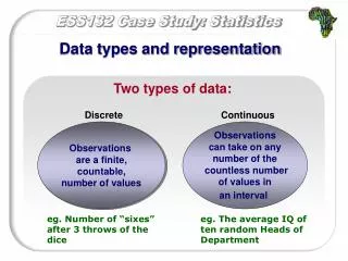
02 Statistics is one of the most crucial parts of our life. Without statistics, data is nothing. We can’t utilize different data without the use of statistics. Therefore the significant role of statistics is to represent the data in a meaningful way. In this way, anyone can understand the data without in-depth knowledge of statistics. Most of the time, the statistics data sets contain massive amounts of values. It is hard to represent these values in the form of lists and articles. That is why the graphs come into existence to represent the aggregate statistic value in clean and well-managed order. Here in this blog, we will share with you the top 7 types of statistics graphs commonly used in statistics. 02 Overview
03 Pareto Diagram or Bar Graph A Pareto diagram is also known as a bar chart. It is the best way to represent the qualitative data. It was developed in the early 1900s by Vilfredo Pareto. He used this graph to conduct his study on wealth and poverty. This chart offers two ways to display the data. You can either represent the data horizontally or vertically. You can use it to compare data, such as amounts, characteristics, times, and frequency. The bar of this graph is emphasized with essential categories. You can quickly get an idea from this bar that which category has the highest amount of data. There are three types of bars in this chart i.e., single, stacked, and grouped. 03
04 Pie Chart or Circle Graph A circle graph is also known as Pie charts. It is also one of the widely used statistics graphs in the world. Statisticians commonly used these graphs to represent the data graphically. As the name suggests, this graph looks like a circular pie with a few slices. Besides, we use this type of statistics graph to represent that qualitative data. Qualitative data means the data is not presented in numerical form. Besides, we put the different categories in each slice of the pie. The size of slices varies upon the data. Some slices might be more significant, and some might be smaller. 04
05 Histogram The histogram is another best statistics graph to represent the data. We use it to express quantitative data. In this graph, the range of values is known as classes. If the classes contain the lower frequencies, then it would have the shorter as compared with the taller ones that contain, the higher frequency. Most of the students get confused with the bar chart and the histogram. Because both of these look quite similar. But these graphs are different from each other in terms of the data measurement levels. In bar charts, the frequency of categorical data is the primary factor. While in the histogram, the data with ordinal values are the primary factor. Ordinal values are not easily measured i.e., feelings, opinions, suggestions. 05
06 Stem and Leaf Plot A stem and leaf plot is one of the best statistics graphs to represent the quantitative data. This graph breaks each value of a quantitative data set into two pieces. These pieces are often known as the stem and the leaf. Furthermore, the higher places values are known as the stem, and the other places values are known as the leaf. We can list all the data values in a compact form with the help of this graph. It is a device that is used to represent the data set. It evolved in the early 1900s from Arthur Bowley’s work. Most of the statisticians use it for data analysis work. 06
07 Dot Plot It is not that much of a famous statistics graph. Most of the experts say that it is a hybrid of the histogram and a stem and leaf plot. In this type of graph, each value is represented as the dot, and this dot is placed above the appropriate class. We use this graph to represent quantitative data values. Likewise, we use the rectangles and bars in histograms. In the same way, we use the dots which are joined with the help of simple lines. We use these graphs to compare the data of many individuals. 07
08 Scatterplots Scatterplots graphs are one of the famous statistics graphs that use in most of the powerful statistics software. It is used to display data based on the horizontal axis and vertical axis. I have mentioned earlier that the statistics tools of correlation of regression are used to show trends with the scatterplot. In the scatterplot, the lines or curve is used to show the data. This chart goes upside down and left to right. Scatter means to place the points at different places to each other. It is the statistics chart to uncover the potential of the dataset. 08
09 Time-Series Graphs The time-series graph is one of the most popular statistics graphs among statisticians. It is used to represent the data points in time. It is the statistics graph that is used for a certain kind of paired data. We use this graph to measure the trends over a certain period of time. Here in this statistics graph, the timeframe can contain the minutes, hours, days, months, years, decades, or even centuries. 09
10 All these seven types of statistics graphs are the major ones. Apart from that, there are other types of statistics graphs, too i.e., the statistics bar graphs, statistics misleading graphs, statistics line graphs, and even statistics bad graphs. Most of the statistics students are also well aware of exponentials graphs, logarithmic graphs, trigonometric graphs, cartesian graphs, and frequency distributions graphs. Now you will be more confident about the use of graphs for different kinds of data. At last, I would like to say that you should use the right statistics graph as per your data set. Conclusion 10
11 11 Contact Us website https://statanalytica,com Email info@statanalytica.com