Download
1 / 15
200 likes | 504 Views
Types of Graphs. 6 th Grade Math. Bar Graph. A graph using vertical or horizontal bars to represent values of data. Bar Graph Example. Create a class bar graph using the following data: What is your favorite type of weather? Snowy Sunny Stormy Cloudy What shall we call our axes?.

E N D
Types of Graphs 6th Grade Math
Bar Graph • A graph using vertical or horizontal bars to represent values of data.
Bar Graph Example Create a class bar graph using the following data: What is your favorite type of weather? • Snowy • Sunny • Stormy • Cloudy What shall we call our axes?
Line Graph • A graph that uses points connected by lines and shows how something changes in value.
Line Graph Example -What was the temperature on day 4? -What do you think the temperature might be on day 7? -On what day(s) was the temperature was below 55 degrees? -What is the mean temperature? -What is the range of the temperature over these six days? -What is the median temperature? -What is the mode for this data?
Circle Graph • A circular graph divided into sections representing the relative size of each value.
Circle Graph Example Each Friday, Mrs. Hinsley’s kindergarten class spins a spinner to determine their activity center. What is the probability that Jarred will spin the art center? A. ¼ B. ½ C. 1/6 D. 2/3
Circle Graph Example 2 The following graph shows the amount of dog food that was eaten by Susanna’s dogs per bag of dog food. 5% 10% 30% 20% 10% 25% Which dog ate the least amount of food? Based on the graph, how much of the food did Scooter and Belle eat altogether? Which two dogs ate the most food? How much more food did Gate eat than Boomer?
Circle Graph Example 3 If 120 students were surveyed, fill in the chart below:
Stem-and-Leaf Plot • This type of plot is a way to organize data by dividing it by the stem (tens digit and greater) and leaf (ones digit). • http://www.shodor.org/interactivate/activities/StemAndLeafPlotter/
Stem-and-Leaf Plot Example Identify the numbers given on this plot What is the mode? What is the median? What is the range? What is the mean?
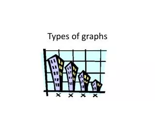
Line Plot • Shows data on a number line with an x or other symbols to show frequency (how often it occurs).
Line Plot Example 1 Find the mean: Find the median: Find the mode: Find the range: 2.2 2 1 4
Line Plot Example • Using the sticky note at your table, record the combined years of the animals that currently live at your house. • Now, let’s analyze our data by finding the mean, median, mode, and range of our results!
Before you hit the door: On separate sheet of notebook paper, construct a line plot and stem-and-leaf plot using the following numbers: 2, 4, 7, 11, 11, 15, 17, 30, 33, 33