Download
1 / 14
140 likes | 376 Views
Types of graphs. Scatter graph. Used to show a relationship between two variables These variables are not independent or dependent variables Example: Representing on a graph the relationship between age of humans and occurrence of cancer. Line graph.

E N D
Scatter graph • Used to show a relationship between two variables • These variables are not independent or dependent variables • Example: Representing on a graph the relationship between age of humans and occurrence of cancer.
Line graph • Used to represent the relationship between an independent and a dependent variable • The independent variable is always on the x-axis and the dependent variable is always on the y-axis • Example: a graph showing the relationship between ambient temperature (independent variable) and the time it takes for a certain sized cube of ice to melt (dependent variable)
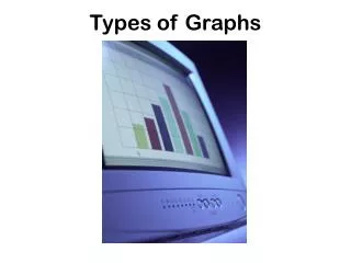
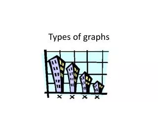
Bar graph • This type of graph represents discrete data, data which is grouped into separate categories • There are no dependent and independent variables • Categories may be placed on either axis • Example: showing the numbers of red, blue, silver, and white cars in a particular city
Histograms • This graph shows continuous data placed into categories • Because the data is continuous the bars produced touch • Usually the categories are placed on the x-axis • Example: showing the different heights of individuals in a certain high school
Pie graph • Used to show continuous data involving one variable • A circle is divided to show the relative proportions of the counts of the various types • Example: a circle showing divisions representing the number of students in a class of 25 receiving each of the possible letter grades, (A, B, C, D, F)
Kite graph • Complex graph allowing visual representation of the relationships amongst three variables • Example: types of plants, and the abundance of plants a certain distance from the water line of a pond
Nomogram • A graph having three axis that represent variables which are related to one another • In this type of graph, when two variables are given the third may be determined • Example: three axes showing the relationship of body mass to oxygen consumption to metabolic rate