Download
1 / 19
190 likes | 310 Views
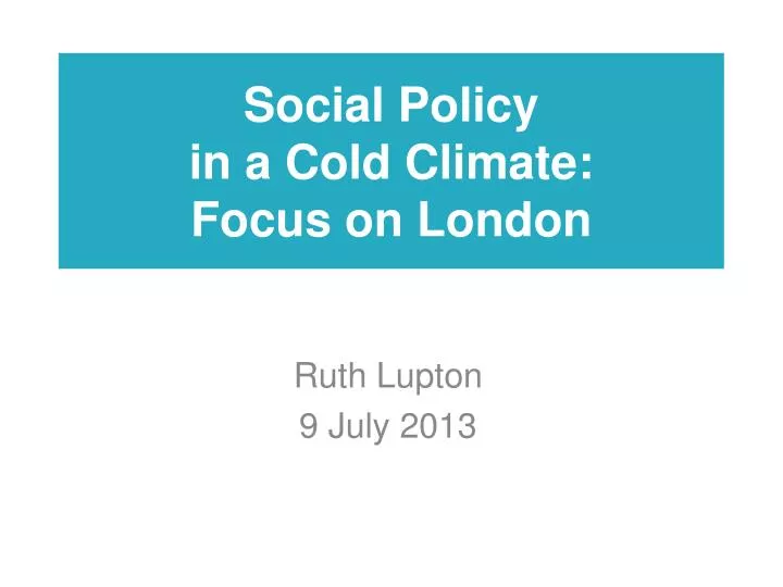
Social Policy in a Cold Climate: Focus on London. Ruth Lupton 9 July 2013. Social Policy in A Cold Climate. The impact of economic and political changes, o n poverty and inequality in the UK, between 2007 and 2014 Phase 1 (now!)

E N D
Social Policy in a Cold Climate:Focus on London Ruth Lupton 9 July 2013
Social Policy in A Cold Climate The impact of economic and political changes, on poverty and inequality in the UK, between 2007 and 2014 Phase 1 (now!) • Labour’s social policy (from 1997 and through the crash) • Changes in economic inequalities 2007-2010 Phase 2 (January 2015) • The Coalition’s social policy • Further changes in economic inequalities In both phases: • Pulling out everything we can at a London level • A particular focus on spatial patterns Also: • Three local authority case studies on the local government cuts in London
Prosperity, Poverty and Inequality in London 2000/01 to 2010/11 • A first report on the London work (more to come!) • Includes: • Changing distribution of qualifications, employment,hourly wages, weekly earnings, incomes and wealth, from pre-crash (2007/8) to post-crash (2010) • Changing spatial distribution of poverty over same period. • Important because: • First crash/post crash comparison for London • Tracks what already happening in London before Coalition reforms • And documents the situation Boris inheritedin 2008 • Contextualised by: • Wider data on London’s economic performance, housing markets etc over decade • Analysis of spatial patterns of poverty pre-crash as well as post-crash
The Team • John Hills leading on economic outcomes, with Polly Vizard, Jack Cunliffe, Polina Obolenskaya, Ludovica Gambaro • Ruth Lupton leading on spatial aspects, with Alex Fenton, Amanda Fitzgerald
Economic Outcomes: Aims and Sources • Aim of analysis: • Overall shape of distribution (focus on 90:10) • Who wins and loses as wider economic circumstances change • Compare London with rest of England, and compare Inner and Outer • Sources: • National Pupil Database (age 16 qualifications) • Labour Force Survey (adult quals, employment, wages, earnings) • HBAI dataset (DWP) (incomes) • Wealth and Assets Survey (ONS) (wealth) • Dates: • 2006/08 (National Equality Panel) and 2010 (i.e. nothing before 2006-8) • Caveats: • Designed for national comparison • More can be done with Annual Population Survey • More can be done with sub-London splits when data available
Spatial Distribution of Poverty Aims and Approach • Aim of analysis: • Where do people in poverty live? • What levels of poverty exist in different neighbourhoods? • How does this change over time? • Approach: • Develop a consistent proxy measure for poverty at LSOA level (a rate of the number of claimants of means-tested benefits divided by the number of households) • Look at 2001, 2008 and 2011 • Look separately at numerator and denominator to explore source of change in rate • Caveats: • Although more can be done to explore data at a local level, small year on year changes in single neighbourhoods should not be regarded as significant – looking for overall patterns
London during growth (2001-2008) • London’s economy does better than any other region • The population of the city grows rapidly • House prices grow rapidly, faster than earnings • The number of social rented homes in Inner London falls, while subsidised private renting increases (esp in Outer London) • Many new high value homes are built in inner areas • Poverty falls only slightly (after housing costs) • London is more unequal on all the indicators we look at in 2006-2008 than other regions
Poverty rates decline in Inner London, as population increases
London’s relative resilience to recession • London the only region to see no dip in output in 2009 • Smaller falls in full-time employment than other urban regions • And smaller rises in unemployment • Part time employment increases: an under-employment rather than unemployment story
Losers: Men and Outer London • The increase in part-time employment is only for men
Some disadvantaged groups less hard hit in London than elsewhere • For youth 16-24: • unemployment up 1.5 percentage points in London • 2.9 percentage points elsewhere. • For Black/Black British people: • no significant changes in London • elsewhere in country a fall in FT employment of 5.7 percentage points whilst unemployment increased. • Similar pattern for social tenants • So differentials between London and other regions close (convergence towards worse outcomes)
Lowest Earning Men Hardest Hit and Earnings Inequality Rises for Men and Women • Overall 90:10 ratio in London went up more - from 7.4 to 9.4 - than in the rest of England (7.8 to 8). • Low-earning men in London had greater decline in earnings than low-earning men elsewhere, driving an increase in wage inequality. • For women, earnings inequality also increased, and by more than in the rest of the country, but less than for men. Top earning women did not experience the same gains as top-earning men.
People with Lowest Incomes see them fall more in London (after housing costs) • Income inequality after housing costs remained virtually unchanged in the period to 2010/11 in England as a whole • In London the 90:10 ratio rose considerably from 8.4 to 10.7 Changes in Net Equivalised Household Income After Housing Costs 2007/8 to 2010
Change in Neighbourhood Poverty Rates 2001 to 2011 • A slight majority of “the poor” (53 per cent) by this measure live in Outer London in 2011 • Proportion of highest poverty neighbourhoods in Inner London falls from 77 per cent to 55 per cent
At the same time, the wealthy of the wealthy pull away, so wealth inequality rises Changes in the 90:10 Ratio (Financial, Physical and Property Wealth 2006/08 to 2008/10 wealth at the 10th percentile in London stayed flat while in England generally it rose 14.3 per cent But median wealth increased 7.6 per cent in London, compared with a 1.3 per cent fall in England generally. At 90th percentile, wealth increased 8 per cent in London, but only 0.4 per cent elsewhere. Different story if pension rights included
But some good signs: Strong and improving qualifications of Londoners Inner London driving the improvements in qualifications
And London’s schools continue to slightly outperform others, with greater socio-economic equality Particularly strong performance of FSM pupils in Inner London
Implications/Discussion • High incomes, high wealth, high poverty are global city characteristics. Can London do it differently? • The changing poverty map could be a good thing, but: • Is it? • What are the implications for services in outer areas? • Are we on our way to a ‘donut city’ (with welfare reform accelerating the trend)?