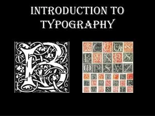
Introduction to Typography
Introduction to Typography. Role of Typography in Design. Typography can provide an element of expression to accompany or reinforce a message. Typography is the art and science of working with type. Role of Typography in Design.

Introduction to Typography
E N D
Presentation Transcript
Role of Typography in Design • Typography can provide an element of expression to accompany or reinforce a message. • Typography is the art and science of working with type.
Role of Typography in Design • Poor typography can have the opposite effect and can prevent you from connecting to the viewer. • At it’s worst it can make your message illegible.
Purpose of Typography in Design • A carefully crafted typography increases the emotional impact of a message more then regular type will adding another dimension to the message. • A well conceived typographic composition allows the designer to connect with the reader.
Role Typography Plays in Design • Letters and numbers can be arranged in clever ways that strengthens the message you need to deliver.
Role Typography Plays in Design • Of course some of the most innovative and creative type breaks all the rules
Typeface Terminology • Type: refers to characters used singly or collectively to create words, sentences, paragraphs, blocks of copy, etc. • Characters: Individual letters, numerals, punctuation marks or other symbols
Typeface Terminology • Typeface: • Refers to the particular style of upper and lowercase letters and numbers of a specific design- the design of the type • Examples: • Helvetica, Times, etc. • Font: refers to all characters of a particular typeface
Typeface Terminology • Uppercase: refer to the CAPITAL LETTERS of the alphabet in a font • Lowercase: refer to the smaller letters
Structure of Type • Baseline: refers to an imaginary line on which the characters seem to be standing • Meanline: this imaginary line runs along the top of most lowercase letters such as I,c,e,m,n,u,v,w and x
Structure of Type • X-height: The height of the body or main element of the lowercase letterform, which falls between the meanline and baseline. • Cap Height: the line that runs across the top of capital letters and ascenders in a line of type
Structure of Type • Ascender: the part of a lowercase letter that rises above the x-height, as in b.d.f.h.l and t • Descender: the part of the lowercase letter that goes below the x-height, as in g,j,p,q and y
Structure of Type • Type Size: the height of a typeface measured from the bottom of it’s descenders to the top of it’s ascenders • Point: A unit of measurement equaling approximately 1/72nd of an inch or 1/12th of a pica; used to express the size of type or leading
Structure of Type • Crossbar • Hairline • Fillet • Link • Bowl • Ear • Loop • Descender • Serif • Counter • Spur • Arm • Stem • Terminal • Stroke Shoulder • Tail • Ascender • Leg • Eye • Spine • Apex
Type Size - Body & Display • Body Type: Body type is type 12 points or smaller; this type is also referred to as text type. • Display type: refers to type sizes 14 points or larger used for headings and titles; areas other then the text body
Serif & Sans • Letterforms can be broken into multiple categories but the most basic subdivision of a typeface is that of whether it is a Serif or Sans Serif typeface
Serif & Sans • Serif fonts are the most common of text or “body copy” fonts. They can work nicely for headline fonts as well. • Serifs are the little feet or arms that hang off the end of letter strokes and typically add a thick/thin look to the letters. • Sans Serif means “without serifs” and lacks these embellishments giving the text an overall more even stroke to the font design
Serif Fonts • Serif Fonts: Serifs on a typeface give letters a more “finished” appearance allowing the letters to flow together easier and making them generally easier to read. • Serif fonts are often used in books, magazines and newspaper for body text
Oldstyle Serif Fonts • Serif Fonts: Serif fonts come in three subcategories: • Oldstyle: based on classical Roman Scriptures. • Letters are very open, wide, and rounded with pointed serifs and a pleasing contrast between heavy and light strokes
Oldstyle Serif Fonts • Serif Fonts: Serif fonts come in three subcategories: • Oldstyle: based on classical Roman Scriptures. Letters are very open, wide, and rounded with pointed serifs and a pleasing contrast between heavy and light strokes
Modern Serif Fonts • Modern: Modern fonts are based on fonts designed over 200 years ago. • They have a greater degree of mechanical perfection then Oldstyle fonts and greater distinction between heavy/light strokes and thin squared-off serifs
Square Serif Fonts • Square Serif: Square or slab serifs are a contemporary style used mainly for small amounts of text, such as advertising copy, subheadings, and headlines. • The letters have a square serif and mostly uniform strokes with little contrast between thick and thin.
Sans Serif Fonts Sans Serif Fonts: As the name implies, these fonts are without serifs and usually have an overall even stroke weight with little variation between thick-thin. Sans Serif fonts evoke a more modern look but are generally harder to read than Serif fonts.
Display Fonts Serif and Sans Serif are the easiest way to divide fonts but there are other categories that fonts can be divided into as well: • Display fonts: Display fonts or decorative fonts are designed to be used as attention getting headline fonts. These fonts include dingbats and any type of font that does not fall into other categories easily. • They are nor intended for body text or large amounts of text but for titles. They should rarely, if ever, be used for body text.
Display Fonts- Dingbats Dingbats: Dinbats are a subdivision of decorative fonts that include many small symbols or pieces of art that can be used to enhance a design. While Zapf dingbats and Wingdings are the most common dingbats, there are hundreds if not thousands of different designs available.
Scripts Fonts Script Fonts: Script fonts are designed to mimic handwriting, therefore, the letters are designed to touch one another. These fonts are traditional type used for formal initiations or documents. They are difficult to read in large bodies of text and are commonly used in headings or subheadings in a layout. Scripts fonts should never be used in all capital letters.
Mono-Spaced Fonts Mono Spaced Fonts: • Most fonts are proportionally spaced; that is the smaller characters take up less space than larger ones. • For example, the letter “I” is not as wide as the letter “m”. • In contrast, in mono-spaced fonts, all characters take up the same amount of space regardless of the actual letter.
Font Styles or Families • The term font families refers to fonts of the same design but with a difference in the weight from one font to another. • All the style variations of a font are the families of that font. Type is ordered by it’s family name and it’s description- ie Helvetica Bold fro example. • Many fonts only come in one style- plain- but many body copy fonts come in a variety of weights and styles such as plain (Roman), italic, bold and bold italic or bold-oblique.
Font Styles or Families • Generally Roman refers to a regular type family- a normal weight or center point in the range of font styles, not too thick or thin. • Posture refers to the slant of the typeface- upright or italic. • An Italic family refers to a Roman style but with a slant to the right of between 10 and 15 degrees. • An Obliquestyle refers to text that is simply slanted to the right.
Font Styles or Families • Weight variations refer to typestyles designed with thinner- thicker variations of strokes.
Font Styles or Families • Some of the weights, in order from lightest to heaviest, include: • Extra-thin- ultra-thin or extra-light • Thin or light • Roman or book • Medium or Regular • Demi-bold or semi-bold • Bold • Heavy, Extra-Bold, Black or Super Bold
Font Styles or Families • The weights for a font are named by the designer and follow no set rules. • Some designers may consider a thin font heavier than a light font. • Even between standard fonts and condensed fonts, there could be a name difference for the same weights. • While it is acceptable to use multiple fonts from a single family, try to keep the font categories to one or two fonts.
Font Styles or Families • The standard normal weight of a typeface is called Regularor may be referred to as normal. • A thinner-lighter version of the typeface may be referred to as light or thin. • Thicker-heavier versions of the style may be referred to as bold or even black in the heaviest cases.
Font Styles or Families • Width variations refer to condensing (narrowing) or extending (widening) of the letters. • A narrower version of the type- with lettering compressed is referred to as a condensed style. • A version of the typestyle where the letter forms have been widened is called an extended style. • Styles within a family of a font may be combinations of multiple attributes- such as a light-condensed or a bold-italic.
Measuring Typography Typographic measurements: • There are two basic units of measurement we use when measuring typography: • Points: Very small units of measure used to measure both the type size and the spaces in between lines of type (leading). • There are 72 points to one inch. • Type size is measured in points and refers to the number of points measured with a line gauge between the ascender line and descender line of the font. A line gauge is a printers ruler which includes inches, picas and points.
Measuring Typography Typographic measurements: • Picas: Picas are a larger unit of measure used to measure line lengths, depth of columns, size of margins, and size of illustrations. • Picas measure 1/6th of an inch. • There are 12 points to one pica. • The width of a line of type is called it’s measureor column width and is always measured in picas.
Measuring Typography Typographic measurements: Line Length: • Line length is also known as the measure or column width • Always measured in picas using a line gauge • Norm for body copy- should be 1.5 times the type size being used • ( for example -
Measuring Typography Typographic measurements: Line Depth: • Line depth or height is always measured from baseline to baseline • Measured in points using a line gauge
Measuring Typography Typographic measurements: Leading: • Leading is a term left over from the days when letterpress type was cast from molten lead. • Therefore to “lead” a line was to add material between the lines of type, giving more space for easier readability.
Measuring Typography Leading: • Leading refers to the space between lines of text measured from descender line to ascender line of the lower text. • Leading between lines equals line depth (baseline to baseline) minus point size (ascender to descender) • Leading affects the appearance and readability of copy and is measured in points with a line gauge.
Measuring Typography Horizontal Spacing: • Two types of horizontal spacing is measured in typography • Wordspacing is the amount of space between words. • Letterspacingis the amount of space between letters of a word. This letterspacing is also known as tracking.
Horizontal Spacing • Tracking is the spacing between characters in a line of text. • Tracking adjusts space uniformly over a range of characters. Tracking is often confused with kerning but tracking refers to the overall spacing of a block of lettering. • When letter spacing is not adjusted by tracking, paragraphs can end with split words, fragments we call widows and orphans in typography.
Measuring Typography Horizontal Spacing: • Widows: a paragraph ending line that falls at the beginning of the following page/column thus it is separated from the rest of it’s paragraph text. • Orphan: A paragraph opening line that appears by itself at the bottom of a page column. A word, part of a word, or very short line that appears by itself at the end of a paragraph.
Measuring Typography • Kerningincreases or decreases the spacing between certain pairs of characters, as in AV, which look better when they slightly overlap. • Kerning is the process of adjusting spacing between characters “in a proportional font” usually to achieve a visually pleasing result. • To the left we have three versions of WAR. The top version has no kerning, the middle version has auto-kerning and the bottom version has had the kerning manually adjusted.
Type Alignment • Alignment refers to the side of the page or column with which the text is even. • Flush left- (ragged right): all text aligned to the left side of the page or column • Centered: All text aligned to the center of the page or column with ragged edges on both the left and right sides. • Flush right (ragged-left): all text aligned to the right hand edge of the page or column • Justified: spacing between words is automatically adjusted so both left and right sides align to the edge of the page or column.
Type Alignment- specialized cases • Runaround: A runaround refers to lines that are shortened where they need to wrap around an illustration or photo. • A runaround may be tailored to fit a regular or irregular shaped object or illustration. • Molded Type: molded type is a case where body type is formed into a distinctive shape such as for a Word Search puzzle or other printed shape. Molded type can be distracting and hard to read and is used only in special circumstances.
Straight vs Tabular Matter • Straight Matter : Straight matter refers to body type set into a normal paragraph spanning a page as opposed to tabular matter. • Tabular Matter: Tabular matter refers to charts, tables, formulas or other typographic layout elements in rows that make typesetting complicated and time consuming. • Tabular matter, because of it’s multiple columns of numbers or text is referred to as multiple justification when referring to it’s alignment.
Tabular Matter Rivers: • Rivers in typography refer to distracting patterns of whitespace that occur running vertically down through a body of text when type has been justified to align to both sides. • These gaps of white space distract the reader making the text difficult and tiring to read. • Spacing needs to be manually adjusted in paragraphs of body text when text is justified and rivers occur.
Caps – All Caps - Small Caps Caps • Caps refer to the uppercase or capital letters in the letterforms. YOU MAY USE “ALL CAPS” BUT IT IS VERY DISTRACTING AND IS RESERVED FOR MAKING A POINT. Small Caps • Small caps refers to a styling where the uppercase form of the letter is used but the size of the letter is smaller then the capital form but larger then the lowercase form.
Drop Caps - Raised Caps Drop Caps • Drop caps are used to start off new chapters and special sections of a report. You can create the cap, then alter the font, the style, and the color of the character through the use of the character style. Many programs have settings to automatically create drop caps. If a program does not have such settings, drop caps should be avoided. Raised Caps • Raised caps are also used to start off new chapters and special sections. Raised caps are created by making the first character larger while making sure the spacing above is sufficient so it does not run into another section.