Download
1 / 53
530 likes | 549 Views
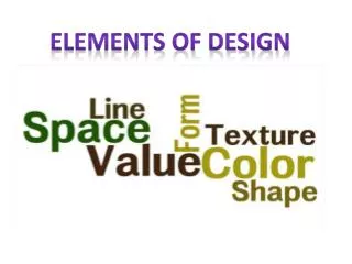
Elements of Design. Line Colour Texture Size Shape Space Value Typography Media. How Type Functions. Personalities of type achieve different effects Consider: formal vs. informal fonts Consider: decorative vs. plain fonts Consider…. Personality and effect of font choice

E N D
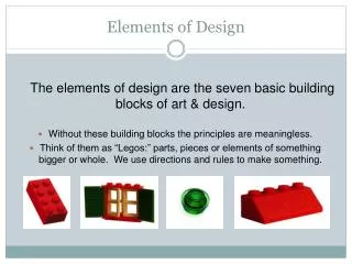
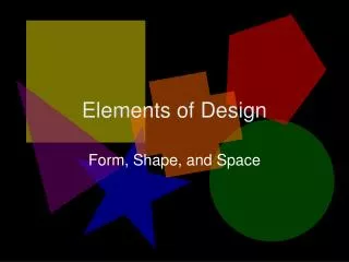
Elements of Design • Line • Colour • Texture • Size • Shape • Space • Value • Typography • Media
How Type Functions • Personalitiesof type achieve different effects • Consider: formal vs. informal fonts • Consider: decorative vs. plain fonts • Consider…. • Personality and effect of font choice • Impact on author’s credibility • Appropriateness for context, form, purpose, central idea, and audience of document
Font Choice Example 1 This makes sense…
Font Choice Example 2 This makes NO sense…
Headline vs. Body Text • Headlines should be bigger, bolder and boom-boom-pow-ier! • Body text should be smaller, simpler, and easier to read for extended periods of time!
Example… What’s wrong with this picture?
The Four Basic Principles • Contrast • Repetition • Alignment • Proximity …Of design, darling
Contrast • Avoid elements on the page that are merelysimilar. • If the elements (type, headings, color, size, line thickness, shape, space, etc.) are not exactly the same, then make them very different.
Contrast is often the most important visual element on the page, and is often used to draw attention to a focal point.
Growth is up 2.6 percent! Due to… • Increased Productivity • Focus on Sales and Revenue • Fewer Troubles with Rats • Ending of Seven Years’ Bad Luck • Miracle-Gro ….Boooooo
Growth is up 2.6 Percent! Due to… • Increased Productivity • Focus on Sales and Revenue • Fewer Troubles with Rats • Ending of Seven Years’ Bad Luck • Miracle-Gro ….Ahhhhhhhh
Repetition • Repeat visual elements of the design throughout the piece. • You can repeat color, shape, texture, spatial relationships, line thicknesses, sizes, etc.
Repetition • This helps develop the organization and strengthens the unity and readability. • Ex. Use the same colour of background throughout, and if one title is bolded, bold all others.
Alignment • Nothing should be placed on the page at ransom – every element must have a purpose. • Every element should have some visual connection with another element on the page. • Align elements on vertical hard edges, usually on the left side.
Alignment Example 1 Yes, this is good.
Alignment Example 3 Alignment
Proximity • Items relating to each other should be grouped close together. • When several items are in close proximity to each other, they become one visual unit rather than several separate units. • This helps organize info & reduce clutter.
Proximity • Items that are not related to each other should not be in close proximity. • The closeness or lack of closeness indicates the relationship. • Elements that are intellectually connected should be visually connected.
Proximity Example 1 NO! YAS!
Proximity Example 2 NO! NO!
Which is better and WHY? Consider all the CRAP we just talked about: • Contrast • Repetition • Alignment • Proximity
B?Before Chamber City After
A?Before Ancient City Before
B?Before Ancient City After
A?Before Construction Network After
B?Before Construction Network Before
A?Before Galeria Before
B?Before Galeria After
Final Examples to Sum up Our Crappy Conversation
Common Design Offenses • Large Images (result in large load times) • Long lines of text that require scrolling (limit to 12-20 words) • Broken hyperlinks (cause user rage) • Lack of contrast (everything is one colour, size, etc.) • Bright and hideous backgrounds (make it tough to read) • Lack of consistency (constant contrast) • Too many graphics (get distracting) • Oversized pages (results in too much scrolling)