COLOR
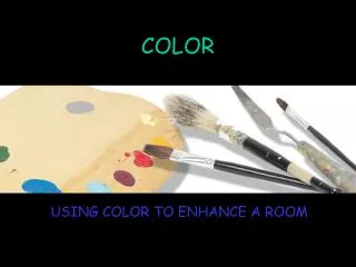
COLOR. USING COLOR TO ENHANCE A ROOM. COLOR. Many designers agree that color is the most significant element of design. Individuality can be expressed through color. Set a mood or illusion. WHAT IS COLOR?. A ray of light

COLOR
E N D
Presentation Transcript
COLOR USING COLOR TO ENHANCE A ROOM
COLOR • Many designers agree that color is the most significant element of design. • Individuality can be expressed through color. • Set a mood or illusion
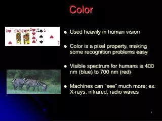
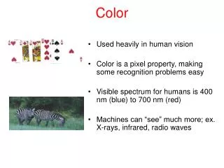
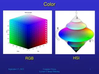
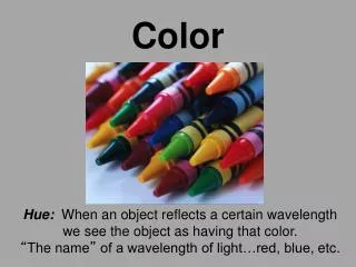
WHAT IS COLOR? • A ray of light • Light broken down in electromagnetic vibrations of various wavelengths. • Color is perceived by the eye and interpreted by the brain. • Color can influence how we feel.
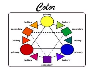
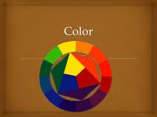
IDENTIFYING COLORS • Primary Colors: cannot be mixed from any other pigments (red, yellow, & blue). • Secondary Colors: mixing equal amounts of two primary colors (orange, green, & violet). • Tertiary Colors: mixing an equal amount of a primary and secondary color (red-violet, red-orange, yellow-orange, yellow-green, blue-violet, & blue-green).
WARM COLORS • Colors associated with the sun • Red • Orange • Yellow • They appear closer than cool colored objects • Used in areas of high activity. • Ex. Kitchen and Family Room
COOL COLORS • Colors that capture the essence of the ocean. • Blues • Violets • Greens • You can visually enlarge a room by painting the walls a cool color • Cool colors are popular for bedrooms, bathrooms, and home offices because of the relaxing effect.
THE COLOR WHEEL A tool used when working with color End for today
TERMS TO KNOW • Hue: the specific name of a color • Black, white, and gray have no hue • Intensity: the brightness or dullness of a color. • You can lessen the intensity of a color by mixing it with its complement
EFFECTS CREATED • High Intensity • Bright, stimulating, and makes objects stand out • Objects will seem larger and closer • Low Intensity • Muted, calming • A ceiling painted a light color will appear higher
TERMS TO KNOW • Value: lightness or darkness of a color. • Basic hues in the color wheel are considered normal values. • Tint: a hue lighter than its normal value (add white). • Shade: a hue darker than its normal value (add black).
COLOR SCHEMES • Color combinations based on color wheel relationships that are used to create a mood or set a tone. • Monochromatic • Analogous • Complementary • Split-complementary • Triad • Neutral/Achromatic • Accented Neutral
MONOCHROMATIC • Using the same tints, tones, or shades of the same hue.
ANALOGOUS • Using three or more colors next to each other on the color wheel.
COMPLEMENTARY • Using colors found directly across from each other on the color wheel
SPLIT-COMPLEMENTARY • Combining a color with the two colors found on either side of the original color’s complement.
TRIAD • Using three colors spaced evenly from each other on the color wheel.
NEUTRAL • Using whites, blacks, grays, and beiges.
ACCENTED NEUTRAL • Using neutral colors with a small amount of one bright color.