Color
Color. Color might be the only visual element of a flower arrangement that anyone ever notices. Color Wheel. A tool to used to understand the uses of color . Made up of 12 colors. Hue - Each color on the color wheel. Colors in the Color Wheel. Primary Color- natural color Red Yellow

Color
E N D
Presentation Transcript
Color might be the only visual element of a flower arrangement that anyone ever notices.
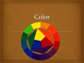
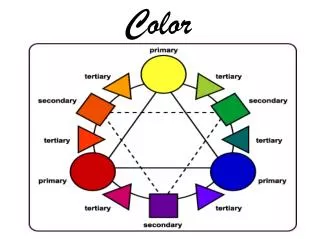
Color Wheel • A tool to used to understand the uses of color. • Made up of 12 colors. • Hue- Each color on the color wheel
Colors in the Color Wheel • Primary Color- natural color • Red • Yellow • Blue • Secondary Colors- equal mixture of two primary colors • Red + Yellow = Orange • Yellow + Blue = Green • Red + Blue = Purple/Violet
Colors in the Color Wheel • Tertiary color- equal mixture of a primary and secondary color • Example: red + orange= red-orange
Color Wheel Instructions • Select a shape that is significant to you. • Trace the shape 12 times in a circle on the poster paper provided. • Label the each shape with the colors of the color wheel in order. • Paint your shapes using the primary colored paint provided. • Outline the shapes with a black marker and label the colors of each shape. • Finish your poster by adding a title and your name, date and period.
Color Wheel Terms • Value- Brightness or darkness of a color • Chroma- Measure of brightness or dullness
Color Wheel Terms • Tint- Add white to make a color brighter • Example: Pink is a tint to red • Shade- Add black to make a color darker • Example: Burgundy is a shade of red.
Color Wheel Terms • Tone- add gray to make a color dull • Example- rose is a tone of pink
Color Wheel Terms • Color Harmonies- combinations of color that are pleasing to the eye.
Color Categories • Warm Colors: color hues composed of yellow, orange and red hues. • Associated with heat and warmth. • Cool Colors: color hues composed of blues, greens, and purples. • Associated with water and ice, cold.
Color Schemes • Color Schemes are combinations of colors. • Color schemes are determined by flower and accessory. • Foliages and stems generally do not count as one of the hues forming the scheme. • White, black and gray may be added without changing the scheme.
Monochromatic • One hue with its tints, shades and tones • Example: Red, pink, mauve and burgundy. • This scheme may become monotonous. To avoid this use tints, tones and shades and include a wide range of intensities.
Analogous • Three or more hues that are next to each other on the color wheel. • Example: Yellow, Orange, Orange-red, Red • Appears pleasing because it is an orderly transition of colors.
Complementary • Two hues directly opposite of each other on the wheel. • Create a lively feel. • Using warm and cool colors creates emotional excitement and visual depth. • Changing the values of these hues add interest to the design.
Split Complementary • A three color scheme composed of any hue, plus the two hues adjacent to its complement. • Example: Red with yellow-green and blue-green. • Create less contrast than the direct complement to adds variety and interest.
Triadic Three color that are equally spaced from one another. Difficult to work. Requires careful selection of flowers and accessories. Can use tints and shades to soften harsh effect of unrelated colors.
Double Complement • Use four colors; two pairs of complimentary colors. • Rarely considered to be a valid option in creating a successful composition.
Alternate Complement • Uses a triad plus one direct complement to one of the three colors. • Example: Triad: Red, Blue and Yellow and Complement: Orange (complement of blue)
Inspirations for Color • Season or Holiday • Examples: Christmas, Easter, Valentine’s Day • Special Occasions • Examples: Baby designs, Anniversaries, Wedding • Symbolism • Example: Message flowers as red roses for love.
Inspirations for Color • Favorite Colors: Choose a favorite color of the giver or the recipient. • Existing Colors • Consider: • Interiors where the design will be placed. • Tablecloth, napkins, china and even food. • Size of room and the distance at which the arrangement will be viewed. • Container and accessories may also dictate color scheme.
Use of Color in Design • Balance- Visual • Use bright intensity or dark values near the rim of the container or base of the arrangement • Depth • Depth can be achieved by combining warm and cool colors within an arrangement. Visual depth is achieved by using both.
Use of Color in Design • Focal Point • Using contrast of colors creates focal point. • Bright intense color attracts the eye. • Rhythm • The use of similar colors throughout a bouquet creates rhythm, • Transition from one color to another also creates rhythm.
Use of Color in Design • Harmony/Unity • Repetition of color throughout an arrangement creates harmony.
What do colors say? Take this color flower Quiz!
White – achromatic - without color • White is a useful neutral, which, because of its reflective qualities, adds brightness and contrast • Symbolism/Meaning: • Simple • portraying both elegance and sophistication • Purity
RED • Red is a lively stimulating color because of its bold and dramatic characteristics. • Symbolism/Meaning: • Strength and dominance • Expresses love
PINK • A tint of red, pink successfully combines with many colors and is often enhanced by the use of stronger contrasting colors. • Symbolism/Meaning: • Romance • Femininity
Orange • Stimulating and energetic • Symbolism/Meaning: • Autumn • Halloween
Yellow • Symbolism/Meaning: • cheerfulness and sunshine • “friendly” • Adding yellow to an arrangement adds spirit and perk up a dull design.
Green • Green is a natural background that does not attract attention. • Symbolism/Meaning: • Soothing and restful • St. Patrick’s Day
Blue • Blue varies in different lighting; many blue flowers are actually purple. • Symbolism/Meaning: • Peaceful, quiet and cool. • Can have a depressing psychological effect when used too much on one design.
Purple • Since purple is the combination of the two extremes in emotional temperature, it can be cool or warm depending on related factors, including: • Lighting • Background • Junction with other colors • Percentage of red and blue • Symbolism/Meaning: • Restful • Denotes royalty and elegance

